Bacardi is an American beverage company, which was established in 1862 and is fully privately-owned. The group has more than 40 brands, under which various drinks are manufactured. The most famous names of the company’s portfolio are Bacardi Rum, Martini, Grey Goose vodka and Patron tequila.
Meaning and history
The iconic Bacardi logo is instantly recognizable across the globe and has never changed its main mascot — the bat. The color palette is still repeating the first versions of the original visual identity of the brand, reflecting the values of legacy and heritage.
The bat appeared on the emblem in 1862. The symbol was chosen after the acquisition of the distillery by the Bacardi Family. There were a lot of creatures living under its roof and the family considered it a good sign.
1862 – the 1890s
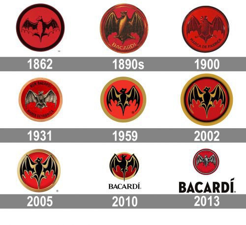
The original logo was a simple and not very detailed image of the bat, executed in black and placed on a solid red circle with a thick black outline. The contours of the image were thin and resembled a pencil drawing. It was a bright and memorable insignia for its times.
The 1890s – 1900
The first redesign was held in the 1890s. The bat was modified and gained bolder lines and more confident contours, along with a modernized color palette — not gold was added to black and red.
Another feature of the new logo was the “Bacardi” inscription in all-caps placed inside the emblem, right under the bat. It was written in thin gold letters, around the perimeter of the frame.
1900 – 1931
In 1900 the color palette was simplified to black and red again. The bat is now seen in more detail and the inscription under it was replaced by “Marca De Fabrica” in black capital letters.
The outline of the circle was composed of two lines — a thick one and a thin, almost invisible, placed from the inside.
1931 – 1959
In 1931 the most detailed and three-dimensional emblem was designed. The bat was drawn in shades of gray and black in order to add volume and motion to it. The frame of the circle was colored in pale gold, and the black inscription was now composed of two parts. The “Ron Bacardi” was added above the bat, repeating the style of the lower lettering.
1959 – 2010
The new concept was brought to the visual identity of the famous brand in 1959. The stylized image of the bat was now executed in black and gold, placed on a red background with a gold thick outline. The lines of the bat were sleek and fancy, showing the company’s willing to become one of the luxury segment.
2002
The redesign of 2002 made the Bacardi logo stronger and brighter, by adding a thick gradient black outline to the inner side of its circular frame. This made the frame look darker and wider and added more character and individuality to the iconic badge. The main element of the logo, the bat, was enlarged and gained a thin gold outline, which made its lines look longer, and angles — sharper. The background of the badge was also changed — the scarlet red shade was replaced by a calm and dark one, the blood-red, which added a mysterious touch’s
2005
During the next fifty years, the logo was modified and slightly changed. The gold lines got shadows and thin outlines, and the emblem gained a slightly three-dimensional look. The version of 2005 was the most ornate and vivid one, with the bat enlarged and the lines of its wings and tail elongated, adding elegance and sophistication.
2010 – 2013
The redesign of 2010 brought back the wordmark, but now it was written not inside the emblem, but under it. The bold black “Bacardi” lettering in all capitals was executed in a sleek serif typeface with a playful stroke, replacing the dot above the letter “I”.
As for the emblem itself, that was the only version, where the bay’s head was turned right. The lines were softened and elongated, and the number of golden lines was reduced. The red color of the background gained a darker gradient shade.
2013 – Today
The logo of the brand we are all familiar with today was created in 2013 and based on two earliest versions — from 1900 and 1931. The bat is drawn in gray and black, with more realistic contours and details and is placed on a scarlet red background, enclosed in a double black and white outline.
There is also “Bacardi Marca de Fabrica” inscription placed on the emblem around the perimeter. The whole emblem is executed in a traditional and powerful red black and gray color palette, with no gold left.
Symbol
What does this logo look like? It is a bat located in the circle. As I has already mentioned, the design of logo is concerned with legents. But not only with it.The plant bought by Facundo was full of bats.
Font
The wordmark, located under the emblem, is written in all capital letters executed in a strong and modern sans-serif typeface, which is similar to Varvara Bold, but with the letter “I” modified.
The inscription evokes a sense of power and confidence. Its thick solid letters represent the brand as a professional and stable, yet the one willing to develop and grow.


