Grey Goose is a premium brand vodka, produced in France since 1997. In 2004 it’s founder, Sydney Frank, sold it to Bacardi group for $2 billion.
Grey Goose was created mainly for the USA market, but in 1998 got a title of World’s best tasting vodka. The core product is complimented by a range of flavored options.
Meaning and history
Although Grey Goose is a French vodka brand, it was created by American businessman Sidney Frank. Frank decided to create a new vodka with a unique character and shared his dream with François Thibault, an experienced master blender from the French province of Cognac. This is how the collaboration came about, giving rise to one of the world’s most iconic vodka brands.
In 2004 the brand was sold to Bacardi, one of the world’s leaders in the beverage markets, and this brought the second wind to Grey Goose. Today the vodka under this brand can be seen in the best restaurants, bars, and hotels across the globe.
What is Grey Goose?
Grey Goose is the name of a vodka brand, owned by Bacardi since 2004. The French brand was established at the end of the 1990s and in literally no time has become one of the top-selling labels of vodka all over the globe. Grey Goose is a luxury segment brand.
Before 2013
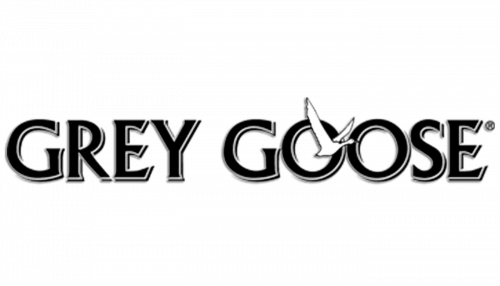
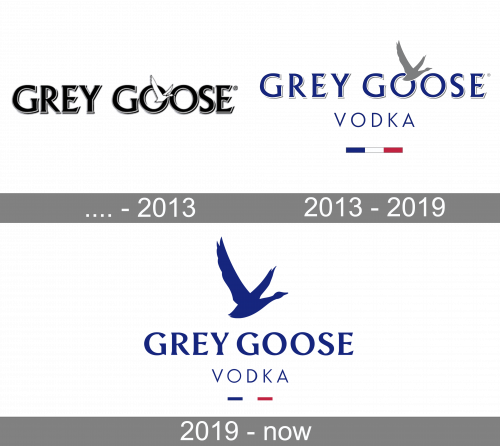
The wordmark was originally a collection of black serif letter similar in appearance to the later styles, except these letters have white outlines and black shading behind them. There’s also a white goose flying out of the first ‘o’.
2013 – 2019
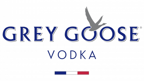
In 2013, they put the letters further apart, recolored them blue, turned the goose grey (and made it bigger) and added some stuff. Namely, there’s a thin word ‘Vodka’ written in blue below, followed by a bar of French national colors.
2019 – Today
Sydney Frank named the brand Grey Goose as he used to sell French wine under the same name decades ago. Now it’s one of the most recognizable names on the beverage market.
In 2019 Grey Goose started the biggest redesign of the brands identity since its launch in 1997.
The iconic goose on the logo now is more of an icon rather than illustration, which makes the look more contemporary.
The new logo wordmark is executed in bolder, confident and striking sans serif with an art-deco touch, and there are no more layered shadows. This new typeface makes the logo sound more optimistic.
Color scheme remained the same – intense blue and white, but with a set of unexpectedly bright secondary colors and patterns.
The new Grey Goose identity is a result of 11-year partnership with Ragged Edge, based in London.
Font and Color
The elegant and bold uppercase lettering from the primary Grey Goose badge is set in a sleek custom serif typeface with softened contours. The closest fonts to the one, used in this insignia, are, probably, P22 Wedge Bold, and Schneidler Latein Bold, but with some modifications of the characters’ contours.
As for the color palette of the Grey Goose visual identity, it is based on a deep and calm shade of blue, which looks super confident and chic, evoking a sense of excellence and showing the high quality of the product, released under this brand.


