Jagermeister, the most known product of the German company Mast-Jägermeister SE, is a digestif prepared out of more than 50 herbs and spices.
Meaning and history
Jägermeister, established by Curt Mast in 1934, stands as a beacon in the spirits industry, emanating from Wolfenbüttel, Germany. Mast’s role as an “old timer” in the creation of this distinctive herbal liqueur marked the beginning of a journey that would see Jägermeister becoming a beloved brand across the globe. Its foundation is a narrative of innovation, quality, and cultural significance, deeply intertwined with the identity of its creator.
The journey of Jägermeister is marked by significant milestones, including landmark legal battles that underscored its commitment to protecting its heritage. In a notable instance, the “Swiss Federal Institute of Intellectual Property” and the “Federal Administrative Court” were involved in decisions regarding the “use of the image” of Saint Hubert and Saint Eustace, emblematic figures in the brand’s iconography, on the grounds of being an “improperly appropriated Christian symbol.” These legal endeavors highlight Jägermeister’s dedication to preserving its unique identity amidst challenges.
In the present day, Jägermeister has solidified its status within the industry, recognized not only for its iconic “cross logo” but also for a “much wider range of products.” The brand’s evolution is evident through its dynamic engagement with a global audience, leveraging “telecommunications services” and a “global website” to reach consumers. The “result of the ruling” in various legal disputes has further cemented Jägermeister’s position, enabling it to continue its legacy without compromise.
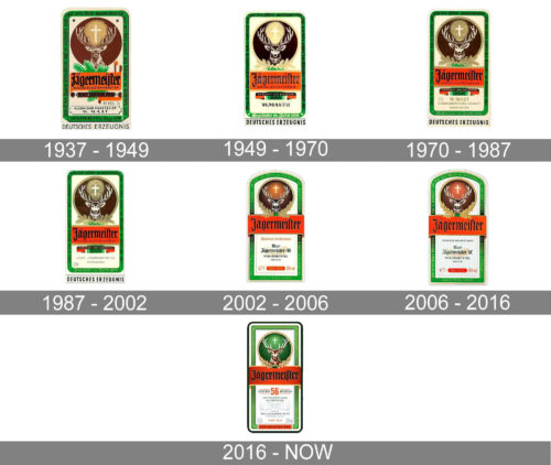
1937 – 1949

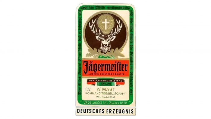
The Jagermeister logo from 1937 featured a vertically located rectangular banner in a thick green frame, with a solid brown circle in its upper part, a wide red banner, and lettering under it. On the circle, there was a gradient brown image of a deer with a cross between its antlers. In the red banner, there was a gothic-style nameplate in black, with a delicate tagline. Behind it — a green fir branch.
1949 – 1970

The lines of the emblem were refined in 1949. The frame was made smoother and thinner, while the colors of the main elements were darkened and elevated. The lettering gained some volume by the addition of gradient gold shades to its dark bodies, and the fir branches changed their color to light beige, balancing the background of the cross, between the antlers of the deer.
What does the cross with antlers mean?
The cross with antlers, an emblematic feature of the Jägermeister bottle label, signifies much more than an artistic element; it embodies a narrative of faith and transformation rooted in catholic origin story. This symbol traces back to the story of Saint Hubertus, who, after the heavenly voice of a stag with a cross between its antlers called him to change his ways following his wife’s death, dedicated his life to Christianity and became known as the master of the hunt. This symbol, therefore, represents not only Jägermeister’s commitment to quality but also its recognition of the profound religious leanings of some consumers, standing as a testament to the brand’s respect for tradition and its own alcohol bottles’ identity.
1970 – 1987

The frame of the brown circle became stronger and more visible in 1970, while the red banner with the nameplate gained a brighter intense shade. The lettering under the badge was changed but still executed in thin capitals of a traditional sans-serif typeface, and the same color palette.
1987 – 2002

The golden shape where the white cross was drawn got a visible texture in 1987. Now this gold figure with straight tin lines, resembling rays, looked like a luxury seal. As for the other elements of the Jagermeister logo, they were kept almost untouched, just the colors were elevated again and the contours — refined.
What animal is the Jägermeister logo?
The animal prominently featured in the Jägermeister logo is a stag. This emblematic figure is not just any stag, but a representation of the legendary stag encountered by Saint Hubertus, which is celebrated in the brand’s own promotional activities. The logo, showcasing the majestic animal with a large glowing cross floating between its antlers, encapsulates the brand’s profound respect for its heritage and the religious character that underscores its identity.
2002 – 2006
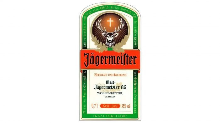
The shape of the badge was changed in 2002. Its upper side got arched from the center, while the angles of the bottom part got stricter. The brown emblem was redrawn in a more modern and sleek way, with gradient shades and more white lines. The cross now looked elegant and evokes a sense of a true miracle. The tagline was removed from the red banner, which made the logo neater and less overloaded.
2006 – 2016

The branches around the emblem were redrawn in gold gradients, looking voluminous and fancy. The brown shade of the circle was changed to a warmer one, with a slight pink touch, and it made the whole brand’s visual identity more friendly and welcoming.
2016 – Today
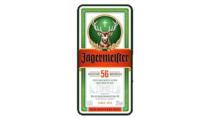
The redesign of 2016 changed the shape of the emblem back to a rectangular one. This year was also very significant for the Jagermeister logo, as it was the first timed when the brown circle of the emblem changed its color to gradient green, just like the one from the inner emblem’s framing. The red banner became a bit darker and the black lettering on it gained shadow and started looking more dramatic and bold.
Old logo interpretation
For a long time, many people supposed that the product’s logo symbolizes the exclamation “Oh dear God.” They claimed that the circle stood for “O(h)”, the stag was the “dear,” while the cross represented God. Now that you know the company’s official legend, you may see how far this explanation is from it. Moreover, chances are that the old interpretation was originally invented as a joke.
We can’t help but point out that the Jägermeister logo bears an uncanny resemblance to the logotype of the Milwaukee Bucks sport club.
What was Jägermeister originally made for?
Jägermeister was originally crafted as a historic herbal liquor intended not for cosmetics or medicinal purposes, but as a beverage to be enjoyed responsibly by those of legal drinking age. Its creation aligns with the jägermeister marketing code that emphasizes responsible consumption and adherence to the country of access’s alcohol regulations. This dedication to tradition and quality assurance has established Jägermeister as a revered name in the realm of spirits, transcending its date of birth to become a staple for enthusiasts around the world.
Font
The Gothic lettering in the Jagermeister logo seems to be hand-drawn. Such types as Wilhelm Klingspor Gotisch, KochFraktur-Regular, and Deutsche Schrift Schmal are very close but no match.
What is the meaning of the Jägermeister symbol?
The Jägermeister symbol, a legendary stag’s head with a beaming cross between its antlers, is deeply rooted in an old Christian tale. This iconic image represents Saint Hubertus, once a wild hunter, who experienced a revelation upon encountering a majestic stag bearing a glowing cross. This transformative vision led him to pursue a holy life, eventually becoming the patron saint of all hunters. The Jägermeister trademark, therefore, is more than just a logo; it is a symbol of the preservation of our quality and an homage to the brand’s rich heritage, reflecting its historic herbal liquor roots and the christian inspiration behind its creation.


