Don Julio is a renowned premium tequila brand originating from Mexico. Established in 1942 by Don Julio González, it has since evolved into a globally recognized label. Primarily celebrated in North America, its influence stretches to Europe and other parts of the world. The brand offers a spectrum of tequilas, from Blanco to Añejo, reflecting its commitment to quality and tradition. In the modern corporate landscape, Don Julio falls under the Diageo portfolio, a leading global beverages company. As the demand for luxury spirits surges, Don Julio continues to carve its niche in the upscale tequila market.
Meaning and history
Don Julio, an iconic name in the world of tequila, traces its roots back to 1942 in the highlands of Jalisco, Mexico. The eponymous founder, Don Julio González, driven by a passion for tequila, embarked on a journey to redefine how it was made. With meticulous attention to detail, he chose quality over quantity, focusing on the pure essence of the agave plant.
González’s innovative approach included planting the agave further apart for optimal sunlight and better growth. He was also among the pioneers to bottle tequila in taller, sleek bottles showcasing its clarity and beauty, a stark departure from the customary short, stout bottles. This not only redefined packaging but also elevated the overall aesthetic of tequila presentation.
The brand’s rise wasn’t meteoric but rather grounded in authenticity and quality. Over the decades, as word spread about this unique tequila, Don Julio began to gain traction, first nationally and then globally.
In 1985, to mark his 60th birthday, González’s family and friends introduced Don Julio “1942,” a tribute to the year he began his tequila-making journey. This premium variant encapsulated the brand’s dedication to excellence.
The late 20th and early 21st century saw the brand expanding its offerings with labels such as Blanco, Reposado, Añejo, and Real, each distinguished by its aging process and flavor profile.
Don Julio’s dedication didn’t go unnoticed. Global beverage titan, Diageo, recognized the brand’s potential and acquired it. Under Diageo’s stewardship, the brand continued to flourish while staying true to González’s original vision.
Today, Don Julio stands as a testament to one man’s unwavering commitment to quality, tradition, and innovation, resonating with tequila enthusiasts worldwide.
1942 – Today
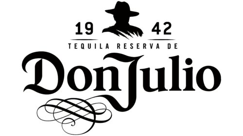
Tequila from Mexico demands a genuine representation, and the Don Julio logo brilliantly captures this essence. It masterfully juxtaposes ruggedness with refinement, each reflecting differently. This emblem radiates luminosity, vibrancy, and a profound sense of occasion, underlining the beverage’s distinctiveness.
Designers painstakingly curated the visual symbol, intertwining it with the rich history of tequila-making, regional customs, and Mexico’s distinctive characteristics. Unique nuances highlight the founder’s significance, with his silhouette inspired by his consistent attire on his family’s estate plantations: a wide-brimmed hat. While in reality, the hat bears a neutral shade, the emblem illuminates it in a sun-kissed orange, harmonizing with the logo’s overall palette. The emblem has retained its core design throughout the brand’s journey.
The brand’s opulent tequila shines with a distinct amber glow within its clear, round bottles with modest necks, mirroring the logo’s deep golden tint. At the heart of the design lies the brand’s pioneer, whose silhouette, devoid of detailed features, yet remains strikingly iconic.
Beside this symbolic figure, the brand’s inception year is artfully split: “19” to the left and “42” to the right, accentuated by delicate lines below. Beneath these numerals lies the elegant script “Tequila Reserva De,” crafted in a svelte, stretched style. Subsequently, the emblem honors its namesake with “Don Julio.” Beyond the routine characters, it incorporates a distinct ligature, or in design lingo, a lettermark. This element, predominantly in the “D” and “J”, is adorned with swirls, stretched traces, sophisticated bends, and crisp terminations. The remaining design draws inspiration from timeless serif typography, encapsulating the brand’s storied legacy.


