![]() Nescafe Logo PNG
Nescafe Logo PNG
The earliest Nescafe logo, which was introduced in 1938, looked very much like the current one. The wordmark featuring the recognizable “N” character has been familiar to consumers from different parts of the globe for 80 years.
Meaning and history
![]()
Nescafé is one of the brands, which prefer evolution to revolution, so once created their logo in 1938, the company was only refining and modifying it throughout the years, without any dramatic changes and innovations. There were five major redesigns of the famous instant coffee manufacturer’s visual identity, but only the first two versions featured something, that is a scent on the current version, as for the color palette, once set in the 1950s, it hasn’t been changed until 2014 when the delicate red accent was added.
1938 – 1953
![]()
The very first logo of the brand was designed in 1938 and featured a strict straight beige inscription on a brown background. The only unusual detail of the whole logo was the letter “N”, which has its bars horizontally elongated and creating a frame for the lettering from up and down.
The warm brown color palette was a great representation of the brand’s nature and essence, resembling a mug of hot coffee in the morning.
1953 – 1968
![]()
The logo was slightly redesigned in 1953, and the main change was with the color palette, now it became monochrome, which gave the company an opportunity to place the logo on different background and use it in various types of advertising.
As for the inscription itself, it was refined, but not changed. All the letters looked more balanced and solid, and were perfectly spaced, evoking a sense of lightness and elegance.
1968 – 1983
![]()
The underline was removed from the logo in 1968. Now the inscription was slightly enlarged and thickened and the elongated tail of the letter “N” was, on the contrary, drawn in a thinner line. Another significant change — the accent above the letter “É” was now on the same level as the upper horizontal line of the logo.
1983 – 1998
![]()
The typeface was changed in 1983. The bold and simple sans-serif was replaced by a stylish and sophisticated serif font with slightly visible delicate and sharp serifs. The font is very similar to Agenda URW Bold and Majesty black fonts, but with the letter “N” customized.
1998 – 2014
![]()
The redesign of 1998 was also about the typeface. The letters became larger and bolder, and the serifs — more visible. It was a very strong and perfectly executed nameplate, which stayed with the company for 16 years. During the same time period, the company started using an additional color palette — the combination of white and red, which was mainly used in the advertising campaigns where the white logotype was placed on a red cap, which became a symbol of the brand and is still used by the company.
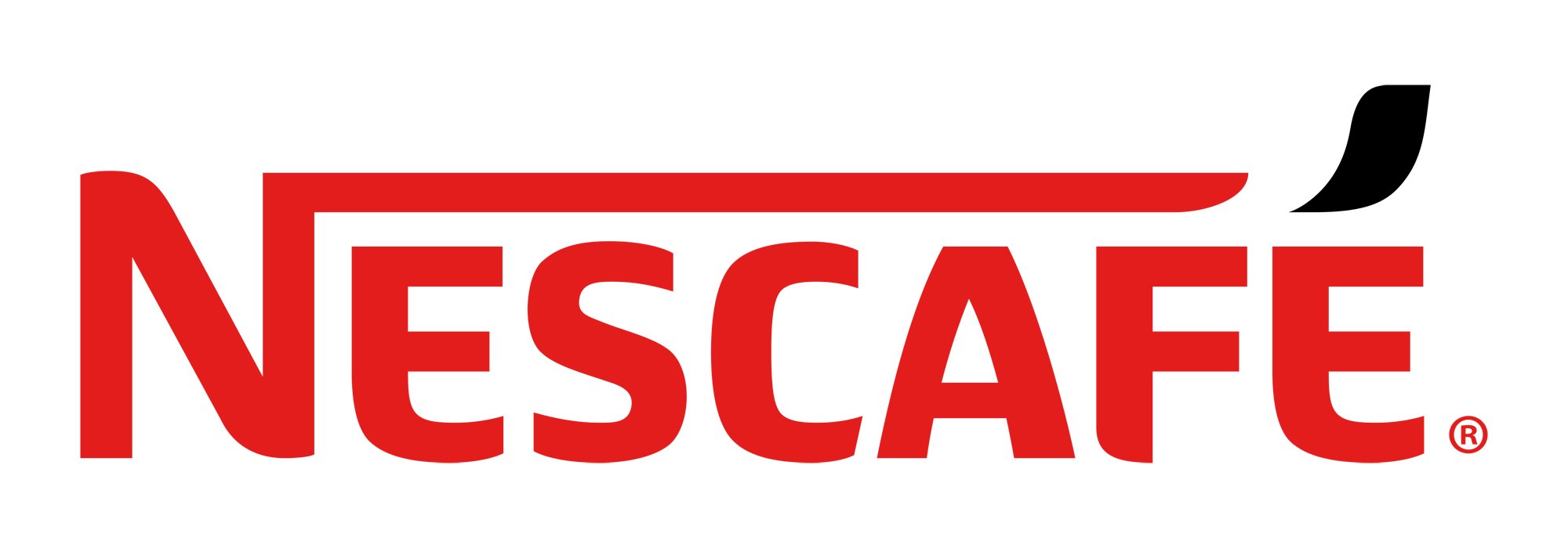
2014 – Today
![]()
The redesign of 2014 brought a new fresh look to the signature Nescafé logo. The serif typeface was changed to a custom sans-serif, which is most likely based on Neuropa Family fonts, but with more distinct cuts and smooth lines. The inscription really looks unique and makes the brand stand out on the shelf.
As for the color palette, the company uses red, white and black in different combinations, but the main version featured black inscription on a white background with a sleek red accent above the letter “É”, which resembles a smoke over the cup of hot coffee and makes you feel the amazing smell.
The 2014 Nescafe symbol was developed by Publicis, CBA, and OgilvyOne (Frankfurt). The French advertising and public relations company Publicis is the world’s oldest and largest one (by revenue). OgilvyOne Worldwide has 112 offices in 40 countries, while CBA has 13 local offices in different parts of the world, from Paris to New York and Mexico.
Font
![]()
In the 2014 version, the serif font has been replaced by a more rounded sans serif one. Almost every character has undergone certain changes. Although they might be not instantly noticeable with the naked eye, you may seem them clearly the moment you take a closer look at both versions and compare them.
The most remarkable change has been introduced to the accent above the last character. Also, both the “E” letters have been modified to resemble a mug’s handle.
Color
![]()
The Nescafe emblem has been using the red-and-white color scheme since 1998. Alternatively, the wordmark may feature a combination of red and black, red and white, or red, black, and white.