From a hiring, job search, and recruiting platform created in 2002, LinkedIn has gradually evolved into the social network needed to grow in your career, network, learn industry news, and develop your personal brand. Today, the platform has a billion registered users from all over the world, and more than 220 million people visit it every month. Companies post jobs on LinkedIn, and employees of large corporations talk about the inner workings and specifics of their work. And in general, today it is hard to imagine finding a job or employees without this social network.
Meaning and history
Before launching the world-famous social network LinkedIn, its developer Reid Hoffman, was developing a dating site and was a member of the board of directors of the famous financial company PayPal. In 2002, he decided to try his hand again and created the LinkedIn site, which was introduced to users a year later. Creating the new platform, Hoffman gained inspiration from Six Degrees, a social network for business, which was popular back in the 1990s but was discontinued. Reid and his team wanted to create a new professional social network based on uniqueness and interconnectedness.
LinkedIn was launched on May 5, 2003, and already in one week it gained more than 12 thousand registered users, and by the end of the year — the number of the website’s members had reached the one million mark. In the early years of the platform’s existence, it was used mainly by large businessmen, well-known marketers, and entrepreneurs in the field of technological innovation, but as the site’s functionality expanded, so did its audience. Thus, in early 2011, the number of users exceeded 135 million. In the same year, the company went to the New York Stock Exchange and held a meeting with President Barack Obama. Microsoft bought LinkedIn for $26 billion in 2016, and Reid Hoffman won a seat on the company’s board of directors.
Now about 900 million people are registered on LinkedIn, representing absolutely different professions and levels of the corporate structure. The bulk of the platform’s users are CEOs, middle managers, and representatives of the IT industry. Despite its strictly professional orientation, LinkedIn is now second only to such social networking giants as Facebook, Instagram, and YouTube in terms of the number of users.
As for the operational part of the platform, it’s quite simple. At its core, LinkedIn is based on the theory of six handshakes, which claims that each person in the world is separated from the other by only six people. From this theory another interesting feature of LinkedIn was borne In this social network, unlike others, it is not possible to contact any user independently. Instead, users are connected by what is known as “trust,” meaning that you can only contact someone you know personally or if you have been recommended to them.
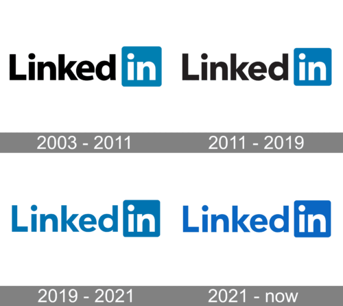
LinkedIn is a platform that first and foremost cares about its reputation. In its more than 20-year history, LinkedIn has never been at the center of any high-profile scandals related to algorithm logic and data security, and the introduction of AI on the platform today is being carried out as carefully and delicately as possible. Even the company’s logo has changed only twice, and both times only slightly.
In terms of visual identity, LinkedIn has always been very strict and professional, although the logo of the network can’t be called boring or outdated. The iconic badge was redesigned a few times in more than twenty years of the website’s existence, and the style and composition we all can see today is a modified version of the original emblem, introduced in 2003.
What is LinkedIn?
LinkedIn is a social network for business communication, finding employees, and opening jobs. Users can post their resumes and detailed work experiences, and companies can post descriptive profiles that will show personal profiles from employees as well. The platform was founded in December 2002, and since 2016 it is owned by Microsoft Corporation. The company has 36 regional offices, ten of which are located in the United States. The social network is available in 26 languages.
2003 – 2011
The original LinkedIn logo was composed of black “Linked” lettering with a solid blue square on its right, where the white “in” in the lowercase was placed. The bold and confident sans-serif typeface of the nameplate was very similar to such fonts as Radiate Sans Bold and LCT Picón Bold. The black, blue, and white color palette of the logo represented the professionalism, seriousness, and reliability of the web portal. The choice of the color palette is easily explained: the black-and-white combination is most commonly associated with a fundamental approach, while blue is a symbol of safety and career development.
2011 – 2019
The first version of the logo stayed untouched for quite a significant period and was only refined at the beginning of the 2010s. The redesign of 2011 only changed the typeface of the logotype, and slightly brightened up the blue shade of the square. The font of the renewed LinkedIn inscription was Avenir Pro, with a bit thinner lines than on the previous version, and the traditional timeless shapes. The lettering looked pretty similar to the original wordmark, and the letter which changed the most was the lowercase “K”. A year later, in 2012, LinkedIn fully redesigns its website and business strategy that led to product innovation and strategy transformation, focusing on two main concepts: to simplify and grow.
2019 – 2021
In 2019 the LinkedIn logo was redesigned for the second time, and now the only change was about the logo’s color palette. The black “Linked” inscription was colored in the same shade of blue, that was adopted in 2011 for the “In” square with the rounded angles, placed on the right from the lettering. In comparison to the previous version, the typeface was slightly refined and the dots above the letters “I” are now placed at a bigger distance from the vertical bars, letting in more air, and creating a lighter and fresher look of the logo.
2021 – Today
The third redesign, held in 2021, has played with the shade of blue on the recognizable minimalistic LinkedIn badge. The color got more intense and deep, creating a stronger contrast with the white elements, and making the contours of the characters look cleaner and straighter. The new color palette evokes a sense of stability and trustworthiness, along with professionalism and determination. The intensified shade of blue has made the look of the LinkedIn website brighter and more vivid too.
Symbol
The iconic LinkedIn logo, the symbol of the network for professionals, looks absolutely up-to-date in its minimalism and strictness. The clean contours and simple concept make up a logo, which is definitely from the 21st century. The lack of decorative elements and the laconic color palette is what makes the badge contemporary, and gives it a life with many years in the future, staying actual.
The wordmark comprises the words “Linked” and “in”. There is a barely noticeable spacing between the two parts of the logo. The word “in” is placed in a blue square shape with rounded angles. This softness of the square balanced the distinctive contours of the characters and the straight cuts of its’ bars.
“Short” emblem
In some cases, there’s a need to “reduce” the logo. For instance, if there’s not too much space or the space has a square shape, it is important to make the logo more readable. In such situations, the word “Linked” is omitted, and only “in” stays. For instance, this approach was used for LinkedIn-branded chocolates, which were square in shape.
Also, the blue square with the white lowercase “In” on it, is the most recognizable part of the LinkedIn visual identity, as is used as the main element of the web and mobile app icon, and today the web emblems make up more than a half of success in the brand recognition.
As the purpose of the famous online portal, its visual identity is based on the principles of professionalism, seriousness, and progressiveness. The blue and white color palette shows LinkedIn as a company with a strong position and traditional values, which can be implemented in all processes, including innovative ones.
Icon
The LinkedIn icon is the most frequently used part of the platform’s logo. It can be seen not only on the LinkedIn platform and official materials but also on sites of companies and personal pages of the people, registered on the platform, as the icon hides a link to their profile.
There are two possible versions of the LinkedIn icon. It can whether be composed of a solid blue circle or a square with rounded angles. As for the central element, it’s the same on both options — two white “in” letters in the lowercase, written in the same typeface as the main official logo.
As for the changes and redesigns, here everything was pretty quiet and surprise-less. Same concept, which was only strengthened and cleaned. Some things do not need dramatic lines or acid colors to look stylish and sleek. And the LinkedIn icon is brilliant proof of this minimalistic concept.
Font
The type used in the LinkedIn wordmark is called Source Sans. It can be utilized to communicate any message that has to do with the company. Although the Source Sans font exists in a number of weights, the company recommends to opt for “Light” or “Semi-bold” versions. Also, if you need to communicate key brand messages in longer texts, it is acceptable to use the Source Serif or Source Code types.
The closest available analogs to the corporate LinkedIn typeface are, definitely, Avenir Pro 95 Black, which only differs in small elements, and the spacing between the dot and the vertical bar of the “I”, and Neology Bold, which has a slightly different shape of the lowercase “K”.
Color
The corporate palette comprises three colors: blue, black, and white. The shade of blue, which is called LinkedIn Blue, is the core of the brand’s identity. There may be several reasons why the company opted for blue. One of them is definitely that many people unconsciously associate it with networking and communication via the Internet (note Facebook’s choice of colors, for instance). Also, there were top managers from PayPal among LinkedIn creators, so it’s only natural that the color close to PayPal blue was chosen.
In addition to this, the psychological symbolism of blue involves such virtues as intellect, authority, power, and success, all of which resonate with the brand’s identity.
By default, the LinkedIn personal profile page has a gray-blue background, which uses a corporate shade of blue and several tones of gray, ranging from dense to almost white. The gray here only reinforces the “professional” bias of the platform but can be changed by each user to any other image, just like the blue circle on the profile photo.


