Hootsuite is the name of a web service for full-fledged management of social media promotion of several profiles in different networks. The service was created in Canada in 2008 and by today has millions of users from all over the globe. Hootsuite is one of the oldest social media management tools on the market and it offers a huge variety of useful features, both free and paid.
Meaning and history
HootSuite is a tool with many features for the most active users of social networks: geeks, marketers, and many others. HootSuite ranks 6th on the list of Twitter clients and is used by many famous large companies such as Mashable and Sony Ericsson, various celebrities, and even the US White House. The Hootsuite website is one of the top 500 in most reputable industry rankings.
Hootsuite is primarily appreciated for its functionality, simplicity, and ease of use. The program is available for all operating systems on both PCs and mobile devices. And, even though Hootsuite offers paid packages, it is quite possible to fulfill all the needs with the tools available for free.
As for the visual identity of the Hootsuite, it is also pretty simple. The badge was redesigned just once, keeping the mood and the main idea of the original version; which was fully based on the name of the platform.
What is Hootsuite?
Hootsuite is a social media tool that allows you to manage and track all your activity on various online platforms. The service was created in 2008, and today it ranks 6th on the list of Twitter clients and is used by many well-known international companies.
2008 – 2014
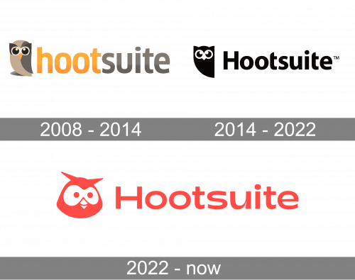
The very first logo for Hootsuite was designed in 2008 and stayed in use by the service for almost six years. It was a badge, composed of a cool graphical emblem placed on the left from the bold lowercase logotype. The emblem depicted a stylized owl, drawn in beige, brown, and gray color palette. The bird looked modern and friendly, and its color palette evoked a sense of calmness and reliability. As for the lettering, it was set in the lowercase of a modern yet simple sans-serif typeface, with the “Hoot” part in gradient yellow, and the “Suite” in brown shades.
2014 – Today
The redesign of 2014 kept the composition of the original badge, though refined all the elements and the color palette of the Hootsuite logo. The owl became flat and monochrome, with its contours simplified and emboldened. As for the lettering, it was now set in the title case of a fancy and smooth sans-serif typeface, with softened cuts of the vertical bars of both letters “T”. The whole inscription was now set in one shade — black, which made the whole look balanced and sleek.
2022 – now
The redesign of 2022 has significantly changed the style of the Hootsuite visual identity, keeping only the original idea and composition: an emblem with an owl, followed by a logotype. Both elements were redrawn in a juicy coral color palette, with the owl being redrawn in a more caricaturish way, with the bird’s face becoming wider and friendlier. As for the lettering, the typeface of its title case letters was switched to a modern extended sans-serif font with bold lines and traditional contours.
Font and color
The stable and bold lettering from the primary Hootsuite badge is set in a traditional sans-serif typeface with wide contours of the letters. The closest fonts to the one, used for the Hootsuite logotype are, probably, LCT Picon Extended Bold and Matrice Semi Bold, but with some shapes modified.
As for the color palette of the Hootsuite visual identity, it is based on a combination of the smooth coral shades of red, and white. The scheme represents the company as an energetic and professional one, evoking a sense of friendliness and showing the Hootsuite value of its customers’ comfort.


