XPeng Motors (Xiaopeng Motors) designs, develops, manufactures, and markets electric vehicles that target middle-class consumers. XPeng independently develops autonomous driving technology and embedded intelligent operating systems, as well as core vehicle systems including powertrain and electronics. A subsidiary of the automaker is developing the XPeng HT Aero flying car.
Meaning and history
XPeng Motors uses the name of its founder, whose name is He Xiaopeng, as its company name. The company was officially founded in 2014. In 2017, the first major investors appeared: the Chinese Alibaba and IDG Capital. In 2019, Chinese Foxconn and Xiaomi also joined the ranks of investors.
The first car of the Chinese brand appeared in 2016. It was the XPeng Beta concept, which a year later was renamed Identity X. XPeng produced only 15 test copies of this model, each of which was made available to the owners and investors of the Chinese brand.
XPeng’s first production vehicle was the G3 compact electric crossover, which hit the home market in 2019. A month later, the company unveiled its second model. April 2019 saw the debut of the XPeng P7 electric fastback, which offered a more premium level of performance than the G3.
The first electric cars were made at the production facilities of the Chinese automobile company Haima. Its plant in the city of Zhaoqing was built in 2019. There are also plants in Guangzhou and Wuhan, but as of the end of 2022, they are not yet operational. In 2020, the XPeng P7 electric sedan came out. A year later, another sedan, the XPeng P5.
The XPeng marketing concept is driving automation, where the main technical solution was the joint use of lidar, radar, and camera. Lidar systems create virtual models of space using a laser, while radar works as a speed and location meter for surrounding objects. The camera complements this tandem by providing initial general information.
Outside of China, XPeng electric cars first started being sold in Norway in 2020. About a year later, the Netherlands, Sweden, and Denmark were added to the list. In 2023, deliveries of two models to Israel began at once: P7 and G9.
New for 2022 is the flagship crossover XPeng G9. And in 2023 the XPeng G6 Crossover was introduced.
XPeng’s corporate style can be characterized as restrained and moderately expressive. Streamlined bodywork and a characteristic “expression” called X Robot Face with narrow eyebrows above the headlights built into the front bumper are the key features.
What is XPeng?
XPeng, also known as Xiaopeng Motors, is an auto brand that was founded in 2014. It is headquartered in Guangzhou and the production of electric cars is set up in Zhaoqing. The company also has offices in the US and Europe. The controlling stake belongs to the founder of Chinese tech giant Xiaomi, Lei Jun.
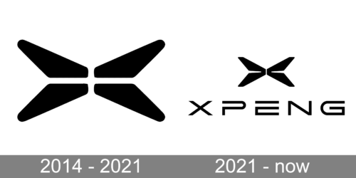
In terms of visual identity, XPeng has stayed loyal to the original design concept, introduced in 2014, even after a thorough redesign of 21. The company refined the contours of the elements, slightly changing the composition, and showing its growth and progress.
2014 – 2021
The original XPeng logo was created in 2014, and stayed active for the first seven years of the company’s history. It was a black-on-white inscription with the first letter “X” replaced by a graphical element, composed of four equal elements. The emblem was accompanied by the lettering in a bold custom sans-serif typeface with sharp cuts of the bars’ ends. Overall it was a very stylish and modern badge, which suited the brand’s essence and philosophy a lot.
2021 – Today
The redesign of 2021 has kept the recognizable style of the XPeng logo, but made some alternations. The first thing to be changed was the graphical “X”, which has now became a separate emblem. Instead of four “petals” it now consists of two mirrored “butterfly wings” and is located above the uppercase “XPENG” wordmark. The lettering was also rewritten, with the bars of the characters getting thinner, and the contours of the letters — wider. The “P” has saved its open contour, as for the “G”, its shape was significantly changed.
Font and color
The stylish futuristic lettering from the primary XPeng logo is written in a custom sans-serif typeface with some interesting delicate elements, such as an open contour of the “P”, and the square curve of the “G”s tail, which balances the same “P”. Another peculiarity of the XPeng typeface is the significantly expanded shapes of the characters.
As for the color palette of the XPeng visual identity, it is a laconic and minimalistic combination of black and white, which stands for progress, style, excellence and professionalism. And all this qualities perfectly characterize the innovative Chinese car brand.


