ZAZ, short for Zaporizhzhia Automobile Building Plant, is an iconic automobile manufacturer from Ukraine. It originated in the Soviet era, in Zaporizhzhia, Ukraine. Known for producing compact, affordable cars, ZAZ became famous for models like the Zaporozhets, catering to the mobility needs of the Soviet populace. Its creations are celebrated for their simplicity and durability, embodying the practical aspirations of the time while navigating economic and material limitations. ZAZ symbolizes a unique blend of Soviet automotive history and Ukrainian industrial ingenuity.
Meaning and history
Zaporizhzhia Automobile Building Plant, traces its roots to 1959 in Soviet Ukraine. Initially a small-scale manufacturer, ZAZ gained prominence by producing the Zaporozhets, an iconic car resembling a mini Fiat, tailored for Soviet roads. This model, known for its affordability and simplicity, became a symbol of Soviet mobility, bridging the gap between the elite’s luxury cars and the common man’s aspirations. Over the years, ZAZ adapted to changing times, embracing newer models and technologies, yet always reflecting the unique socio-economic landscape of its origin.
Post-Soviet era, ZAZ evolved, facing market shifts and competition, yet retained its identity as a testament to Ukraine’s enduring automotive legacy. This journey from a local manufacturer to a player in the global market underscores ZAZ’s resilience and adaptability, mirroring the dynamic history of Ukraine itself.
What is ZAZ?
ZAZ, standing for Zaporizhzhia Automobile Building Plant, is an emblematic Ukrainian car manufacturer with deep roots in the Soviet era. It’s renowned for producing the Zaporozhets, a vehicle synonymous with practicality and accessibility in Eastern Europe, symbolizing a distinct chapter in the region’s automotive history.
1960 – 1964
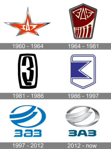
The logo showcases a stylized, five-pointed star with a metallic silver sheen and a gradient of red to orange. Inside the star, the bold, white Cyrillic letters “ЗАЗ” stand out, representing the Zaporizhzhia Automobile Building Plant’s initials, conveying a sense of industrial strength and heritage. The design is sleek and modern, yet with a nod to the company’s long-standing history in the automotive industry.
1964 – 1981
This emblem presents a different aesthetic from the previous one. It’s a shield-shaped logo dominated by a deep burgundy background. The top portion boldly features the Cyrillic “ЗАЗ”. The entire logo is bordered by a sleek black line, enhancing its prominence. It’s a more intricate and symbolically rich design than the simpler star motif, indicating a narrative of progression and community.
1981 – 1986
The logo transitions to a minimalist, abstract design, featuring a stark black and white contrast. Gone are the shield shape, replaced by an elongated ellipse encapsulating the stylized “З”. This pared-back, bold approach reflects a modernistic turn, focusing on a more streamlined and contemporary brand identity. It’s a striking departure from the detailed emblem before, showcasing a trend towards simplicity and graphic clarity in the brand’s visual evolution.
1986 – 1997
In this iteration, the logo is defined by a bold, singular “Z” that fills the entirety of the shield, creating a striking and uncluttered visual. The use of a single color and the absence of additional graphics or text underscores a move towards a highly stylized and recognizable brand symbol.
1997 – 2012
The updated logo shifts to a blue color scheme with a modern, circular emblem adjoining the company’s name in stylized Latin script. The emblem, composed of swooping, ribbon-like elements, suggests motion and continuity. This design significantly departs from the stark simplicity of the previous monochromatic “Z,” moving towards a more global and contemporary look. It combines a graphic symbol with the brand name, reflecting a more international branding approach.
2012 – Today
The logo evolves into a three-dimensional metallic design with a circular motif, suggesting sophistication and progress. The “ЗАЗ” text is now beneath the emblem, in a modern sans-serif font, a shift from the previous intertwined style. The metallic sheen adds depth, highlighting the brand’s futuristic vision and quality. This design reflects a sleek, technological progression, aligning ZAZ with contemporary automotive trends.


