WCW was a professional wrestling promotion. The era of WCW is often cited as a golden age of professional wrestling. Despite its eventual decline, WCW left an indelible mark on professional wrestling, popularizing concepts like the “superstar” and the “pay-per-view event.” WCW also introduced several unique match types, including the “WarGames” match, which featured two or more rings surrounded by a steel cage, and the “Trailer Park Match.” These innovative concepts often put a creative twist on traditional wrestling.
Meaning and history
WCW was active from 1988 until 2001. It was founded by Ted Turner, who acquired Jim Crockett Promotions, a major wrestling promotion in the Southeastern United States. It was created as a competitor to the WWF (now WWE). WCW became particularly popular during the “Monday Night Wars” in the late 1990s. It was during this time that Turner Broadcasting System began to invest more heavily in WCW. In 2001, WCW was purchased by its fierce rival, the World Wrestling Federation. This led to its eventual dissolution.
What is WCW?
WCW was an American professional wrestling promotion. It featured many of the biggest names in professional wrestling history, including Hulk Hogan, Ric Flair, Sting, Goldberg, and DDP. WCW’s influence went beyond wrestling as it was featured in films, TV shows, and video games.
1982 – 1985
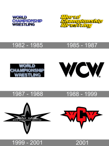
One of the earliest logo versions is done in a deep blue color with the name “World Championship Wrestling” split between the two lines. It is aligned to the left and features all caps. In some cases, the logo is given a gradient that gives it a more sophisticated and professional appearance. The font choice which features slightly arched strokes in combination with straight lines is what makes it unique.
1985 – 1987
The updated logo uses a geometric font, although still features quite bold strokes. The designers chose to capitalize only the first letters, which look just as good. Although the name is aligned to the right as was seen in the earlier logo, each line is indented slightly further to the right. This gave the logo some movement. Combined with bright yellow and contrasting black, the logo reflected the dynamics and energy that are integral to the wrestling competitions.
1987 – 1988
In this logo, the company returned to all caps for a bolder look. All three lines of the inscription are centered for a change. The font chosen for the name has a geometric feel and three-dimensional effect. The light color of the inscription stood out against the black background. At the same time, there was no superiority that the blue offered or energy that was brought by the yellow logo version.
1988 – 1999
It was in 1988 that the company designed a logo that became recognizable across the world. The name got shorted to the initials. In some cases, though, the full name was added right underneath or to the right. The strokes look bold and their pointed, sharp corners give the logo a daring and confident feel. These are surely the qualities that one would need to have to win a wrestling championship. The logo can be seen in different colors: black, red, purple, and blue.
1999 – 2001
This is a striking and unique logo design. Spelled across the center, the logo has the full name, World Championship Wrestling, printed in all caps using an italicized, bold font without serifs. Right above it, the designer added pointed decorative, symmetrical elements that stood for the two “W”s in the name. The letter “C” was featured in the center as an elongated oval shape with pointed ends. The black and silver color palette gave the image a futuristic touch. The company surely wanted to attract attention as it was during this time that the ratings were starting to decline.
2001
When the WWF was taking over, they used a bold logo design that combined the logo introduced in 1988 and the latest logo version. The red and black color palette no longer looked like it was representing the best. Instead, it was a bloody defeat and mourning of once once-great wrestling promotion.
Font and Color
One of the earliest logos uses a bold, sans-serif that looks exactly the same as Adver Gothic font. The logo, which has been seen since 1985, has a font that resembles the LHF Convecta Base font. The 1988 design uses Helvetica Pro Black Condensed Oblique font for the full name and a bold, edgy font for the shortened version. The bold, italicized font featured in the 1999 logo is very similar to Onlytiful Regular and Etrusco Now Condensed Black Italic font. The last logo is also bold and has sharp, angular elements.
There are several key colors that were used by WCW. First of all, it is a deep blue color. It is seen in several versions and gives the logo an authoritative and confident look. The red is a representation of leadership, excitement, and energy. The black color is known to be a classic, powerful color that creates a bold and strong image. There was also a version that featured a yellow color palette. This color is also very energetic and great at grabbing attention.


