 Deutsche Eishockey Liga Logo PNG
The Deutsche Eishockey Liga (DEL) is a premier professional ice hockey league in Germany. Established as a private entity, it is owned by its participating clubs. This league represents the pinnacle of ice hockey in Germany, featuring top-tier talent and intense competition. Centrally operating in Germany, DEL has its presence felt in various regions across the nation, bringing together a diverse mix of teams from different cities, each contributing to the rich tapestry of German ice hockey culture and competition.
Meaning and history
The Deutsche Eishockey Liga was founded in the summer of 1994, emerging as a successor to the erstwhile Bundesliga and transitioning to a company-based operation to enhance professionalism and financial stability in German ice hockey. This reformation marked a significant shift, aiming to elevate the sport’s profile in Germany.
Throughout its history, the DEL has witnessed numerous remarkable achievements. One of the league’s pinnacle successes includes its substantial contribution to the development of German ice hockey, elevating the sport’s quality and popularity within the nation. The league has been instrumental in nurturing talented players who have gone on to achieve international acclaim, further cementing DEL’s reputation as a breeding ground for top-tier hockey talent.
As of my last update in April 2023, the DEL continues to hold a prestigious position in the world of ice hockey. It remains a cornerstone of professional ice hockey in Germany, known for its competitive matches, skilled players, and significant contributions to the sport both nationally and internationally. The league’s ongoing efforts to innovate and improve have kept it at the forefront of German sports leagues, continuously attracting fans and new talents alike.
What is Deutsche Eishockey Liga?
The Deutsche Eishockey Liga (DEL) is a professional ice hockey league in Germany, formed in 1994. As the highest level of ice hockey in the country, it consists of top-tier teams competing fiercely for the championship title. Known for its high-caliber matches and contribution to developing hockey talent, the DEL remains a central figure in German and international ice hockey.
1994 – 1995
The original DEL logo was a blue flag with a red stripe on the top. You could see the abbreviation “DEL” in white over the blue field.
1995 – 1997
The 1995 logo uses the same flag image from before. The written bit that was featured below it in the previous logo is gone. Instead, the word ‘Krombacher’ is written in white on the top left corner of the flag.
1997 – 2001
The next version (1997) featured the letters “DEL” in blue over the white background. This time, there was a gradient texture applied to the name of the league. A puck could be seen in the middle of the “D.”
2001 – 2011
In 2001, the logo became flat, while the lettering below was replaced by “Die 1. Bundesliga.”
2011 – 2019
While the Deutsche Eishockey Liga logo has a modern tech feel, it seems to lack sports symbolism, so you may be left in doubt whether it belongs to a sports league, an internet provider or a household appliances manufacturer. On the whole, the logo looks like a metallic badge with 3D letters.
2019 – 2020
The combination of bright red and silver makes the logo eye-catching, yet refined at the same time. The large red letters “DEL” are given in a smooth italic font. While the part of a red ellipse seen in the top right corner presumably symbolizes a hockey puck, this idea probably wouldn’t cross your mind unless you’re told it’s a hockey league logo. The gradient textures applied both to the lettering and the silver outline adds much dimension.
2020 – Today
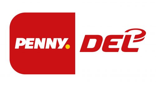
This logo uses the same DEL emblem as the one before it. That being said, they removed the grey frame and put the emblem on the right part of a big rectangle with rounded corners. The other half was red and featured the logo of Penny, the season’s sponsor.


