Volvo is a Swedish brand of luxury cars manufacturer. The company was founded in 1927 by the SKF Financial Group. In 1999 the brand was sold to Ford, and today Volvo is one of the most popular and respected for its high-quality car producers in the world.
Meaning and history
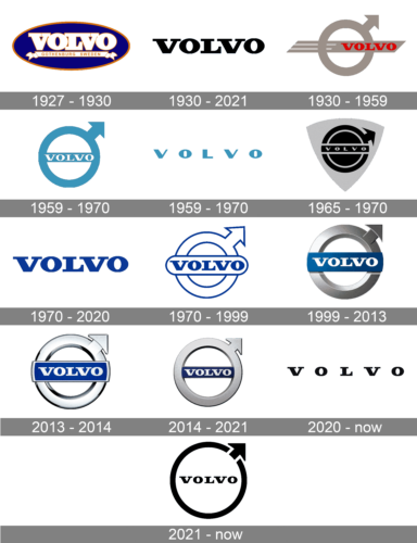
The name “Volvo” means “I roll” in Latin. It was registered by SKF as a trademark for ball bearings, 12 years before the automobile company was established.
The brand is pretty conservative with its visual identity and still uses the emblem, which was created at the very beginning of the Volvo history.
What is Volvo?
Volvo is the synonym for Swedish quality. This Scandinavian automobile manufacturer, established in 1927, today has a wide range of sedan and all road cars, as well as commercial vehicles, including buses and trucks, manufactured and distributed all over the globe.
1927 – 1930
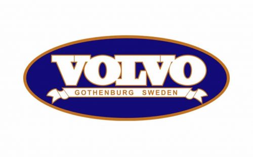
The very first Volvo logo was composed of a blue oval with a golden-brown outline and a wordmark placed in the center of it. The nameplate was written in a traditional for its time typeface with thick white letters. The logo also featured a tagline placed below the wordmark on a thin white ribbon, “Gothenburg Sweden”.
The delicate silver emblem was used on the car grille on its own. It was elegant and simple, a celebration of modest design and perfect taste.
1930 – 2021

The logo introduced in 1930 looked very modern thanks to its minimalistic design. The black color enhanced a timeless look. It was just the word “Volvo” printed using a similar bracketed serif typeface as the original logo with slightly wider letters.
1930 – 1959

In 1940 the brand designs the base for the logo we all know today. It is composed of a more confident Volvo emblem with a wordmark placed on a thick horizontal line going through the center of the circle with its left half “cut” into three thinner lines, symbolizing movement.
The wordmark is in red all-caps, written in a classic serif font. The contrast of red and silver reflects Volvo’s passion and power.
1959 – 1970

The designers preserved the ring with an arrow shape seen earlier but placed the banner with the name inside the ring. The logo featured a color that was somewhere between teal and turquoise. Such color is typically associated with sophistication, balance, renewal, and practicality. Given that it has notes of blue, the logo can give a feeling of trustworthiness and loyalty. For the name, the company used white, a color of perfection.
1959 – 1970

The brand also used its name printed using the same color as in the logo with an arrow. It also used a sans-serif version of the font used in that logo version. There were no other elements.
1965 – 1970
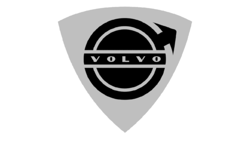
There was yet another version used until 1970. It was done in black and white color palette and featured a ring with an arrow and name placed on a rectangular shield pointing down. This version reflected the strength and power of the brand.
1970 – 1999

The brand switches color palette to black and silver and continues experimenting with the shape. During this period the Volvo emblem is placed inside a black square with a silver outline. The corners are softened, which is perfectly balanced with a rounded-angled base of the wordmark.
1970 – 2020

The most minimalistic emblem was created in 1970. It features the Volvo emblem with a wordmark in a copper palette. Clean lines of the emblem and letters look neat and modern. It is a simple yet very strong visual identity for its time.
1999 – 2013

The Volvo color scheme is set, now it features silver and royal blue, where the blue is for the rectangular of the nameplate, which is placed inside the Volvo silver emblem.
2013 – 2014
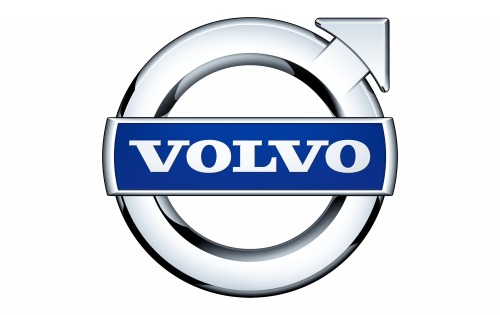
The Volvo badge, created in 2013 was lighter than the previous one. The silver framing gained a glossy texture, which looked fresher and colder. As for the blue banner, it got a thin silver framing, which gave a more elegant look to the lettering, making them look finer and more sophisticated.
2014 – 2021

Current Volvo logo is based on the previous one, but now it is three-dimensional and the lines of the typeface are more clean and confident.
The combination of blue and silver celebrates the Volvo values of quality and design, it evokes the sense of reliability and timelessness of the brand, reflecting its progressive approach and movement, as well as its rich heritage.
2020 – now

The redesign of Volvo’s visual identity held in 2020 introduced a minimalist and progressive logo, which only featured black lettering on a white background. The recognizable serif typeface with thin square serifs looks distinct and confident, and a lot of space between the symbols adds air and sophistication to the image.
2021 – Today
In 2021 the Swedish automaker brings back its iconic circle with an arrow to the official logo. Although, the new emblem was executed in the same style as the previous one — flat black symbols with clean neat contours, placed on a white background. The typeface of the logotype remained untouched, but the lettering became smaller and more condensed in terms of spacing, to fit well into a super recognizable roundel with an arrow, diagonally pointing upright.
What does the Volvo logo mean?
The Volvo symbol is an ancient alchemical sign for iron. The symbol is used to indicate the strength of the iron used in the car, as Sweden is known for its metallurgy all over the world.
Why did Volvo change its logo?
The redesign of the Volvo badge, held in 2021, is intended to represent the iconic emblem of the Swedish brand in a modern minimalistic style, showing that the company can follow the latest trends in visual identity design, and reflecting its innovative approach and progressiveness, without losing its connection to the roots.
What’s the symbol for a Volvo?
The Volvo logo, a circle with an arrow, is the Roman symbol of the God Mars, the shield, and the spear. For the Swedish car brand, the trademark sign stands for another ancient symbol of iron, which is very similar to the Roman symbol of the God Mars. In this way, the company wanted to emphasize its country’s success in the steel industry and to convince people that its cars are as reliable and strong as steel.


