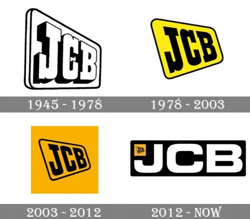
Although the logo of the English company JCB (Joseph Cyril Bamford Excavators Ltd.) has gone through at least four updates, you can notice some consistency, which has been necessary to create a visual link between the old and new logotypes.
Meaning and history
JCB is a British corporation specializing in equipment for various industries, including construction, agriculture, waste handling, and demolition. The company was established by Joseph Cyril Bamford in 1945 in Uttoxeter, England. Currently, it is headquartered in Rochester, Staffordshire.
1945
The original JCB logo featured the three letters inside a rectangular plate with rounded corners. The board was positioned diagonally so that its side could be seen. The letters had black shades. As a result, there was a 3D effect.
1978
The letters grew black, while the plate grew yellow. Although the plate was still positioned diagonally, it grew flat because there were no shades and sides seen.
2003
The yellow filling disappeared. The plate was placed inside a square filled with muted orange. The serifs disappeared leaving the JCB logo a bit simpler.
2012
The letters have been rotated. The type has been simplified once again – the horizontal bar on the “J” has disappeared. The letters seem wider now.
The word “JCB” is white over the black background. In the top left corner, there is a small version of the 2003 logo, which is hardly legible at smaller sizes.


