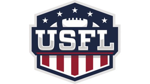
The first era of United States Football League (USFL) history did not last long at all – just two years from 1983 to 1985. USFL matches were held in the spring, there were only 12 teams, and the league quickly ceased to be interesting for the public. However, in 2021, the management decided to revive the League. Today FOX Sports owns the United States Football League along with co-founder Brian Woods.
Meaning and history
The original USFL was a competitive professional football league that operated for three seasons from 1983 to 1985. In the 1983 inaugural season, USFL owners lost millions of dollars. These losses were due to fan interest that was lower than expected and player salaries higher than expected. However, USFL managed to hang on for a couple more seasons. But after the 1985 season, the league ceased its activities.
The historic USFL Spring League was revitalized in 2022 for the first time since 1985. At that time, there was a full 10-week regular season at two stadiums in Birmingham, Alabama, and three playoff games at Tom Benson Stadium at the Hall of Fame in Canton, Ohio. The first champion of the revamped league was the Birmingham Stallions soccer club. In 2023 Birmingham Stallions confirmed their championship.
However, that was the end of the league’s history once again. On December 31, 2023, the USFL merged with another league, the XFL, to form the United Football League, UFL, a new professional league. The UFL 2024, split into two conferences, included 4 teams from the XFL and 4 from the USFL.
1983 – 1985

While the United States Football League was only active for four years, from 1982 to 1986, it left an interesting design legacy.
The United States Football League logo has been obviously inspired by the flag of the United States, which can be seen both in the palette and patterns. The letters “USFL,” which form the focal point of the emblem, are visually divided into two fields. The top parts feature white stars on the dark blue background, while below, there’re red and white stripes. Of course, the similarity to the American flag isn’t exact. Unlike the flag, the logo features vertical stripes, and the colors are slightly different, too.
While the abbreviation “USFL” was rather popular, it still wasn’t familiar to each and every person within the country, so the author of the USFL logo had to include an “explanation.” He placed the lettering “United States Football League” below the main emblem sandwiching it in between two horizontal lines. The lines and the text are given in dark blue.

Apparently, both the abbreviation and the full name of the league are given in one and the same italicized sans serif type. While some designers may accuse the type of being pretty generic, it is also highly legible.
2021 – Today

The flag of the United States has been part of the USFL logo since 1983. This logo is no exception. The designers used the logo introduced in 1983 as the base. They slightly changed the font, making the letters shorter and the stars slightly smaller. In addition, they gave the logo a bolder and more solid look by changing the blue to a much darker shade of blue. The red now looks more saturated as well. If one would set the two logos side by side, one will instantly see that the red and white lines are no longer the same width as they used to be. The new logo features fewer white lines and twice as thick red ones. This created a more powerful image. Finally, the line running under the initials was thicker, the full name was also done using a bolder font, and the second line was completely removed as the bold inscription stood out even without it.


