The franchise that is now known as the Atlanta Gladiators (Duluth, Georgia) was set up as the Mobile Mysticks in 1995. From 2003 to 2015 this ice hockey team bore the name of the Gwinnett Gladiators. In 2015, a few years after their relocation to the Atlanta metropolitan area a decision was taken to add the word “Atlanta” to their name.
Meaning and history
The Atlanta Gladiators, an illustrious name in the realm of minor league ice hockey, trace their origins back to their foundation in 2003. Initially named the Gwinnett Gladiators, they were established as an East Coast Hockey League (ECHL) team, representing a significant development in the Atlanta metropolitan area’s sports landscape. This team emerged from the roots set by their predecessor, the Mobile Mysticks, bringing with them a legacy of sportsmanship and tenacity.
Throughout their history, the Atlanta Gladiators have amassed an impressive array of achievements, reflecting their commitment to excellence in the sport. Notably, they achieved a remarkable milestone in the 2005-2006 season by clinching the South Division Championship, a testament to their skill and perseverance on the ice. Their continued participation in the ECHL playoffs over several seasons has also demonstrated their consistent performance and ability to compete at high levels. This sustained success showcases the team’s dedication to fostering talent and maintaining a competitive edge in the league.
As of now, the Atlanta Gladiators continue to hold a prominent position in the ECHL. Operating under the ownership of the Atlanta Gladiators LLC and affiliated with the NHL’s Boston Bruins and the AHL’s Providence Bruins, the team plays their home games at the Gas South Arena in Duluth, Georgia. The Gladiators remain a beacon of athletic prowess and community engagement, drawing fans and aspiring athletes alike to the thrilling world of ice hockey.
What is Atlanta Gladiators?
The Atlanta Gladiators are a professional minor league ice hockey team, part of the ECHL. They serve as an affiliate to both the NHL’s Boston Bruins and the AHL’s Providence Bruins, showcasing emerging talent in the sport. Based in Duluth, Georgia, the Gladiators continue to be a significant presence in the hockey community, known for their competitive spirit and contributions to the sport.
1995 — 2002
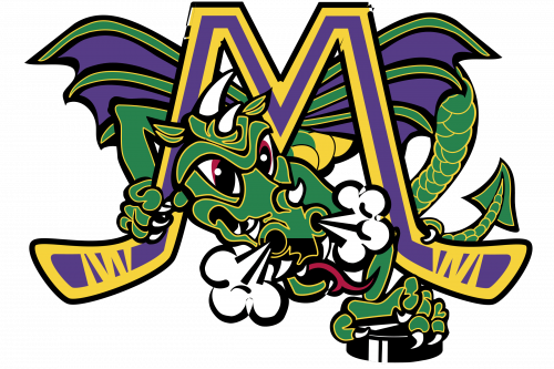
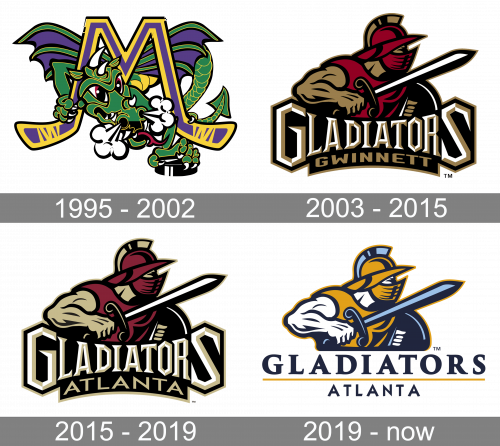
The team’s original name was ‘Mobile Mysticks’, and during this period they used a special emblem. It looked like a big purple letter ‘M’, made from two hockey sticks with yellow outlines. In the center and behind the character, they’ve drawn a fabulous green dragon, clutching onto a hockey puck.
2003 — 2015
The name “Gladiators” submitted during the contest “Name the Team” in 2003 was recognized as the best one. As a result of the renaming, the new logo was the image of a gladiator in gold and garnet. The gladiator is wearing a typical gladiator outfit including a gladiator helmet with face armor. In his right hand he is holding a sword and in his left hand there is a shield.
The stylized wordmark “Gladiators Gwinnett” goes across the bottom. The white with gold fringing “Gladiators” and the gold “Gwinnett” are against a black background.
Such a logo added more energy to the team’s identity.
2015 — 2019
As part of the name change in 2015 the team updated their logo by replacing the word “Gwinnett” with the word “Atlanta”. The rest of the logo remained unchanged, as well as their colors ‒ black, garnet, gold and white.
2019 — Today
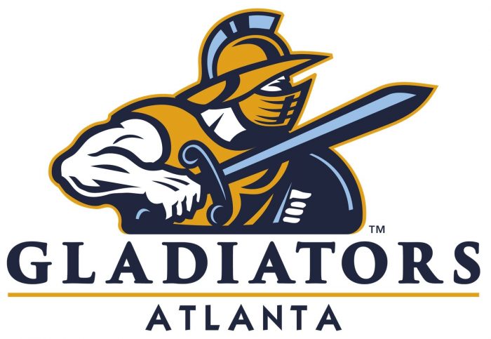
The redesign of 2019 changed the color palette of the Gladiators logo are refined the lettering under the graphical part. Now the badge features delightful blue and ochre color palette which looks noble and fresh. As for the wordmark, it is set in a white background and executed in all capitals of a smooth and bold serif typeface, with the “Atlanta” tagline in sans-serif uppercase.


