In the realm of branding and corporate identity, logos serve not just as mere symbols but as powerful storytellers, conveying the essence, values, and uniqueness of a brand through clever design and symbolism. The significance of logos goes beyond their visual appeal, embedding layers of meaning that resonate with consumers on a subconscious level. This article embarks on an exploration of the profound creativity and strategic ingenuity behind some of the world’s most iconic logos, revealing the stories they tell and the secrets they hide in plain sight.
Take, for example, the LG logo, which at a casual glance appears to be a friendly face, symbolizing the brand’s approachable and customer-friendly attitude. This design subtly incorporates the letters L and G, also suggesting a “world of happiness” in its overall image. Similarly, the NBC logo, with its vibrant peacock feathers, not only captures attention with its burst of color but also represents the network’s pride in its rich array of programming, the peacock’s feathers symbolizing the wide spectrum of shows it broadcasts.
Chocolate lovers might be surprised to learn that the Hershey’s Kisses logo hides an extra kiss in the space between the ‘K’ and the ‘I’, a sweet secret that echoes the brand’s legacy of spreading joy through chocolate. Similarly, the Pinterest logo employs the shape of a map pin as a direct nod to the platform’s function of allowing users to “pin” their interests, ideas, and inspirations, making the logo itself a clever visual metaphor for the service it provides.
The article also delves into logos that are a testament to their founders’ stories and missions. For instance, the Apple logo, often associated with knowledge and discovery, pays homage to the story of Adam and Eve, while also representing the fruit of innovation. Meanwhile, the golden arches of the McDonald’s logo have become synonymous with fast food globally, their design not only representing the letter “M” but also marking a new location on the map of countless original locations around the world.
Technology and innovation find their symbols in logos such as that of Sony’s PlayStation, with its simple yet effective geometric shapes representing the brand’s cutting-edge gaming technology. The BMW logo, often thought to symbolize a spinning propeller, actually reflects the company’s history in aviation with its colors representing the Bavarian flag, paying homage to its origins while signaling its evolution into a premier car manufacturer.
Environmental and social initiatives also find a voice in logos. The African Children’s Initiative uses the image of a mother and child to highlight its mission of support and care, encapsulating its goals in a simple yet powerful visual story. Similarly, the World Wildlife Fund’s logo, featuring a panda, serves as a poignant reminder of the organization’s commitment to wildlife conservation.
Each logo, from the elegant simplicity of the Gillette razor company, which uses precise lines to suggest the sharpness and efficiency of its products, to the intricate design of the Carrefour logo, which embeds a hidden “C” within its two arrows pointing in opposite directions, encapsulates a world of meaning within its bounds. These logos serve as a silent yet powerful language, communicating brand identities, histories, and values in a universal visual script that transcends languages and cultures.
As we peel back the layers of these famous logos, we discover a fascinating intersection of art, history, technology, and philosophy. Each design choice, from the selection of colors and shapes to the strategic use of negative space, is a deliberate effort to connect with the consumer, convey a message, and ultimately, leave a lasting impression. This article invites readers to embark on a journey of discovery, to “click to see examples” of how logos are much more than they appear, serving as gateways to the stories, secrets, and aspirations of the brands they represent.
15. Lego
The name of the Danish company comes from the local expression “Leg Godt”, which can be translated as “play well”. The motto of the brand means “Only the best is good enough”. Indeed, the accuracy of the production of each block of the Lego constructor is up to 0,002 mm.
14. Haagen-Dazs
The Haagen-Dars ice cream brand was created by the Dane named Rubin Matus as a puzzle. The brand name, which some repeatedly tried to “translate” (as a “like” sign or even as the name of the company’s founder or his progenitor) in simply a set of letters. Actually, this phrase cannot be translated from any language whatsoever, although it sounds like a Danish or other Scandinavian language.
The motto of the company “Made like nothing else” applies equally both to the product and the logo.
13. Walt Disney
The Walt Disney logo depicts a fairy-tale castle. If the first prototype of the image was German castle Neuschwanstein, then later the designers turned their fantasies into reality: in Paris, they built the fairy castle of Cinderella in the image and likeness of the logo. However, upon closer examination of the logo, one can find references to Pinocchio, Mary Poppins, Peter Pan hidden in it.
The latest version of the logo was presented to the public simultaneously with the premiere of the movie “Pirates of the Caribbean: Dead Man’s Chest”.
12. Cadillac

The company’s founder, Henry Lilland, called the first car “Cadillac”, appealing to the name of his famous ancestor, Antoine Lome de la Mott Cadillac. The man became famous not in the Old World, but in the USA, having founded the city of Detroit in the state of Michigan.
By the way, the logo almost completely duplicated the coat of arms of Antoine de la Mott Cadillac himself.
11. Nintendo
The name of the Japanese video game brand Nintendo, which started its business in 1889 as a manufacturer of traditional Japanese playing cards, has two versions of translation. The first considers this word as a combination of three hieroglyphs translated as “Leave luck to the heavens.” Another possible translation is “The Temple of Free Hanafuda” (“Hanafuda” in this context can be translated as a “player” or a “card player”).
The logo was created exclusively for the international market, which is why it was simplified. In the end, there was only a name with a simple font put in a stylized oval.
10. Chupa Chups
The name of the brand was born from the Spanish word “Chupar” (“To suck”). The creator of the brand Enrique Bernat (born in Spain) tried to emphasize the idea that the traditions of his ancestors mean a lot to his business. By the way, initially the famous candies on chopsticks were called Chups. Bernat invited Salvador Dali to help him with the logo, and the artist proposed to use a yellow daisy as a base (he did not even bother to draw the flower), and place the name in the center. But since Dali did not like the one-word name, he suggested duplicating it. Chupa Chups fans owe Dali another distinctive feature of their candy – the original location of the logo – which is not on the side of the ball but at the top (to make it more noticeable).
9. Ebay
The brand’s creator, Pierre Amediar, worked for the Echo Bay Technology Group and initially planned to choose the domain name EchoBay.com for the site, but the domain was already taken. Well, the programmer thought through the task and reduced the name to EBay.com. To emphasize the variety of products offered, he painted each letter in its own color.
8. Audi
The Audi logo does not represent all 4 elements, as some researchers of logos claim, appealing in their analysis to the traditions of pagan mythology and culture. These are the logos of four companies, that merged in the face of danger from competitors and decided to create Audi concern (Audi, Horch, Wanderer, DKW). August Horch, the founder of Horch, could not save the company from bankruptcy during the crisis and sold all of his family’s shares. After his decision to return to this business again, he translated his name into Latin. Both Horch and Audi are translated as a call “Listen!”.
7. Sega
The brand’s name is translated as “Japan Game Service”. Originally, the company was registered in Florida and supplied pinball machines to military bases. After losing the Second World War, Japan signed capitulation, and one of its conditions was a ban on the development of military technology. Therefore, only registration in the United States could let the company do business on military products.
However, already in 1950 Sega moved its head office to Japan and the product line changed beyond recognition. In 1980, Sega Company began to develop arcade computer games. The arsenal of the company now enlists more than 500 original games of this genre.
6. Fanta
The Fanta brand was created in the middle of the twentieth century as a result of the brainstorming of ordinary Coca-Cola workers from Germany. The words “fantasy”, “imagination” in German sound like “Fantasie”. Once they removed the last three letters, the brand acquired a short and memorable name.
The logo had a specific font, enclosed in the contour of the circle. In order to emphasize the originality of taste, the designers stylized the logo with a slice of orange.
5. Levi’s
The brand was created in 1853 in San Francisco. The brand’s creator, Levi Strauss, engraved his name in history, having called his jute pants “Levi’s“.
The first logo depicted two horses trying to tear up a pair of jeans. However, later such detailed images began to go out of fashion, and the form of the logo changed. Now it’s an appeal to the “back” pocket, with an emphasis on two semicircles. After all, the jeans are designed to emphasize (and even correct) the shape of this part of the body.
4. Samsung
The name of the brand is made up of two Korean words “Sam” (in translation – “3”) and Sung (“stars”). However, in Korean, the number 3 has additional meanings – “greatness”, “power” and “multiplicity”. Indeed, in 1930, the company was engaged in trade and insurance services, in processing of food products and in a number of other businesses. It was up until 1960, when the company’s management focused all its attention on electronics, turning a small regional company into the world leading electronics manufacturer.
3. Pepsi
The brand was initially called “Brad’s Drink” – after the name of the company creator, Callan Bradham. But in 5 years the name of the drink was changed to “Pepsi Cola“. However, it was the word “dispepsia” (“indigestion”) which was chosen as the basis for the logo – the word emphasized the unpleasant feature of soda to cause belching.
The logo changed more than ten times over a century and a half of the brand’s existence. Originally, it was a complex font design with the elements of caligraphy. Each letter had a diamond-shaped thickening in the center, and the capital letters “P” and “C” were connected by a monogrammed underscore. Until 1950, the Pepsi Cola logos were made in a single red color. However, the competition with “Coca-Cola” required the update of the logo, and the image turned from the inscription into a three-color striped cap (alternating waves of red, white, and blue). In 1973, the corrugated surface of the “cap” and the contour of the logo disappeared. Nevertheless, “the wave” seriously changed only in the middle of the 2000s: the left part of the white stripe was leveled under the pressure of red and blue colors, but on the right it widens to the top symbolizing the desire to new success.
By the way, fans of the conspiracy theory are convinced that the logo carries a double message. If you turn the logo upside down, the text will change – “Pepsi” turns into “Is De (a) d”.
2. Alfa Romeo
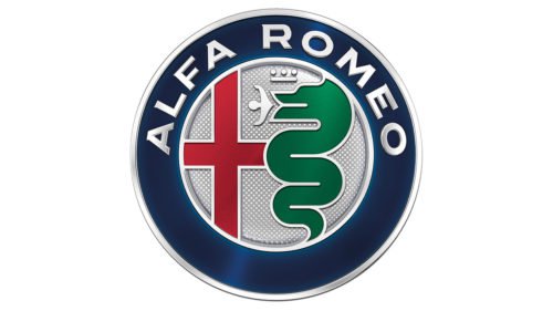
The Alfa Romeo logo has an eight-century history. The red cross on a white (or silver) background is the heraldic symbol of Italian Milan (which can be easily confirmed by the fans of local football clubs). The snake swallowing a child is a symbol of the aristocratic Milanese family Visconti – the oldest of living noble Milan family. The coat of arms with the image of a snake, as well as a white cape with a red cross, can be found in historical sources of the XIV century, referring to the first crusades.
By the way, the insecurity of the bloodthirsty snake symbol on the logo is compensated by the increased requirements for the safety of Alfa Romeo cars.
1. Pandora
The Danish jewelry house used a mythological figure to create the new brand. According to the ancient Greek mythology, Pandora was born by the order of the supreme deity Zeus as an extremely attractive woman, whose main task was to punish people for the misdeed of Prometheus (the hero stole fire from Olympus and brought it to the people and was crucified on a rock with compulsory and constant torture – every day the eagle came to peck the liver of the prisoner of the gods).
Seemingly restrained logo contains “only” the royal crown which caps the letter “O”. This is quite a fair characteristic – among the clients of the Pandora trading house are people of all social strata, including representatives of royal families. Besides, the jewelry from the Pandora brand really looks amazing.
Which secrets of logos seemed more interesting to you? Share your favorite riddles of the logos in the comments below.
Conclusion
In the article “Top 15 Secrets Hidden in Logos,” we uncover the artistry and hidden messages embedded within some of the world’s most famous logos. These symbols, at first glance, might seem straightforward, but they carry within them layers of meaning that speak volumes about the brands they represent.
For instance, the FedEx logo, designed by Lindon Leader, is celebrated for its clever use of negative space to form an arrow, symbolizing forward direction and efficiency. Similarly, the Toblerone logo pays homage to its origins with the silhouette of a bear hidden within a mountain, representing Bern, Switzerland, famously known as the “city of bears.” This clever use of background space invites viewers to look closer, revealing stories and values that these brands embody.
The Baskin Robbins logo features the number “31,” representing the flavors available, cleverly integrated into the letters “BR.” This not only highlights the variety offered by the ice cream giant but also uses color and form to create a visual pun that is both playful and memorable. Amazon’s logo goes beyond mere branding by incorporating a smile that connects the letters “a” and “z,” suggesting the vast range of products available from A to Z, while also creating a subliminal message of customer satisfaction.
The use of animals and nature in logos brings a touch of the natural world into the corporate sphere, such as the Pittsburgh Zoo & PPG’s logo, which cleverly uses negative space to depict a gorilla and a lion facing each other. The Bronx Zoo’s logo takes a similar approach, featuring giraffes and birds that form the iconic New York skyline, emphasizing the zoo’s connection to its urban environment.
Technology brands also embed meanings into their logos that reflect their industry and values. The Cisco logo represents an analog wave, a nod to the company’s roots in networking and digital technology, while the design of the Sony Vaio logo merges analog and digital technology, with the ‘VA’ representing an analog wave and the ‘IO’ depicting binary code, highlighting Sony’s role in the evolution of technological advancement.
Even in the food industry, logos carry hidden messages. The Chick-fil-A logo incorporates a chicken into the “C,” while Tostitos brings a social element into its branding, with two people dipping a tortilla chip into a bowl of salsa, represented by the “t”s and the dot of the “i” in its logo.
The logos of sports and cultural institutions also convey deeper meanings. Adidas, for example, uses three stripes not just for brand recognition but also to symbolize the mountain, representing the challenges athletes face and overcome. The London Symphony Orchestra’s logo appears as a simple acronym at first glance but upon closer inspection, reveals an abstract representation of an orchestra conductor, embodying the essence of music and performance.
In conclusion, these logos are not merely symbols of corporate identity but are rich with hidden meanings and stories. They invite viewers to discover the values, origins, and aspirations of the brands they represent, making the logos themselves as memorable as the products or services offered. From the clever use of negative space to the incorporation of elements that reflect a brand’s heritage or mission, these logos stand as testaments to the creativity and strategic thinking behind some of the world’s most recognized brands.


