

A crocodile is a dangerous animal, a predator, which has barely been good even in kids’ stories and cartoons. Although, many companies and sports clubs choose a crocodile as their mascot, or put its depiction as the primary logo. This is because this reptile has an unusual shape and a nice green color, which can make any brand stand out in the list of competitors.
Apart from its visual characteristics, the crocodile also symbolizes such strong qualities as wisdom and efficiency, this animal is also associated with stealth and power. A pretty good list of features, any strong company would like to obtain.
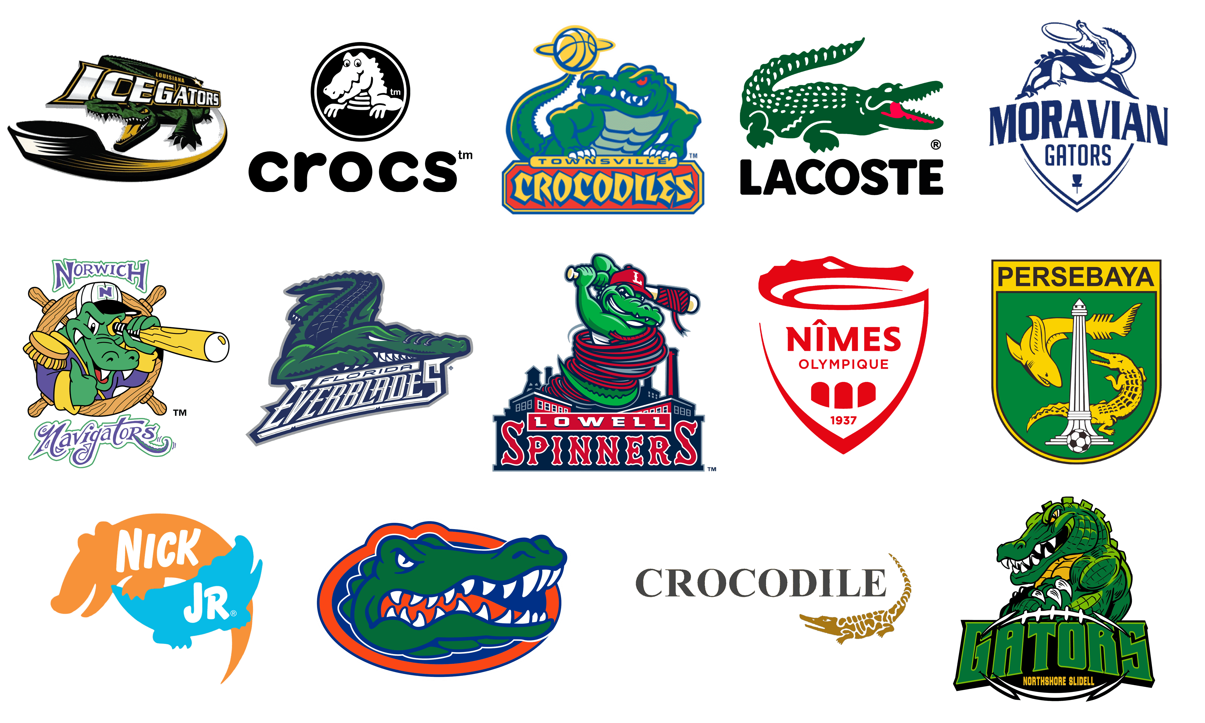
In our today’s list, we are going to have a closer look at the world’s most famous logos with a depiction of a crocodile on them. All names in the list are set in alphabetical order.
Crocodile Garments
![]()
Crocodile Garments is a large Chinese company, engaged in the production of textiles and clothing, established at the beginning of the 1950s. The logo of the company is composed of bold uppercase lettering in a fancy serif typeface. Written in solid gray, the inscription is balanced by an elegant stylized image of a crocodile, drawn in solid gold elements. The badge can be seen on a white or black background, and the mood of the logo changes dramatically depending on the chosen option.
Crocs
![]()
Crocs is a famous brand of footwear, which is known all over the globe for its colorful rubber mules and sandals. The brand uses a cool and friendly logo, composed of a graphical part and lowercase lettering under it. The Crocs emblem features a caricature of a crocodile, drawn in white against a solid black roundel in a double white and black outline. The animal has some horizontal stripes across its chest, supporting the stripes on the badge framing. As for the lettering, it is executed in an extra-bold rounded sans-serif, which elevates the kind and welcoming mood of the logo.
Florida Everblades
![]()
Florida Everblades is the name of a professional hockey club from Estero, which plays in the East Coast Hockey League. Despite the fact, that the club competes in the minor league, its visual identity could have beaten the badges of some NHL members. The Florida Everblades logo, executed in a green and blue color palette, boasts a sharp and modern image of an aggressive crocodile with white triangular teeth, placed above the white two-leveled lettering, set in a fancy typeface with sharpened elements.
Florida Gators
![]()
Florida Gators is the name of an athletic program from the University of Florida. The program consists of 21 men’s and women’s teams, competing in various sports disciplines. Crocodile is a pretty common animal in this state, so its image is widely used not only by brands and businesses but by more reputable organizations too. The logo of Florida Gators features a smooth and bright image of the crocodile’s head, drawn in green and outlined in blue, set on a solid red horizontally oriented oval. The reptile looks strong and dangerous with its mouth open, and white triangular teeth shown to everyone.
Lacoste
![]()
Lacoste is a famous brand of casual and sportswear, which has the most well-known logo with a crocodile of all ever created. The bold green reptile on the Lacoste badge is drawn horizontally in full length and facing to the right. The crocodile is set in solid green with small white dots all over the upper part of its body, and a bright red tongue coming out of its open mouth. The green and red emblem are placed above the bold black uppercase wordmark in a heavy geometric sans-serif typeface with the softened contours of the letters.
Louisiana IceGators
![]()
Louisiana IceGators are a professional hockey club from the United States, which was established in 2009 and today plays in the Southern Professional Hockey League. The logo of this club boasts a modern depiction of a crocodile, executed in the green, black, and yellow color palette, where yellow is used for the eyes and tongue of the reptile. The crocodile is placed under an enlarged gradient silver lettering in a bold black outline and is underlined by a wide black trace, arching from the hockey puck, drawn on the left part of the logo.
Lowell Spinners
![]()
Lowell Spinners is the name of a professional American baseball club, which was a member of the Minor League Baseball until 2020. The caricaturish alligator on the logo of this team was drawn with a baseball bat in its hands. The animal was standing in the middle of the badge, wearing a cap with the club’s identity, and wrapped with a red rope. The background of the logo boasted a red, blue, and white city landscape, underlined by two-leveled lettering in two different styles: the white extended “Lowell” in a sharp serif font written on a red rectangular, and a smooth wishbone-style “Spinners” in red capitals with a white outline, set against a blue background.
Moravian Gators
![]()
Moravian Gators is the name of a professional disc golf club from the Czech Republic, which has also chosen to use a dangerous and aggressive reptile as its mascot. The logo of the club looks very stylish and elegant, drawn in thin and smooth blue lines over a white background. The alligator is set on the top of the triangular crest with two-leveled lettering on it. The reptile is holding a disc in its mouth and looks pretty playful. As for the inscription, its upper part is slightly arched, set in solid blue capitals of a sharp and clean typeface, while the bottom line features a smaller size of the characters and thinner lines.
Nick Jr.
![]()
Nick Jr. is a famous tv-channel for kids, which is known all over the globe. The visual identity of the channel has different variations — the company likes using animals for its two-colored silhouette badge, and the crocodile is one of these animals. The orange silhouette of a parent crocodile is drawn above a smaller, kid’s, turquoise body. The bold sans-serif “Nick” in white is written across the orange crocodile, while the blue one features the “Jr” lettering in the same style and color. The logo looks very warm and friendly.
Nimes Olympique
![]()
Nimes Olympique is the name of a professional football club from France, which was established at the end of the 1930s, and has always had a crocodile as a part of its visual identity. The red and white logo of the club looks super chic and sophisticated. It featured a smooth triangular crest in a bold red outline, which to part is curved, making up an image of a crocodile’s head. Set in red; the reptile looks very elegant and powerful. As for the main part of the crest, it has a red inscription, written on it in two lines, and accompanied by three solid red arched with a small red “1937” datemark under it.
Northshore Gators
![]()
Northshore Gators is a professional indoor football team from Louisiana, United States. The alligator on their badge is drawn in a bright exaggerated style, with massive sharp elements. Executed in two shades of green, and yellow, the reptile has white triangular teeth and thin black lines all over its body, making up the leather structure. The image is placed above a heavy green logotype in a sharp serif font with voluminous massive letters set on a black background, which features a shape of a horizontally oriented rugby ball.
Norwich Navigators
![]()
Norwich Navigators is the name, which was used by the Connecticut Defenders, a professional baseball club, in the 1980s. The logo of the club featured a bright and delightful image with a green crocodile wearing a captain uniform and a baseball cap with the team’s identity on it. The sailor reptile was enclosed into a circular frame, stylized as a wooden steering wheel. The emblem was accompanied by the “Norwich” lettering in purple characters, set over a white background and outlined in green, placed above it, and the fancy cursive “Navigators” with the elongated tail of the “R” drawn as an octopus tentacle, at the bottom.
Persebaya
![]()
Persebaya is the name of a professional football club from Indonesia, which was established in 1927. The club has a very bright and elegant visual identity, which is based on a solid green crest with a rounded bottom part. The body of the crest is decorated by a tall white column, with a yellow crocodile and a sharp arched around it. The small black-and-white football is placed in the bottom part of the badge, while the top part of accompanied by a solid yellow banner with the name of the club written on it in bold black sans-serif capitals.
Townsville Crocodiles
![]()
Townsville Crocodiles is the name of a former basketball club from Australia, which existed from 1993 to 2016. The club used a bright stylized image of a crocodile as the main part of its visual identity. The reptile was drawn in green and blue above the solid red banner with the yellow logotype on it. The crocodile on this badge was spinning a yellow basketball on the end of its tail, has its eyes colored red, and looked very aggressive, evoking a sense of fighting spirit and determination. Supporting the yellow ball and lettering, the reptile was also decorated with some smooth yellow details.
Conclusion
In the realm of iconic branding, the crocodile logo not only epitomizes Lacoste’s storied heritage but also serves as a beacon for the effective use of symbolism in the fashion industry. While Lacoste stands as a towering example with its roots deeply embedded in the elegance of tennis culture, courtesy of René Lacoste’s innovation and the nickname “Le Crocodile,” it’s essential to appreciate how this emblem of tenacity and luxury has influenced and paralleled other brands in leveraging animal symbols to convey their identities and values.
Beyond the green courts of Wimbledon and the clay of the French Open, where Lacoste’s crocodile has become a symbol of athletic elegance and luxury, other brands have also harnessed the power of animal emblems to communicate qualities such as strength, freedom, and sophistication. The use of the crocodile logo by Lacoste, designed by Robert George and elegantly positioned on the pocket of polo shirts, blazers, and accessories, underscores a narrative of tenacity and perseverance. This narrative echoes through the fashion industry, where animal logos are often employed to project an image of power, freedom, or luxury to the consumer.
Lacoste’s commitment to conservation, highlighted by its recent redesigns and initiatives in Hong Kong focusing on the protection of endangered species like Sumatran tigers, sets a precedent for brand responsibility towards environmental conservation. This pivot not only enhances the brand’s image but also aligns with global efforts for the conservation of nature, showcasing how brands can lead by example in promoting awareness and action towards the preservation of endangered animals.
The influence of René Lacoste’s vision extends beyond the tennis court and into the broader landscape of luxury fashion, where the consistency of the crocodile logo and the sans-serif font of the Lacoste logo have become benchmarks for brand identity. Other brands looking to carve their niche in the competitive market can draw inspiration from Lacoste’s blend of tradition and innovation, its dedication to quality, and its evolving commitment to environmental stewardship.
As we celebrate the legacy of the crocodile logo and its indelible mark on the fashion industry, it’s clear that the story is not just about Lacoste but about the power of branding and the role it plays in connecting with consumers, conveying brand values, and standing out in a crowded marketplace. The journey of the crocodile logo from a simple bet to an international symbol of luxury and conservation is a testament to the enduring power of a well-crafted emblem and the vision of its founder, inspiring brands across the globe to pursue excellence and responsibility in equal measure.


