FC Schalke 04 (full name – Fußballclub Gelsenkirchen-Schalke 04 e. V.) is a football and multi-sports club playing in the Bundesliga (Germany).
Meaning and history
In 2022, FC Schalke 04, one of the largest German football clubs, started playing in the Bundesliga, the top-tier football league of Germany. Before that, the club has been a part of the second-tier league, 2. Bundesliga.
The name of the football club is a reflection of its heritage, where “Schalke” stands for the area of Gelsenkirchen, the city the team was founded in, and “04” — for 1904, the year of the club’s establishment.
What is FC Schalke 04?
FC Schalke 04, more often abbreviated as S04, is the name of a professional football club from Germany, which was established in 1904, hence the date mark in the name of the club. Today FC Schalke 04 plays in Bundesliga, the top-tier football league in Germany.
1924 – 1945
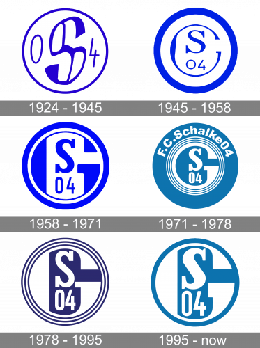
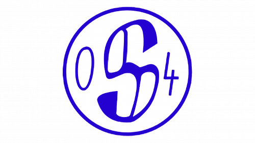
The original badge, designed for the FC Schalke 04 in 1924, stayed untouched for more than twenty years. It was a solid white roundel in a bright blue outline with an enlarged stylized letter “S” as the main element on the logo, and the “04” datemark, placed on the sides from the capital “S”.
1945 – 1958
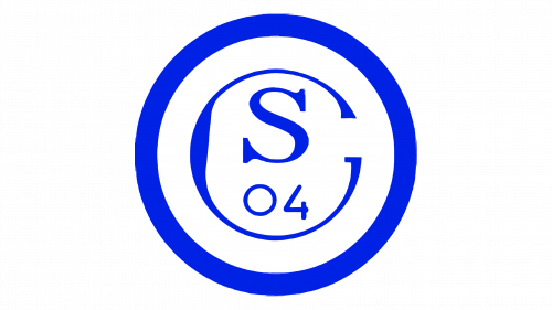
The redesign of 1945 kept the original color palette and the circular shape of the badge but refined the composition of the main medallion’s part. The new badge features a more classic capital “S” inscribed into an enlarged capital “C” and underlined by a “04” datemark.
1958 – 1971
In 1958 the contours of the Schalke 04 football club were strengthened and cleaned up, while the badge itself gained some solid blue elements, creating an abstract geometric pattern, and a unique look of the circular badge.
1971 – 1978
This version of the FC Schalke 04 logo already has many of the features present in the current one. We can see the “SC” abbreviation paired with “04” (the year when the club was founded, 1904). The palette combining white with a distinctive shade of blue is also familiar.
The older logo is, however, more cluttered. There are several thin rings in white and blue, as well as the lettering “F.C. Schalke04” in small glyphs.
1978 – 1995
The design team simplified the emblem by just removing everything outside the third blue ring. As a result, the logo now draws your attention to its central part, which becomes more prominent.
1995 – Today
The club has used the same approach to make the design even simpler. Now, they have cut everything beyond the first blue ring. As a result, the ring encircles the central part of the emblem.
While there have been no more changes in the structure of the FC Schalke 04 logo, the designers slightly modified the shape of the glyphs inside.


