Cruz Azul is the name of a professional football club from Mexico City, which was established in 1927, and today plays in the highest-ranked football association in the country, Liga MX, taking the central lines in its rating. The club is owned by Cemento Cruz Azul and has Jaime Ordiales as its president.
Meaning and history
Cruz Azul is one of the oldest and most awarded professional clubs in the history of Mexican football. Today, Cruz Azul is the 2nd most successful team in the history of the CONCACAF Champions League, the most reputable football association in North America. But the Mexican club showed itself good in the South American competitions too.
The team from Mexico City always has its place in the top 100 best football clubs in the world, which is quite impressive, as football has never been the strongest point in Mexico.
What is Cruz Azul?
Cruz Azul is a professional football team, established in Mexico City in the 1920s. Today Cruz Azul is one of the top 100 strongest football clubs in the world, and one of the most titled in North America.
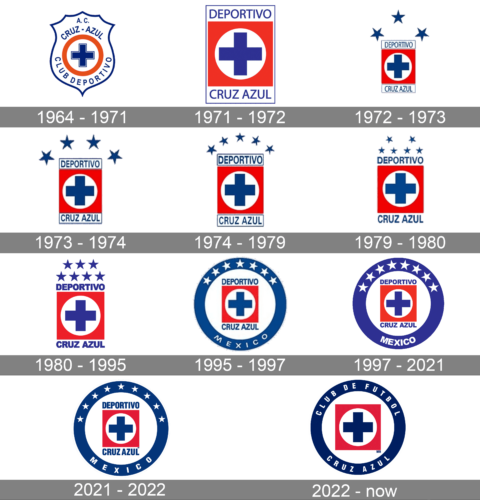
In terms of visual identity, the football club from Mexico City has had quite many redesigns of the logo throughout the years, but all of them are based on the blue cross as the central element and feature the same color palette, so those were mostly minor refinements.
1964 – 1971
The Cruz Azul logo, designed in 1964, features a smooth and classy crest outline with five peaks on top, and widely arched sides. Inside the white shield, there was a solid blue cross, enclosed into a thick red circle, and surrounded by the blue uppercase “A.C. Cruz Azul” inscription on top, and the “Club Deportivo” at the bottom.
1971 – 1972
The redesign of 1971 has made the Cruz Azul logo more geometric and bright. The elegant crest outline was removed, and now the badge featured a vertically oriented rectangular shape, with the solid red background of the main part, the white circle with the bold blue cross in the center, and two white rectangles, outlined in blue, set above and under the main part. Inside the top rectangle, the blue uppercase “Deportivo” was written in sans-serif, while the “Cruz Azul” was set on the bottom one.
1972 – 1973
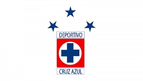
In 1972 the logo got some additions — those were three large five-pointed stars in solid blue, which were arched above the main badge. The red rectangular banner got smaller, so now the three stars, representing the wins of the football club, became the most visible elements of the badge. With this badge, the club played for one season.
1973 – 1974
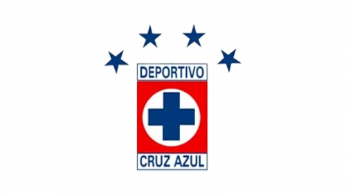
The fourth star was added above the red rectangle in 1973. In order to balance the look of the badge, the stars got smaller sizes, and now the whole composition of the logo got more harmonious and logical. All other elements of the badge got their contours cleaned and refined, and the shade of blue of the Cruz Azul logo became a bit brighter.
1974 – 1979
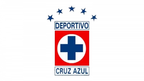
Another win and another star were added to the Cruz Azul logo in 1974. Now there were five small five-pointed stars, arched above the same red rectangular badge, and slightly going out of its borders to the sides. All the key elements remained the same, and the color palette wasn’t touched.
1979 – 1980
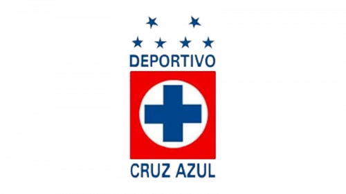
The redesign of 1979 slightly reorganized the structure of the Cruz Azul logo, as it became necessary after the sixth star was added to the top of the badge, and the club was not going to stop. Now the six stars were set in two groups of three, forming two triangles above the main logo. Another change of that period was in removing the blue rectangular frames of both parts of the inscription.
1980 – 1995
After another won championship, the two triangular structures were accompanied by another star placed between the packs, which made it arched again. Now four five-pointed stars were set in one straight horizontal line along the upper border of the rectangle, and three were arched above it.
1995 – 1997
The redesign of 1995 has finally changed the composition of the Cruz Azul logo, leaving the club more space for the stars, and celebrating its titles. The red rectangle with the white circle and a blue cross inside, enclosed between two parallel wordmarks was now set on a white background of a rounded badge, with thick blue framing. The upper part of the framing comprised seven solid five-pointed stars in white, while the white “Mexico” lettering in the uppercase of a lightweight extended sans-serif typeface was written along the bottom part of the circular frame.
1997 – 2021
The shade of blue of the Cruz Azul logo became lighter, while the circular frame — was thicker. The eighth white star was added to the top part of the frame, and the “Mexico” inscription has changed its font to a bolder and more traditional one. The logo stayed untouched for two decades and became instantly recognizable all over the globe.
2021 – 2022
In 2021 the Cruz Azul football club badge was redesigned again. Not only the 9th star was added to the framing of the badge, but also the color palette was enhanced, gaining deeper shades of both blue and red. The “Mexico” lettering is now executed in a modern and bold sans-serif with a lot of space between the narrowed letters. The white outline was added to the external perimeter of the badge, which made the logo look brighter on the dark jerseys of the players.
2022 – now
The redesign of 2022 has removed the white stars from the Cruz Azul primary badge and reorganized the composition, placing all the lettering around the blue circular frame of the badge, and keeping the central part clean of any text, with just the blue cross on a white roundel and a solid red square. The new inscription is written in bold white capitals of a modern sans-serif font, with very simple and strict contours, evoking a sense of professionalism and reliability.
Font and color
The “Deportivo Cruz Azul” inscription from the primary badge of the professional football club from Mexico City, is set in a heavily condensed sans-serif typeface. Which looks pretty close to such fonts as Railroad Gothic Pro and Placard Std Bold Condensed.
As for the color palette of the Cruz Azul badge, it has blue as a primary color, as the “Azul” in the name of the club translates from Spanish as “Blue”. Red is here to create the iconic tricolor, and repent the passion and power of the team, making the badge eye-catching and memorable.


