Established in Port St. Lucie, Florida, in 1988, the franchise is currently part of the Florida State League. It’s the Class A-Advanced affiliate of the New York Mets.
Meaning and history
While the logo of the St. Lucie Mets has been partly inspired by that of the New York Mets, it’s unique and independent as it tells its own visual “story.”
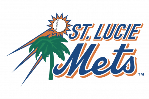
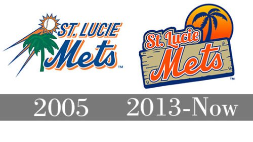
2005 — 2012
 In its core, the old St. Lucie Mets logo was very close to the current one. Happy holiday mood was created by a green palm tree and the sun, while the word “Mets” on the forefront was given in the same script as on the logo of the parent team.
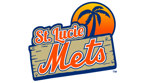
2013 — Today
The palm, the sun, and the recognizable script are still here, yet they are now given in a different style. The sun has grown larger and now resembles a baseball. Both the sun and the palm tree have moved to the right, while the text now looks like a road sign. The combination of orange and dark blue was borrowed from the New York Mets’ logo.


