 Springfield Thunderbirds Logo PNG
Based in Springfield, Massachusetts, the ice hockey team Springfield Thunderbirds is part of the AHL and the affiliate of Florida Panthers. It was formed out of the Portland Pirates franchise not long before the 2016/17 season.
Meaning and history
The Springfield Thunderbirds are an American professional ice hockey team based in Springfield, Massachusetts. Founded in 2016, the team was established by Paul Picknelly, a prominent local businessman, marking a new chapter in the region’s rich hockey history. The Thunderbirds serve as the American Hockey League (AHL) affiliate of the National Hockey League’s (NHL) St. Louis Blues.
From their inception, the Springfield Thunderbirds have strived to build a strong presence in the AHL. Their journey in the league has been marked by significant achievements and milestones. Notably, the team has garnered attention for their engaging style of play and dedicated fanbase. One of their remarkable achievements includes reaching the playoffs in the 2020-2021 season, showcasing their competitive spirit and skill. The team’s success on the ice has been complemented by their community involvement, earning them a reputable position in the league.
As of now, the Springfield Thunderbirds continue to thrive in the AHL. They maintain a strong roster of players, many of whom are seen as potential future stars in the NHL. The team’s current position reflects a blend of promising talent and seasoned experience, positioning them as a notable force in the league. Their ongoing efforts to engage with the community and enhance the game experience for fans underscore their commitment to not just hockey, but to the spirit of Springfield as well.
What is Springfield Thunderbirds?
The Springfield Thunderbirds are an American professional ice hockey team, affiliated with the NHL’s St. Louis Blues and competing in the AHL. They are known for their dynamic play and community engagement.
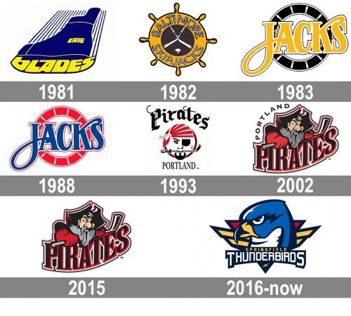
1981 — 1982
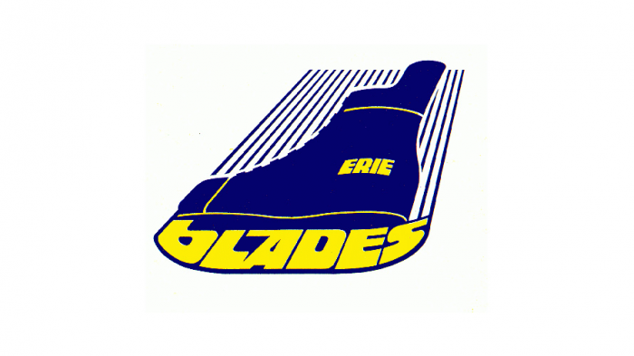
The logo of 1981 introduced the original name of the hockey club — the Erie Blades. And it was a pretty direct graphical interpretation of the naming. The solid blue ice skates with the blade are replaced by a stylized yellow “Blades” inscription in a custom sans-serif typeface with smooth rounded letters. The “Erie” part of the name was placed right on the skate. The whole image was accompanied by several thin blue vertical lines coming up from the skate and representing speed and motion. This logo only stayed with the club for a few months.
1982 — 1983
The redesign of 1982 introduced a completely different badge for a completely different name of the club. It was a wooden ship steering wheel in an orange and brown color palette with the “Baltimore Skipjacks” lettering written around its perimeter, stylized as if it was written with a rope. Two crossed white hockey sticks and a hockey puck was drawn in the center of the badge, on a dark brown background.
1983 — 1988
The logo was redrawn again in 1983, and this time it was a badge, that stayed with the club for longer than a few months. The new concept was built on the same theme as the previous logo, but it was executed in a more minimalist and modern manner. The steering wheel was stylized in black and white, and the wordmark was shortened to just “Jacks”, being written in bright yellow uppercase letters in an elegant serif typeface with the tail of the “J” elongated and curved.
1988 — 1993
In 1988 the color palette of the logo was switched and the black circular background became red, with all the steering wheel outlined also turning red. As for the main hero of the badge, the wordmark, it kept the typeface and size, but also switched the color scheme and now was written in a calm yet the intense shade of blue, outlined in medium-thick white and thin red. In this variation, the badge looked brighter and evoked a sense of style and passion.
1993 — 2000
The Portland Pirates era started for the hockey club in 1993. Though it lasted until 2016, the logo was redesigned just twice during this period. So the first version depicted a stylized portrait of a pirate placed on a white circle with a red and black outline. The whole drawing was executed in this traditional and elegant color palette, as well as the lettering. The “Pirates” in gothic cursive was arched above the circular badge, written in extra-bold black lines, while the “Portland” part of the inscription was written in a straight line under the portrait, executed in a slightly narrowed traditional and elegant serif font, also in black.
2002 — 2015
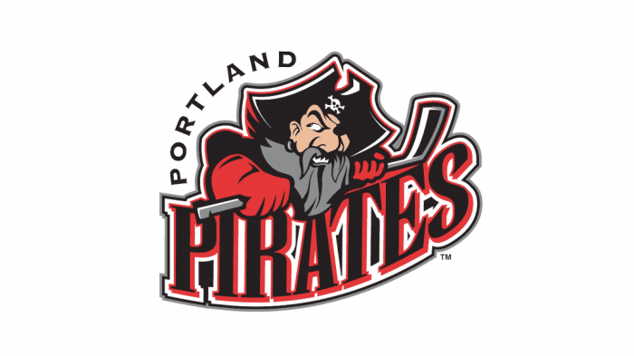
The logo was redrawn in 2002. The young pirate was replaced by the old one — with a long gray beard and one eye lacking. The man was wearing a black jacket and red gloves and was carrying a gray and black hockey stick in his hands. The enlarged “Pirates” wordmark was written under the image in black and red uppercase letters executed in a bold and classy serif font, and outlines in white and black, with the whole badge. The “Portland” was arched above the upper left part of the logo, in black capital letters of a simple yet solid sans-serif typeface.
2015 — 2016
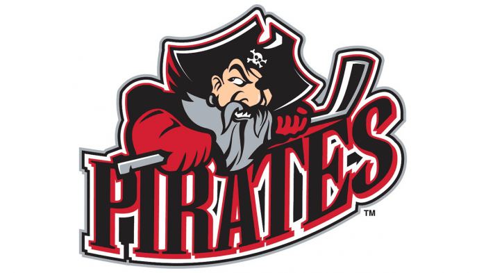
The redesign of 2015 kept the graphical image of the previous badge, enlarged all the elements, and removed the “Portland” part of the lettering from the logo. The contours and color palette of the insignia remained untouched though due to the pirate and the wordmark getting larger, some of the elements became more visible, and the logo in general — more eye-catching.
2016 — Today
The primary Springfield Thunderbirds logo features the head of a bird. The head itself is blue, the beak is golden, while the part of the bird’s neck that can be seen under the beak is white. The two-lined wordmark in white and yellow can be seen below. The logo was designed by Matthew McElroy.
Colors
The color scheme is bright and clear, with its saturated shades of red, navy blue, sky blue, white, and gold.


