The AHL team the Providence Bruins is the primary development team for the NHL’s Boston Bruins.
Meaning and history
The Providence Bruins, an American professional ice hockey team based in Providence, Rhode Island, were founded by Frank DuRoss, Joseph Cavanagh, and Herbert R. McCormick in 1992. This team, affiliated with the Boston Bruins of the National Hockey League (NHL), competes in the American Hockey League (AHL), representing a crucial step in the development of players for the NHL. Over the years, the Providence Bruins have garnered significant achievements, including winning the Calder Cup in the 1998-1999 season, which is the AHL’s most prestigious award. Furthermore, they have consistently provided a platform for young players to showcase and develop their skills, many of whom have progressed to successful careers in the NHL.
In recent years, the Providence Bruins have continued to be a strong presence in the AHL. They are known for their competitive spirit and their commitment to developing hockey talent. As of now, they maintain a significant role in the AHL, not just as a competitive team, but also as a vital contributor to the sport’s growth at the professional level. Their current position reflects both a proud history and a continued promise for the future, as they persist in fostering new talents and contributing significantly to the hockey community.
What is Providence Bruins?
Providence Bruins is an American professional ice hockey team, affiliated with the NHL’s Boston Bruins. Based in Rhode Island, they compete in the AHL, developing players for the NHL.
1988 – 1992

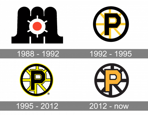
The initial logo of Providence Bruins was designed in 1988 and stayed with the club for a little less than four years. It was an abstract and very modern image, which could easily be imagined as a logo of a sports fashion brand or a high-end auto- or yachts-maker. It was a black background formed by three arched segments, with an image of a white steering wheel with a solid red dot in the middle. No lettering was added to the badge.
1992 – 1995
Starting from its very first version introduced in 1992, the Providence Bruins logo has always been based on a large “P” inside a wheel. In the original emblem, the “P” was black, the spokes of the wheel were yellow, while the outer circle was black.
1995 – 2012
The 1995 update provided the yellow spokes with a black outline. Eventually, the team opted for a symbol where the “P” was yellow with a black outline, while the wheel was solid black.
2012 – Today
The gold “P” stands out when placed over the black wheel, while the white background makes the contrast even more dramatic.


