Smirnoff is a brand of vodka, founded in 1860s in Russia by Pyotr Smirnov. In 1886 Smirnov received the Tsar’s special designation as a Purveyor of the Imperial Court. The brand is owned by Diageo Group since 1997.
Meaning and history
When the Bolsheviks took over, the distilleries were shut down and Pyotr’s son Vladimir ran to Paris, where he revived the vodka brand under the name “Smirnoff”.
The Smirnoff logo design was born from a desire to reflect the brands amazing history, whilst also including a nod to the contemporary spirit and vibrancy.
The design, completed by Design Bridge bureau, includes an amended logotype with bolder lettering and larger ‘eyebrow’ shape that the logo sits on.
1860 – 1940

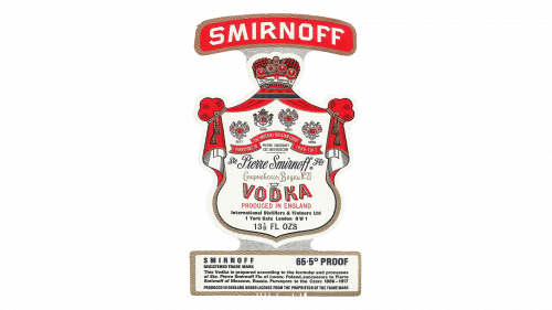
The very first emblem for Smirnoff, designed in 1869, was very ornate and complicated. The badge was composed of an enlarged white crest in a double gold outline and red velvet “curtains” on its upper part, a golden crown, and a smooth arched banner. The banner, colored in red and outlined in gold, featured bold white lettering on it and was the main brand’s signifier.
1940 – 1978
The redesign of 1940 simplified the Smirnoff logo, removing the massive crest and keeping just an arched red banner. The lettering on it was refined and gained a thin black shadow, which made the sans-serif capitals look more stable and powerful. The gold outline switched its shade to a calmer and muted one, which surprisingly turned the banner into a more chic and luxurious one.
1978 – 2003

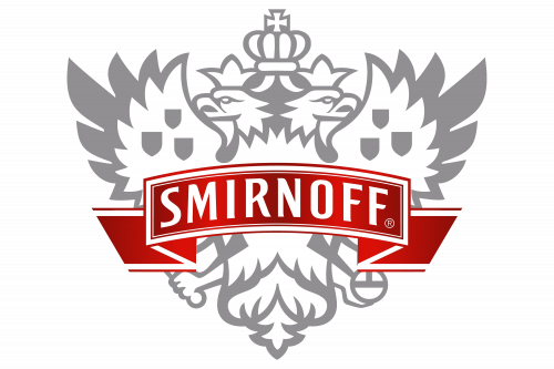
The concept of the Smirnoff logo was changed in 1978. The red banner in a gold outline turned into an arched red ribbon with white framing. The square sans-serif inscription became smooth and elegant, and the main change of the 1970s — a heraldic eagle with two heads and a crown was drawn in light gray and placed behind the ribbon, becoming the main element of the brand’s visual identity.
2003 – 2016
In 2001 the symbol of the Empire, the eagle, was redrawn in a sharp and modern style, getting its body plain and silver, and the co tours — straight and clean. The ribbon with the lettering was also refined, changing its main color to a darker one, and getting its white framing a bit wider. As for the wordmark, it kept the typeface of the previous version, and its smooth soft lines perfectly harmonize the sharp angles of the eagle.
2015 – Today
Color and font
In its logo Smirnoff uses a custom typeface, based on a Humanist sans serif font. The lettering is bold and elegant, yet looks very modern.
The main Smirnoff’s color scheme includes red and silver. The red color represents the strength and the old-fashion banner, the strong and old story of Smirnoff, its old tradition and everlasting experience. The silver color is also a symbol of purity.
Smirnoff uses different colors depending of the taste, as the brand produces 31 variations of vodka. For example, the dominant color will be red if you buy a Smirnoff n°21 and black if you buy a Smirnoff n°55. For different occasions, the design of the packaging can change, but globally, the bottle stays the same for all basic and flavored vodkas.
The Emblem
The Smirnoff logo has a two-headed crowned eagle and a red banner written Smirnoff in capital letters. It is a nice mix of color, combined with a modern geometry design of the eagle’s silhouette. The flying eagle means the movement, vodka that goes higher, that is the best. The crown is here to symbolize the quality of the vodka
The double-headed eagle is the symbol most strongly associated with Russia. The first known appearance of the double-headed eagle in Russia dates to the late 15th century. In 1992 the Russian Federation restored it to the state coat of arms. Official and personal coats of arms, stamps, coins, military flags and banners have all used the symbol.
The most widespread opinion about the double-headed eagle is that the two heads face East and West, which symbolizes the geographic position of Russia. This symbol is seen as an allegory sometimes for unity, and sometimes for absolute monarchy.


