

![]()
Rich Logo PNG
Eye-catching and energetic, the logo of the Russian juice brand Rich also conveys the “natural” idea, which is essential for the product’s sales.
Meaning and history
![]()
Rich is the Coca-Cola-owned brand of juices and fruit drinks, which was established in Russia at the beginning of the 2000s. For the first three years of its history, the brand was owned by the Russian Multon, and already in 2005, it was noticed by the international giant.
The Rich juices are very popular on the local market and have always been, and with the acquisition of the brand by the Coca-Cola Group nothing has changed, and the juices and fruit deserts of the brand are still sold mainly in Russia.
What is Rich?
Rich is the name of a Russian brand of fruit juices, which was established in 2002, and today is owned by the American Coca-Cola Company. The range of the bran’s products includes juices, fruit drinks, and fruit-based desserts, such as purees.
Old
![]()
Their old logo uses the name wordmark written in black, and the same thing written in smaller white letters inside a red oval. The oval is directly above the wordmark. The font used in both is a basic serif with slightly abrupt corners.
Before 2020
Rich is one of the core brands of the Russian company CSJC Multon. The company was established in 1995. In 2005, Multon joined the Coca-Cola System. Ever since it has represented the juice business of Coca-Cola Corporation in Russia
![]()
2020 – now
![]()
The redesign of 2020 has simplified the Rich logo and made it look more stable and professional. The new concept comprises a bold and elegant serif logotype in the title case, executed in a calm and dark shade of blue. The logotype has no graphical additions, and this is the first time in the brand’s history that it doesn’t use its solid red emblem with the white lettering on it.
Emblem
The Rich logo consists of the wordmark inside a red shape.
The wordmark features a classic type with a unique touch. The proportions and overall shape of the letters are traditional. You can see elegantly rounded serifs and a combination of slightly bolder and lighter strokes. The oval above the “i” is one of the distinctive features. Another one is the soft curve on the diagonal “leg” of the “R.” It conveys the “natural” theme in a subtle way.
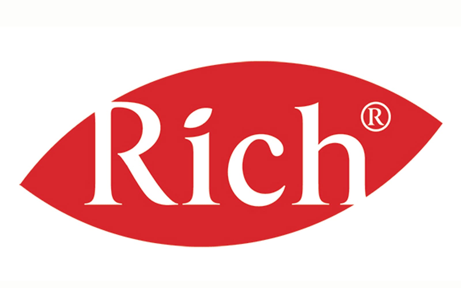
This theme is supported by the red leaf shape, into which the writing is placed. However, the leaf, which has become a cliché for “natural” in logo design, is not too obvious in the Rich logo – the visual metaphor would have been more obvious (and generic) if the color had been green.
The leaf is slightly tilted to create an upward, positive dynamics.
Font and color
The clean and elegant title case lettering from the primary Rich badge is executed in a bold serif typeface with thick bars, arched lines, and elongated thin serifs, which add sharpness and uniqueness to the inscription. The closest fonts to the one, used in the Rich insignia, are, probably, Carot Display Medium, Kaczun Oldstyle Bold, or Albra Medium, but with some delicate modifications.
As for the color palette of the Rich visual identity, it is set in a deep and strict shade of blue, which evokes a sense of precision and excellence, looking a bit dramatic, and making the brand stand out in the list of its compatriots. This shade of blue is usually associated with creativity, wisdom, and imagination.


