Grant’s is the Scottish brand of whiskey, which was established in the 1880s and named after its founder. Today it is still owned by the family and is considered to be one of the best-selling whiskey brands across the globe.
Meaning and history
The visual identity of the family-owned distillery is simple yet elegant and confident. There have never been many changes made to Grant’s logo, and once the brand started using its iconic symbol at the beginning of the 1980s, it has never left the visual identity again.
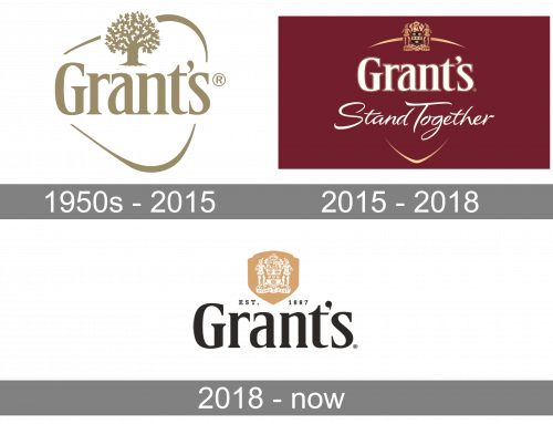
1950s – 2015
The famous Grant’s bottle is probably as recognizable as its logo. It was created in the middle of the 1950s by a German designer and became an inevitable symbol of the distillery. The triangular shape of the bottle inspired the Grant family to create a new logo, so the family crest was put on the bottle, along with the year of establishment indication.
The Grant’s logo today has two versions — the one with the crest, and with the oak tree. The wordmark is being a star on both and executed in one and the same typeface — an elegant serif font, the one that is close to Alter Headletter or Manchester typefaces. The traditional old-style letters are slightly narrowed but look perfectly balanced due to the thickness of the lines and delicacy of the serifs.
As for the graphical parts of the logo — the Grants coat of arms is usually executed in gold and burgundy, a very “royal” and luxury combination, while the image of the tree uses gold and is usually placed on a light background — white or pale yellow. Another difference between the two Grant’s logos is framing, as the Tree version is enclosed in a triangular outline with rounded angles, repeating the shape of the iconic bottle.
The Grant’s visual identity is a brilliant example of traditional elegance, not overloaded by details, but representing the brand’s history and main values. The calm yet classy color palette, consisting of gold, white, and burgundy, reflects the high quality of the product and the strong link of the brand to its roots.
2015 – 2018
The updated version uses a maroon rectangle as background. The brand’s wordmark is put onto its top half, while the bottom section is occupied by the motto – ‘Stand Together’. The other elements include two curved golden strokes that look like an unfinished outline of a shield, as well as the Grant family crest above.
The letters in this one are mostly white with some golden outlining. The font used in the main wordmark is the same as before, although the motto employs a hand-written style.
2018 – Today
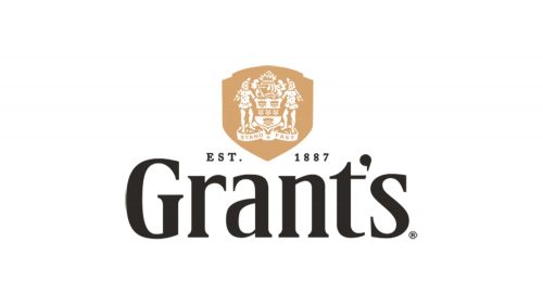
In 2018, it was reduced to just the black wordmark (exactly as it was), the family crest right above (colored white and put into a golden badge figure), and the year of founding written in small black letters between the two main parts.


