Silent Hill is a media franchise inspired by the literary genre of psychological horror. The key part of the franchise is a namesake series of survival horror video games, which was created by video game director and designer Keiichiro Toyama, developed and published by Konami.
Meaning and history
In 1999, the series was started by a video game, where Harry Manson was looking for his adopted daughter, who had disappeared in the city of Silent Hill.
1999 – 2001

Both the original Silent Hill logo and the following one work to conjure up the same emotions, yet they use different approaches to reach the goal.
The original logo looks like a very old road sign, where some of the letters have already almost disappeared. This effect is specifically noticeable in the initial and final letters, which are very thin. Even the glyphs that are still rather bold aren’t solid. Instead, they have multiple scratches.
In other words, the wordmark looks like a road sign that has seen better days. What had happened to this city and its inhabitants? Where are they? These questions inevitably come to mind, and you’re left wanting more information.
2003 – 2010
2012

Here, letters also have a different weight. Yet, they don’t look old – there aren’t any scratches or ragged borders of any sort.
Instead, the wordmark represents a bizarre (if not sinister) combination of “normal” glyphs with “dangerous” ones. What we mean by “dangerous” is the addition of all sorts of sharp elements (note the “L,” the “E,” and the “I,” for instance). The “T” bears an uncanny resemblance to the hammer. Even the glyphs we’ve called “normal” (the “L’s,” or the “N,” for example, have sharpened elements).
2022 – Today
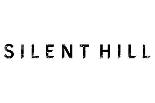
The Silent Hill logo redesign, held in 2022, has introduced a clean minimalistic badge, which looks pretty much the same as the original logo, designed in 1999, but more balanced and confident. The new concept features a bold uppercase inscription in a modern font with the surface of the letters slightly erased. The black and white color palette makes this badge look strong and confident, and at the same time evokes a sense of mystery and danger, pointing to the plot of the game and its essence.
Font

As the Silent Hill logo doesn’t include a pictorial part, its typography plays a crucial role. The letters haven’t been taken from an existing font but were drawn specifically for the purpose.
Colors
The default color scheme for the existing wordmark is black and white. It can be adjusted to fit any visual context, no matter whether the background is white or black.


