THQ is the name of a former entertainment company, which was established in the United States in 1990. For more than twenty years of its existence (the company ceased all operations in 2013), THQ has released more than a dozen of super-popular video games, based on such franchises as Sponge Bob and Bratz.
Meaning and history
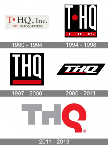
The visual identity of the video games brand has had several incarnations throughout the years of the label’s existence. The very first version was created while the name of the company had a dot between the “T” and the “HQ” parts, so was the second one. The new era of the THQ visual identity started with the simplification of the name, in 1997.
1990 – 1994
The initial THQ logo was composed of a red and black inscription in the uppercase, with the elegant serif “T”, followed by a thick solid dot placed in the middle of the line, executed in red, and the “HQ” in the same typeface, drawn in black. There were several versions of this logo — sometimes it was complemented by the “Software” inscription on the right, in other cases, the “Software” was used as a tagline. The logotype could be placed on a white or gradient blue background, but always stayed elegant and recognizable.
1994 – 1998
The redesign of 1994 modernized and strengthened the THQ logo, keeping the initial red, black and white color palette, but completely changing the style and contours of the letters. Now it was a white narrowed sans-serif inscription with a massive red dot in it. The elements were placed on a solid black square and had a red rectangular banner underlining it. The white “Inc.” in an extended sans-serif was written over the banner.
1997 – 2000
The dot was removed from the company’s name and logo in 1997. For the first three years, THQ kept using the concept, designed in 1994, just without the red dot and white “Inc” lettering. All the other elements, including the red banner, which was now plain, remained in their places.
2000 – 2011
The redesign of 2000 made the previous version of the logo more powerful and en-ergetic, by keeping the strong red, black and white color palette, yet redrawing the lettering. Now the white inscription was executed in a custom slanted typeface with thick lines, rounded angles, and some smooth cuts on the contours of the letters. The thick rectangular underline turned into a red line, placed under the first two letters of the company’s name, and finishing near the tail of the “Q”.
2011 – 2013
The last logo, created for THQ, featured a completely different design and a new color scheme. It was a bold custom inscription with the first two letters in light gray and the “Q” in red. While the “T” was executed in strict traditional lines, the “H” has the upper part of its left vertical bar cut out, and the “Q” was drawn in one smooth line, resembling a mirrored question mark, but without a dot.


