Maruti Suzuki is the name of the leading automaking company in India; which was established at the beginning of the 1970s and merged with Suzuki in 1981. Maruti Suzuki produces the most purchased cars in India and exports its vehicles across the globe.
Meaning and history
Maruti Suzuki is a brand that has held a leading position in the domestic Indian market for many years. From its inception in the 1980s to the present day, the manufacturer has been steadily improving its products, both by creating entirely local designs and by collaborating with the world’s leading corporations.
Today Maruti products in India are represented by more than fifteen models of modern quality cars, and most of the models are being exported to other countries.
The Maruti Suzuki cars are preferred by more than half of India’s residents. But in addition, cars are also successfully sold in the foreign market – Maruti Suzuki exports its products to eastern countries, Africa, Latin America, and even Europe.
In addition to extremely low prices, Maruti Suzuki cars attract customers with decent quality, a modern level of comfort and safety, and good service.
Indian automobile company Maruti Udyog Ltd is the largest in India, focusing on The plant that started operating in 1973 in the vicinity of the Indian city of New Delhi.
Maruti Suzuki is one of the largest car manufacturers in South Asia. At the moment Suzuki owns the controlling stake in the Indian company. In 2008, it was a budget Indian manufacturer that helped Suzuki avoid bankruptcy.
What is Maruti Suzuki?
Maruti Suzuki is the largest Indian automobile manufacturer, which was established in 1973, and merged with Suzuki at the beginning of the 1980s. The company is specialized in the production of low-budget vehicles based on Suzuki models.
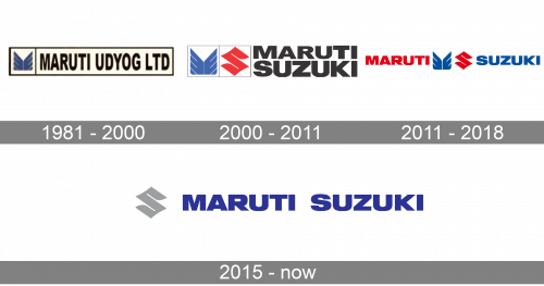
As for the visual identity, the logo of Maruti Suzuki today is a graphical representation of the automaker’s affiliation to the Japanese company, but it has not always been like that. The initial badges were designed with their inspirational features, which high have stayed with the brand for a couple of decades.
1981 – 2000
The original Maruti Suzuki logo featured a combination of a geometric graphical emblem in dark blue and lightweight uppercase lettering in black, set under it. The emblem depicted two stylized wings, which formed a shape, repeating a contour of a capital letter “M”. As for the next part of the badge, it was set in simple eyes clean sans-serif typeface.
2000 – 2011
The redesign of 2000 has added the corporate Suzuki logo to the Maruti badge, making it look more professional and recognizable. The blue-winged “M” was now drawn against a white background, enclosed into a black square frame and placed on the left from the white square of the same size, and with the same black outline, but in its center was another symbol: the solid red “S” in the recognizable Suzuki style. As for the lettering, it was also composed of two parts now, with both names written in bold black capitals one above another.
2011 – 2018
In 2011 all black elements were removed from the Maruti Suzuki logo, and now it was all blue and red, drawn against a plain white background, with no framing. Sometimes the bright logo got accompanied by a bold title case motto “Way of Life!” Set in a thick yet narrowed sans-serif, in black. The main part of the badge was set in a straight horizontal line, with the red “Maruti” lettering or snark followed by the blue-winged “M” emblem, the red Suzuki “S” icon, and the solid blue Suzuki logotype in the corporate style.
2015 – Today
The redesign of 2015 has removed the Maruti emblem from the logo of the brand and simplified the color palette to blue and gray, which made the whole image look super professional and stable. The new badge is composed of a light-gray Suzuki emblem, followed by a bold uppercase logotype in solid blue, with both parts of the inscription set in the same size, style, and color.
Font and color
The heavy yet clean and modern lettering from the primary Maruti Suzuki logo is set in a geometric sans-serif typeface with stable and brutal characters. The closest fonts to the one, used in this insignia, are, probably, Neue Helvetica Std 93 Extended Black, Swiss 721 Std Black Extended, and Nimbus Sans Extended Black.
As for the color palette of the Maruti Suzuki’s visual identity, it is based on a clean and bright combination of blue and gray, which evokes a sense of professionalism, safety, and stability. The calm yet deep shade dog the badge shows the company as an expert and makes the customers trust it and feel safe in its vehicles.


