UD is the name of a Japanese automaking brand, which was established in 1935 and got acquired by Volvo in 2007. Today the company specialized in the production of trucks and buses and distributes its vehicles not only in Asia but internationally, having six truck and three bus models in its portfolio.
Meaning and history
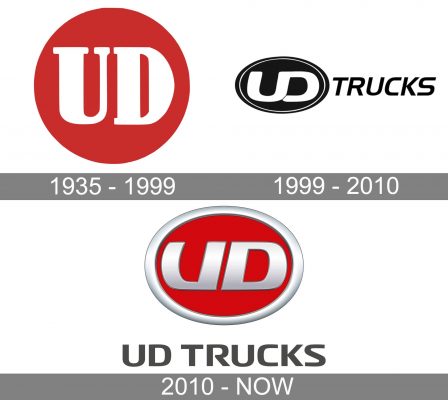
The visual identity of UD Trucks has been based on just two letters on a circular medallion since the very first years of the company’s existence. Though the badge was modified and refined throughout the years, the scheme hasn’t changed much, but the additional text-based logo was added to the brand’s identity and is still used by UD, with or without the rounded medallions
1935 – 1999
The very first logo for UD was introduced in 1935, the year of the company’s establishment, and stayed with it for more than five decades. It was a solid bright red circle with a bold white “UD” lettering in an elegant and classy serif typeface on it. Simple and fine lines and strong contrast of colors made this modest logo sharp and delightful. The badge looked stable and eye-catching when placed on the bonnet or grille of the UD vehicles.
1999 – 2010
The redesign of 1999 brought a new color palette and style to the UD visual identity. Now it was a voluminous dark blue and silver badge, with the circular shape switched to ellipsoidal. The dark blue background of the refreshed medallion had some slight gradient shades, and its thick and smooth silver outline was balanced by the custom sans-serif lettering in the same color. The UD inscription on the new badge was executed in one line with the letters sharing a vertical bar and the contour of the “D” opened, having the tail cut diagonally. The merger uppercase letters made the logo evoke a sense of unity and togetherness, while the strict and dark color palette represented stability and seriousness of the company and its fundamental approach.
2010 – Today
In 2010 the UD logo was redesigned again. The shape of the new medallion was something in between the circle of the original version and the oval from the 1999 design. As for the color palette, now the badge featured a solid red background and had its framing and lettering executed in gradient silver, with the frame in lighter shades. As for the lettering, it was outlined in black and used a smooth and bold sans-serif typeface with slightly arched bars and straight cuts.
Under the red and silver badge, there is sometimes a logotype in capitalized dark gray letters placed. The inscription looks modern and sharp, showing the progress of the brand and its ability to change and improve.
Font and color
The UD Trucks inscription from the latest logo version of the brand is written in the uppercase of a neat and bold sans-serif typeface with a sharp character and very special mood. The typeface of the company’s logo is pretty close to such fonts as Rogue Sans Nova Demi Bold Extended and Neuropa Bold, with the open contour of the “R” and slightly sharpened tails of the lines.
The red and silver color palette of the UD logo is a reflection of style and passion, which also shows the brand’s professionalism and determination along with its innovative approach and progressiveness. The addition of dark gray logotype makes the composition more stable and confident, pointing to the professional qualities of the company.


