 Sacramento River Cats Logo PNG
While the team was established in 1978 as the Vancouver Canadians, it moved to California in 2000, where it received its current name. Part of the Pacific Coast League, the River Cats have been the Triple-A affiliate of the San Francisco Giants since 2015.
Meaning and history
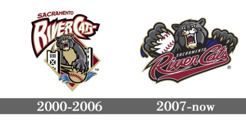
Although the logo of minor league baseball team the Sacramento River Cats has gone through a redesign at least once in its history, it has preserved its mood, style, and the central character, a large grey cat with a ferocious glare and long sharp claws.
2000 — 2006
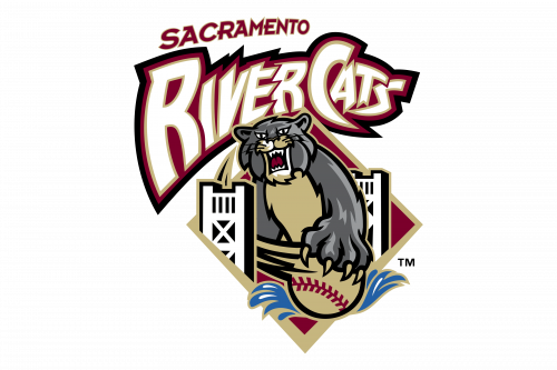 The first Sacramento River Cats logo featured the team’s cat mascot with a baseball in its paw. There was the famous Tower Bridge on the background.
2007 — Today
While in 2007 the team introduced a completely different logo, we can’t say that they made any notable changes in their brand identity itself. The main focal point is still the same grumpy cat that could be seen on the previous Sacramento River Cats logo; he has just lifted its paws a little. The muzzle and its expression, as well as the color scheme, remained the same.
The only notable update is probably that the logo now looks more monolithic as the text has moved down and is now given in a different type.
Colors
The reason why neither the style nor the color scheme has been updated could be that the merchandise has been relatively successful, from the commercial point of view. It can always bee seen on the list of 25 minor league clubs from the point of view of merchandise sales.


