Part of the Mexican League, the Leones de Yucatán have had almost the same logo since at least 2000.
Meaning and history
The Leones de Yucatán were founded in 1954 and joined the Mexican League the same year. The name of the franchise, which means “Yucatán Lions” in English, was inspired by the beer company that belonged to the founders of the team.
1954 – 1959
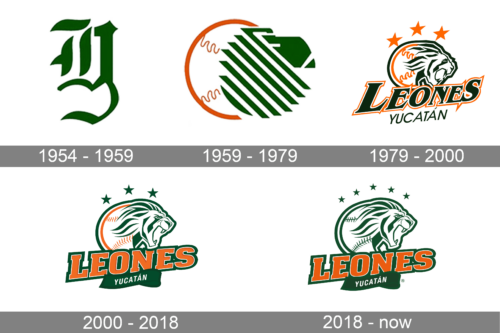
The first logo features a stylized “Y” character, combining elements of tradition and modernity. The “Y” is designed with fluid, organic lines that create a sense of movement and grace, suggesting a fusion of classic elegance and contemporary dynamism. The use of green in the logo is evocative of growth, vitality, and a connection to nature. This single-letter monogram is both abstract and recognizable, offering a bold visual identity that stands out for its simplicity and creativity. The emblem is emblematic of a brand that values heritage while also embracing the new, aiming to be perceived as both grounded and forward-thinking.
1959 – 1979
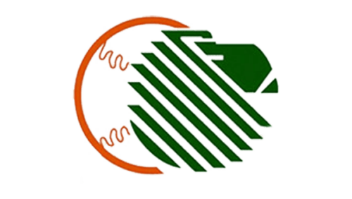
In the second logo, an abstract design that appears to blend the organic with the technical is displayed. The logo features what seems to be a stylized representation of an animal – lion, with horizontal stripes filling its form. The contours are bold and geometric, with sharp angles that lend the image a sense of precision and modernity. Encased within an orange circle that symbolizes the ball, the design suggests a global perspective, energy, and passion.
1979 – 2000
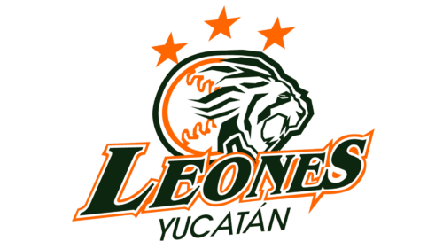
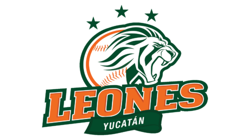
The previous version of the Leones de Yucatán logo depicted the side view of a lion’s head with three stars above and the name of the team below.
2000 – 2018
The emblem was slightly updated in its palette and shape. The original orange stars grew green, the typeface became bolder, while the letters became larger. Also, the shade of green is now somewhat brighter than on the earlier Yucatán Leones logo.
2018 – Today
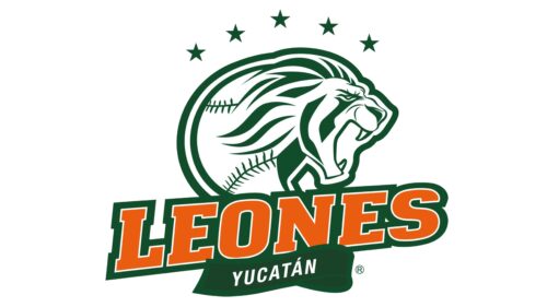
The current logo portrays a majestic lion in mid-roar, set against a backdrop of stars and a baseball motif, encapsulating the spirit of a sports team. The lion, an icon of strength and courage, is rendered in a style that combines realism with graphic artistry, its mane flowing into the silhouette of a baseball. The name “LEONES” arches powerfully above the lion, with “YUCATÁN” anchored below, all set in bold, block lettering that conveys confidence and impact. The use of green and orange creates a vibrant contrast, energizing the logo with a sense of enthusiasm and competitive spirit. This emblem not only symbolizes the pride and passion of a team but also the cultural and regional identity it represents.


