The Minor League Baseball team Norfolk Tides is known as a farm team of the Major League Baseball club the Baltimore Orioles.
Meaning and history
While the club’s roots go to 1961, it adopted its current name only in 1993. Initially, the team played under the name of the Portsmouth-Norfolk Tides, while its second name was Tidewater Tides (1963–1992).
1993 — 2015
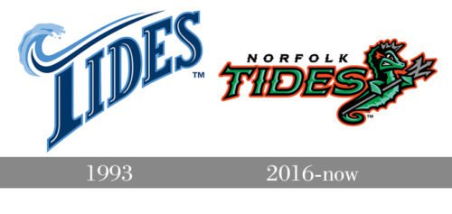
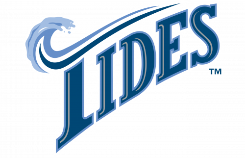 The Norfolk Tides logo unveiled in 1993 (together with the current name) was based on the word “Tides” positioned diagonally. The unusual top “bar” on the letter “T” was designed in the shape of an ocean wave, which gave the otherwise ordinary logo a unique and instantly recognizable look.
2016 — Today
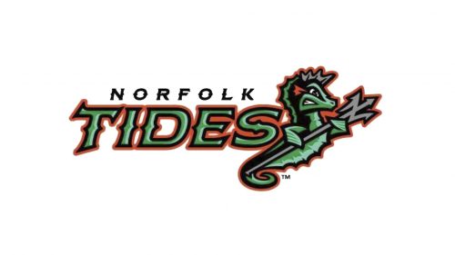 Starting from the 2016/2017 playing season, the team has been playing with a completely different emblem, which has nothing in common with its predecessor. Now, a green seahorse with a trident is the visual center of the logo. The full name of the team is placed to the right.
Colors
If you take a closer look, you will notice that the palette of the Norfolk Tides logo is more complex and nuanced than it seems from the first glance. There’re two shades of green, which add volume. Orange helps to create a contrast, while black and grey provide the finishing touch.


