The American Hockey League team San Jose Barracuda is the former AHL club Worcester Sharks, which relocated to San Jose in 2015. It is an affiliate team of the NHL’s San Jose Sharks.
Meaning and history
San Jose Barracuda, a professional ice hockey team, was founded in 2015. It was established as the American Hockey League (AHL) affiliate of the San Jose Sharks, an NHL team. The founding of this team was part of a major AHL realignment aimed at creating closer geographical connections between NHL teams and their AHL affiliates. The Barracuda plays its home games at the SAP Center in San Jose, California, a venue they share with the Sharks.
Throughout their history, the San Jose Barracuda has achieved notable successes. The team quickly made a name for itself, becoming known for its energetic and competitive play. The Barracuda won the John D. Chick Trophy in the 2016-2017 season, marking their victory as the Pacific Division champions. They have consistently been a strong contender in the AHL, showcasing a roster of talented players, many of whom have advanced to play in the NHL. This progression underscores the team’s significance as a developmental stage for rising hockey talent.
As of now, the San Jose Barracuda continues to uphold its reputation as a formidable team in the AHL. They remain a crucial part of the development pipeline for the San Jose Sharks, providing a platform for young players to hone their skills and gain professional experience. The team’s current position is reflective of its ongoing commitment to excellence in the competitive world of ice hockey, continuing to engage and excite fans with high-quality play and the promise of nurturing future NHL stars.
What is San Jose Barracuda?
San Jose Barracuda is an American professional ice hockey team competing in the AHL as an affiliate of the NHL’s San Jose Sharks.
1996 — 2001
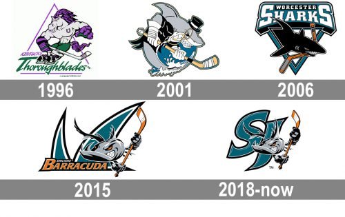
The logo of the club, created in 1996, featured the original name of the Barracuda, the Kentucky Thoroughblades. The badge featured a funny caricature of a horse with a horseshoe tattoo on its breast. The animal was wearing skates and held a hockey stick in its hands. The whole image was placed into a thin triangular frame and had the bold green wordmark underlining the horse. The lettering was written in an elegant cursive font, and placed under the straight sans-serif “Kentucky” in a smaller size.
2001 — 2006
The Kentucky Thoroughblades name was replaced by the Worcester Sharks, and the new logo was introduced in 2001. It was a cool caricature of a gray shark with a hockey stick, drawn on a circular blue background, with a double black and yellow outline. The predator was wearing a black smoking, an elegant head, and a Golden pince-nez. The whole image looked very creative and funny.
2006 — 2015
The redesign of 2006 brought a stricter and more traditional design to the club’s visual identity. This time it was a solid black shark, which was breaking the stick with its sharp teeth. The animal was coming out of a geometric frame — triangle pointing down — in white and blue. The sea-blue banner with the lettering was placed above the triangular emblem and featured a two-leveled inscription in black and white on it.
2015 — 2018
A ferocious anthropomorphized barracuda shark is the central theme of the San Jose Barracuda logo. The beast is clenching its “fingers” around a hockey stick. On the background, there’s a teal shape resembling a shark’s fin, while the name of the team is placed below, closer to the left.
2018 — Today
The redesigns of 2018 kept the concept of the previous logo but simplified and cleaned the badge. The lettering was removed from the new version, and this made the graphical element more visible and sharp. The shark’s fins from the background became smaller, which made the gray barracuda the star of the logo. The beast also got its contours cleaned and refined and some lines of the tail elongated.
Colors
Teal creates a soft and appealing combination with the comparatively discreet shade of orange, while black, white, and grey add refinement and diversity.


