The AHL’s team Rockford IceHogs plays as the top minor league affiliate of the NHL’s Chicago Blackhawks.
The team founded as the Baltimore Bandits in 1995 received its current name and logo in 2007.
Meaning and history
The Rockford IceHogs, an American professional ice hockey team, were founded in 1999. This club, based in Rockford, Illinois, started its journey in the United Hockey League (UHL) before transitioning to the American Hockey League (AHL) in 2007. The IceHogs’ inception marked the beginning of a new era in Rockford’s sports history, attracting a strong local following and contributing to the city’s sporting identity.
Throughout their history, the Rockford IceHogs have achieved notable successes. One of their most significant accomplishments came in the form of a division championship in the 2007-2008 season, a remarkable feat considering it was their inaugural season in the AHL. This achievement not only highlighted their competitive spirit but also established them as a formidable team in the league. Besides on-ice success, the IceHogs have been instrumental in developing talent, serving as the AHL affiliate of the Chicago Blackhawks. Many players have graduated from the IceHogs to play in the National Hockey League (NHL), showcasing the club’s commitment to nurturing and developing professional hockey talent.
In the present day, the Rockford IceHogs continue to be a prominent presence in the AHL. Their current position reflects both the challenges and opportunities in the dynamic world of professional hockey. Despite the competitive nature of the league, the IceHogs maintain their commitment to excellence, both in developing young talent and striving for success in the league. Their role as a feeder team to the Chicago Blackhawks remains a vital aspect of their identity, contributing significantly to the larger hockey ecosystem.
What is Rockford IceHogs?
The Rockford IceHogs are an American professional ice hockey team in the AHL. Known for their competitive play and role as the Chicago Blackhawks’ AHL affiliate, they focus on developing NHL-ready talent.
1994 – 1997
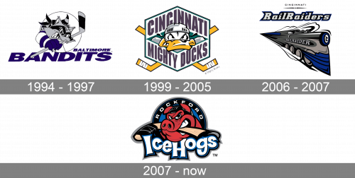
The first name of the Rockford Icehogs was Baltimore Bandits, so this Wordmark was used for the initial logo, created in 1994. It was a blue and gray badge with a caricature of a raccoon, who looked very aggressive and was wearing a hockey uniform, also holding a hockey stick. The gray and black animal in a white and blue jersey was placed above a two-leveled inscription in a slanted geometric sans-serif typeface.
1999 – 2005
The club changed its name to Cincinnati Mighty Ducks in 1999, and the new logo appeared in the same year. It was a cool and bright badge, which was instantly recognizable and evoked a progressive feeling. The hexagonal badge in a thin green and black outline with a white background had a caricature duck portrait in its center and an enlarged purple inscription above and under it. Behind the hexagon, there were two yellow crossed hockey sticks.
2006 – 2007
Cincinnati Rail Raiders was another name of the hockey club, which appeared in 2006. For one year only the team was using a new badge, designed in 2006 as well. It was a dark gray, blue, and black train with an elegant uppercase lettering in a serif typeface, and a sharp logotype placed above it, in a thick blue and black outline. The “Cincinnati” inscription was set on the very top of the composition, written in all capitals of a clean light-weir sans-serif typeface.
2007 – Today
The team founded as the Baltimore Bandits in 1995 received its current name and logo in 2007. The Rockford IceHogs emblem depicts a cartoonish red hog wearing a hockey helmet and biting down on a hockey stick. The word “IceHogs” in a fancy type is placed below the animal, while “Rockford” is positioned above.
Colors
In addition to the three colors of the official palette – red, black, and white – the Rockford IceHogs logo also includes blue, light brown, beige, silver, and maroon. It’s one of the few sports logos with a comparatively diverse palette.


