PAZ (Pavlovsky Avtobusny Zavod) is a Russian bus manufacturer based in Pavlovo, Nizhny Novgorod Oblast. The company is a part of the GAZ Group, which is one of Russia’s largest automotive conglomerates. Established in 1952, PAZ specializes in manufacturing small and medium-sized buses used for various purposes such as public transport, school buses, and special-purpose vehicles. The company primarily operates in the domestic market, serving Russian cities and regions, but has also exported its products to other CIS countries and Eastern Europe.
Meaning and history
Founded in 1952 in Pavlovo, Russia, PAZ (Pavlovsky Avtobusny Zavod) has been a key player in the Russian automotive industry. It is currently owned by GAZ Group, one of Russia’s leading automotive companies. Over the years, PAZ has gained a strong reputation for producing reliable small and medium-sized buses that serve various functions, from public transit to school buses. The company has also innovated in special-purpose vehicles, such as medical buses. PAZ primarily operates within Russia but has expanded its reach to other CIS countries and Eastern Europe. In recent years, the company has made efforts to modernize its production lines and introduce models that meet Euro 5 emission standards. As of now, PAZ remains a critical asset to the GAZ Group and continues to be a dominant force in Russia’s public transport sector.
What is PAZ?
PAZ, or Pavlovsky Avtobusny Zavod, is a Russian bus manufacturing company located in Pavlovo, Nizhny Novgorod Oblast. Established in 1952, it primarily produces small and medium-sized buses, including those for public transportation and special purposes. It is a subsidiary of the GAZ Group.
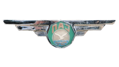
1958 – 1967
The brand used a winged logo for close to ten years. The wings each had three feathers that spread straight horizontally. The metallic silver color of the wings was meant to symbolize modernity and style. The center had an octagon shape and a light green color. It had a circle picturing water and seagull flying above it filling the lower two-thirds of this geometric shape. The brand name was arching above the circle and was printed in Russian using a bold, sans-serif font.
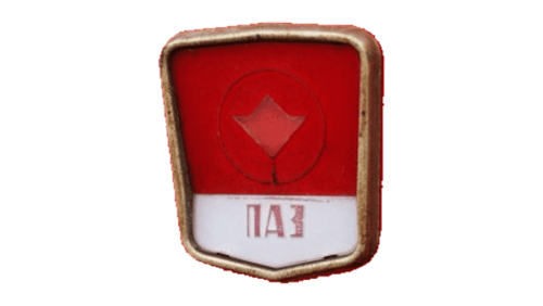
1967 – 1989
The new logo looked bold and had a shield shape with a rounded golden border. The upper two-thirds of the shape was done in saturated red and featured a raised circle with a four-pointed geometric figure resembling a crown or flower in the center. The name was printed at the bottom on a white background. Once again, the company used the Russian alphabet, but the font here was different and featured high-contrast strokes and no serifs. The logo turned bold and classy.
1989 – now
The new logo was minimalistic and done in a monochrome blue color palette. It featured an open circle with the flower/crown symbol in the center. This symbol was first introduced in 1967 and the company decided to use it to represent the brand. Underneath was a bold inscription featuring bold, interconnected Russian characters that spelled out the name. Although this logo was designed back in 1989, it looks contemporary thanks to its minimalistic appearance. The blue used here symbolizes the reliability and stability of the brand.


