GAZ, or Gorky Automobile Plant, is a prominent Russian automobile manufacturer owned by Oleg Deripaska’s Basic Element. Specializing in commercial vehicles and cars, GAZ’s portfolio ranges from trucks, buses, and vans to special-purpose vehicles. Operating not just domestically, GAZ’s presence spans the globe, having established business in over 40 countries.
Meaning and history
Founded in 1932 by the Soviet Union government, GAZ (Gorky Automobile Plant) holds an illustrious history in the Russian automotive industry. With remarkable accomplishments such as the production of the iconic “Volga” cars, GAZ has continuously innovated to meet the demands of changing times. Presently, under the stewardship of Oleg Deripaska’s Basic Element, GAZ continues to thrive, focusing on commercial vehicles and diversifying into new segments like electric mobility.
What is GAZ?
GAZ, or Gorky Automobile Plant, is a renowned Russian automaker specializing in commercial vehicles. Owned by Basic Element, it is globally active, operating in over 40 countries.
1932 – 1946
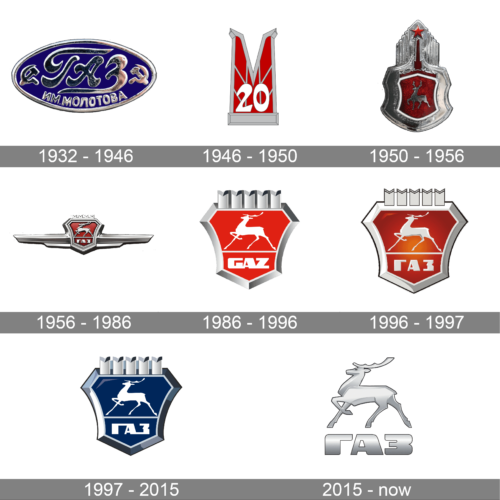
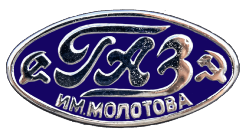
A dark blue oval emblem with silver elements and inscriptions was used for over a decade. The company name was printed using uppercase, Russian characters. The name was decorated by two anchors on either side of it. In addition, the emblem specified the last name of the individual the brand was founded in honor of – Molotov. The emblem was completed by a silver frame. All the silver elements of the logo appeared to be raised above the oval plate, which made the emblem appear more grand.
1946 – 1950
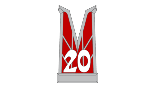
This logo seems quite obscure as it consists of a large, abstract letter “M” with the number 20 at the bottom of it. The character is the initial of the individual the company was honoring. It was done in red with a gray outline and gray lines running across the letter in a specific pattern. At the bottom, the emblem had a rectangular shape that resembled a pedestal. The number was done in white, which allowed it to stand out against the darker, bold background.
1950 – 1956
It was during the fifty’s that the company introduced the iconic deer image. It was done in silver and placed on a crimson background in the form of a shield. The shield was decorated by a quite wide silver border. A red torch with a star at the top was springing from the shield and was also decorated by a multilayer border.
1956 – 1986
The updated logo had a lot in common with the previous version. The torch was no longer there. Instead, the designers elongated the emblem horizontally by adding three-dimensional wing-line elements on either side of the shield. Besides redrawing the deer and making it look more grand, the company added its name underneath the majestic animal.
1986 – 1996
The shape of the emblem was updated again. It is now a three-dimensional shield with peeks at the top that create an illusion of a crown. The deer, on the other hand, looked flat and was now done in white with thin, delicate elements. The name of the company was also done in white and featured a bolder typeface. For the first time, the name was printed using English characters. The logo did not look as magnificent as the previous version but rather had a more modern and clean appearance.
1996 – 1997
The company brought back a richer shade of red and gave the logo a more enhanced three-dimensional touch. This included the red background as well as the deer and company name underneath. The center part of the logo was now the element that attracted attention. The silver border was much lighter and had a smoother gradient with a thin black outline to let it stand out on any background.
1997 – 2015
The logo has not changed significantly. The first thing that catches the attention was the introduction of a blue color. The red and silver color palette has been used by the company for half a century. The blue color is not new, though, as the original logo featured exactly the same color palette. The shape and all elements stayed almost unchanged. The designers enhanced the three-dimensional effect of the border while making the deer and inscription flat and white. It created a nice contrast and gave the logo a sophisticated feel.
2015 – now
The deer and the name became the only elements of the brand’s emblem. It is now done in silver color and has a gradient that gives it some illusion of volume. Although the deer was slightly redrawn, it had a shape similar to the ones in the earlier versions. The legs and horns of the deer are made thicker, which made the animal look stronger and allowed it to stand out even on lighter backdrops. The inscription also got bolder and featured more fluent and rounded strokes.


