Oakland Motor Car Company was an American automaker, established in 1907 by Alanson P. Brush and Edward Murphy. The company was later acquired by General Motors (GM) in 1909. Headquartered in Pontiac, Michigan, Oakland specialized in producing mid-range automobiles. As part of GM, the Oakland brand was eventually phased out in favor of Pontiac by the 1930s.
Meaning and history
Founded in 1907 by Alanson P. Brush and Edward Murphy, Oakland Motor Car Company was an American automaker that later became a part of General Motors in 1909. Operating out of Pontiac, Michigan, Oakland was instrumental in the introduction of several automotive innovations including the use of mono-block V8 engines. The company was also known for producing more affordable but still high-quality automobiles during its era. By the 1930s, the brand was phased out and its factories and assets were redirected to form GM’s Pontiac division, thereby ending Oakland’s independent existence.
What is Oakland?
Oakland Motor Car Company was an American automaker founded in 1907. Acquired by General Motors in 1909, it was based in Pontiac, Michigan, and specialized in mid-range automobiles. The brand was phased out in the 1930s, leading to the formation of Pontiac.
1907 – 1909
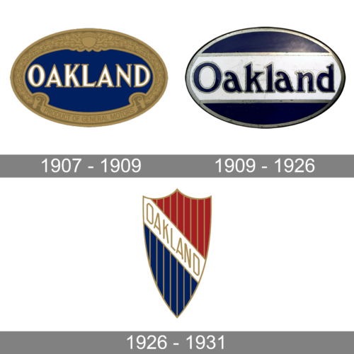
The logo of the brand looked luxurious and grand thanks to a golden ornate frame. It had oak seed in the center at the top and a banner that said “Product of General Motors” in uppercase, sans-serif letters. The rest of the frame was filled with oak leaves that filled the rest of the frame. It was a very symbolic frame considering that the brand name was Oakland. The designers used a serif font of black color with a light purple outline that resembled Weekenia Regular font to print the name in the center. The white letters with a golden outline popped against the rich blue background.
1909 – 1926
A drastically different logo was introduced soon after the previous one was designed. It was also oval but the framing consisted of a thin silver line that was contrasted by an even thinner dark blue line on the outside. The center was also dark blue which allowed a white banner with silver lines on the bottom and top to truly stand out. The name was done in dark blue, making it seem that it was cut out on the white background and it was the background peeking through. The letters had a thin silver outline to match other silver elements. The name printed using a FoundFont Bad Postcard or similar font looked quite different than the inscription in the previous logo. Its unique feature was the letter “a”, which was tilted to the left and was not really in line with the rest of the characters.
1926 – 1931
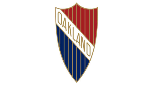
The company began to use a crest shape for its logo, which was quite common among automobile brands. This logo was used by the brand until it transformed into the Pontiac brand. It had a white banner running from the upper corner down to the center and carrying the name printed in golden. The banner separated the crest into the upper red portion and lower dark blue. The crest had a golden outline that matched thin vertical lines that created a pattern. Although this version was completely different than the original one, it had the same sophisticated and powerful appearance.


