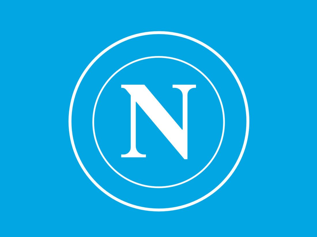
18 years after its previous logo change, Italian football club SSC Napoli has updated its visual identity. The new look of the previous season’s Serie A champion was presented in a special video entitled “Proud To Be Napoli”.

During the redesign, Napoli’s traditional letter “N” received a monochrome and more modern design. By getting rid of some of the design elements of the old version, the team’s symbol looks cleaner and simpler. In the new iteration, the round emblem has dropped its two-tone blue coloring and three-dimensional appearance. Instead, the “N”, whose shape has remained unchanged since 1980, is surrounded by two circles.
This simplicity fully fits into modern trends in graphic design, where dimensional structures are replaced by flat ones, and also makes the logo more flexible with the ability to use any color scheme. In addition, it is a good adaptation for the digital environment.

At the same time, for the logo, the club replaced the classic light blue color with a darker tone. However, the light azzurro shade has been retained for Naploi’s new jerseys that the team will wear in the upcoming 2024/25 season. They feature the N-emblem in white, along with the name of Napoli’s new sponsor, MSC Cruises, a Swiss-Italian cruise company.
However, the truly new identity for Napoli is its typography, as the Neapolitan club has acquired its own signature font for the first time, called NapoliFont. As the team describes it, it is “the perfect synthesis of the essence of the brand and the city it represents.”

According to a Napoli press release, “Naples is a melting pot in constant turmoil. A city with a thousand facets, where contrasts come together to create a kind of eclecticism.”
It was this sense of heritage and cultural richness of the city that inspired the new version of the logo and custom font. The ties between the city and the club are expressed in the letters with their connections and diagonals, reminiscent of the architecture of Naples, as well as in the bold and compact strokes, sharp and dynamic angles, symbolizing a united and determined team. In short, the design reflects the genetics of the Neapolitans who live by passion, the history of Naples, and the chapters yet to be written.

Napoli’s rebranding confirmed the current trend towards modernization of identity among European football clubs. Recently, we have seen such moves from Aston Villa, Lyon, Inter, and other teams. At the same time, clubs’ acquisition of their own typeface is of particular interest. In this sense, Napoli follows the example of Barcelona with the font of FCB, Juventus (JuventusFan), and AC Milan (MilanTypeRev).
Nowadays, typography plays as important a role as graphic design. An independent font creates individuality and is one of the central pillars of branding. NapoliFont, based on the visual traditions of Napoli, could well serve as a strong distinctive attribute of the Neapolitan team.


