AC Milan is an Italian football club, which was established in 1899. The club is the strongest and the most famous in Italy and has several high rewards, including FIFA and UEFA. One of the leading European Football Clubs was created by Alfred Edwards and Herbert Kilpin, two Englishmen.
Meaning and history
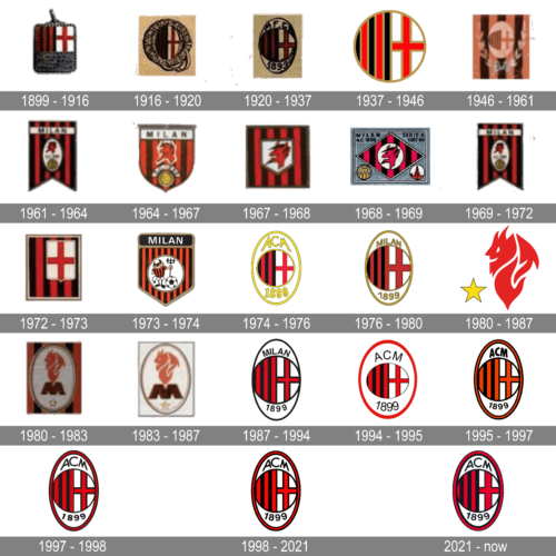
The visual identity of the celebrated European football club has always been based on the Red Cross, positioned on a white background. It is the iconic St.George’s Cross, or St.Ambrose Cross (in Italy), which is also an essential part of their mother-city flag.
During the first part of the club’s history, its logo was repeating the crest of Milan and was changing with the growth and progress of the city.
What is AC Milan?
AC Milan, a professional football (soccer) club hailing from the Italian city of Milan, boasts an extensive history of success. Since its inception in 1899, the club has secured a total of 18 Serie A titles, 5 Coppa Italia titles, and 7 UEFA Champions League titles, propelling it to become one of the most accomplished football clubs in Italian history. The club proudly hosts its home matches at San Siro Stadium, a renowned arena shared with its city rivals Inter Milan.
1899 – 1916

The very first badge of the team was a smooth square, vertically divided into two parts, with a Red Cross on the right and vertical black and red stripes on the left.
1916 – 1920
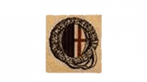
In 1916 the logo gained a circular shape and an ornate frame, accenting on the values of heritage and traditions. It was more a medallion than a logo, showing the club’s roots and history.
1920 – 1937

In 1929 the circle with stripes and cross was placed inside an oval with “MFC” lettering on the top and “1899” inscription in its bottom part.
1937 – 1946
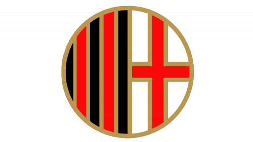
The logo from 1937 was bright and minimalist. The white, red and black circle gained a clean and thick red outline, which made it look brighter and more confident.
1946 – 1961
The version of 1946 had a laurel wreath around a white oval, where the iconic circle was located.
1961 – 1964
The Red Devil appeared on the A.C. Milan logo in the 1960s. Now it was seated on the white oval, which was located on a flag with black and red vertical stripes.
1964 – 1967
The oval was removed from the logo in 1964 and the flag’s shape was changed to a shield. The “Milan” inscription was written in black and placed on a white rectangle on the top of the shield.
1967 – 1968

The version of 1967 featured the red devil on a white shield, which was placed on a square with a black and red background.
1968 – 1969
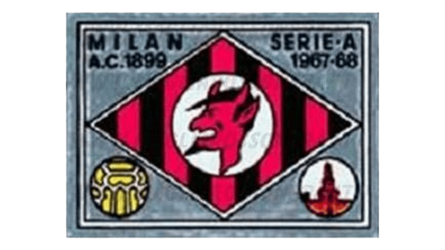
In 1968 the shape was changed to a rhombus, which was placed on a dark rectangular background.
1969 – 1972
The version of 1969 repeats the one from 1961, but with its lines refined and contours more confident.
1972 – 1973
The logo was again redesigned in 1972. Now the Red Cross was placed on a white shield, which was located on the upper right side of a red and black square.
1973 – 1974
The version of 1973 boasts a white circle rested on striped background with the “Milan” lettering in capitals written in white inside a black rectangle in the top of the shield.
1974 – 1976

In 1974 the prototype of the logo we all know today was designed. The circle with stripes and cross is placed inside an oval with “ACM” wordmark on top and “1899” under the circle. The inscriptions were written in yellow and balanced by a yellow frame.
1976 – 1980
The version of 1976 was neater and more delicate than the previous one. The “Milan” lettering on the top part of the oval was in simple yet confident sans-serif, which added professionalism and expertise to the logo, especially when drawn in black.
1980 – 1987

During the 1980-1987 period the football club, it used a logotype showing a smiling devil styled as a red flame. A yellow five-ended star, contoured black, usually stood bottom left.
1980 – 1983

The devil came back in the 1980s. Now it was placed above the extra-bold letter “M”, inside the white oval, placed on a striped background.
1983 – 1987
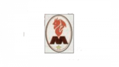
The background was removed and the Devil logo now looked more modern and strong. Enclosed in a yellow and black frame, it was instantly recognizable and bright.
1987 – 1994
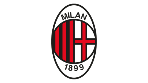
In 1987 the club decides to come back to the roots and redesigns the logo again. The circle with red and black stripes on the left and a Red Cross on a white background on the right is placed inside an oval with a yellow outline. The “Milan 1899” inscription in yellow is placed between the circle and the frame and executed in the same yellow.
1994 – 1995
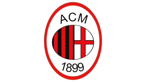
The word “Milan” is replaced by “ACM” and the yellow color is changed to black, which adds power and confidence to the logo. For one year the club was using a version with the green wreath around the oval medallion.
1995 – 1997
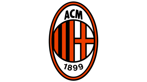
The club’s logotype changed the color scheme in 1995, that time from black and red to orange and black. The upper and lower inscriptions were made bolder and larger than before. Moreover, the logo shape got narrowed and elongated.
1997 – 1998
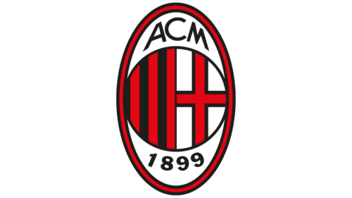
For over a year, AC Milan used its logo in an enriched red and black color palette. That edition also depicted the characters stretched along the top of the oval. The inscription with the year of the club’s foundation was also thickened.
1998 – 2021
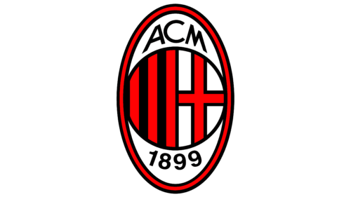
The version of the A.C. Milan visual identity was designed in 1998 and only slightly refined throughout the years. The oval is now framed into red, with a thin black outline. The “ACM 1899” inscription in black uses a simple yet strong sans-serif typeface, which adds a sense of confidence and influence.
All the lines are neat and clean, making the famous football club’s visual identity a truly iconic example, which is instantly recognizable worldwide.
2021 – now
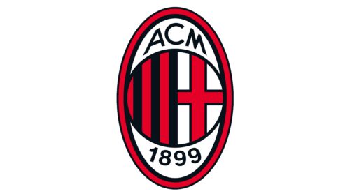
In 2021, several minor changes were made in regards to the thickness and layout of lines and contours. The black borders got bolder for much of the inner imagery, except for the red cross, which became comparably thicker. The black border on the outside of the oval instead became thinner.
Font and colors
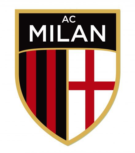
The AC Milan name acronym in the club’s logo is characterized by a bold and assertive sans-serif typeface. The capital letters are strikingly proportioned and exhibit a slight tilt, imparting a sense of fluidity and dynamism to the design. Additionally, the letters are uniformly arranged and exhibit a consistent thickness and weight, which instills a feeling of equilibrium and poise.
AC Milan Logo Colors
RED
PANTONE: PMS 185 C
HEX COLOR: #FB090B;
RGB: (251,9,11)
CMYK: (0,99,100,0)
BLACK
PANTONE: PMS BLACK 6 C
HEX COLOR: #000;
RGB: (0,0,0)
CMYK: (75,65,67,90)


