

Launched in 2013, Qwant is a French search engine which is mainly used in France and other francophone countries. The website doesn’t generate income from advertising. Instead, it is funded by providing its technology to other websites and businesses. In this regard, Qwant doesn’t employ user tracking or personalize search results. The brand has recently updated its design to express its revised ambitions and aspirations for being more available and modern.
![]()
Initiated by financier Jean-Manuel Rozan and computer security specialist Éric Léandri, Qwant, which generates almost two-thirds of search queries in France, rolled out its new design coincided with the release of the extension for VIPrivacy, a free tool that can be used to protect personal data while surfing the web. The company has always argued that surfing with Qwant is secure, guarding user privacy. And it claims that it has six million visitors a month.
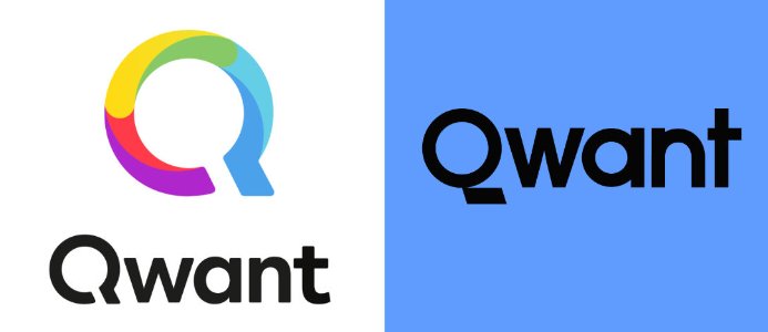
The Qwant new logo is typographically reduced, compared to the previous colorful emblem. Ditching the rainbowish Q sign, the brand decided on a strict design, albeit with an original typeface for the wordmark in black coupled with a background in Cornflower Blue – Qwant’s new brand color. The company describes the logo as “differentiated, legible, and sober”. The emblem is also said to be integrated into a “successful graphical identity”.
The launch of the new design and VIPrivacy will be accompanied by a promotion campaign which is going to start shortly.
In general, this design solution is quite independent, considering the visual language, colors, and typography. Visually, it is absolute “here and now”, something that a brand needs to stay qualified and attractive in terms of digital media.


