Girl Scouts is a welfare association, which focuses on providing healthy and secure conditions for women who live in secluded areas, and getting them to work for the society.
Meaning and history
Girl Scouts is an American organization, founded at the beginning of the 20th century for American girls, who live both in the United States and abroad. Today the association has almost 2 million of girl members and 800 thousand adult ones.
The association, founded by Juliette Gordon Law, aims to prepare girls for adult life, learn how to express themselves, protect their point of view, strengthen their character and enhance communication skills. In other words, to make the American girls confident and strong.
The Girl Scouts association is the largest in the world, and known on all continents, as many movies and franchisees are dedicated to it. The girls also wear a very recognizable uniform, with a stylish green logo on it.
1912 – 1920’s
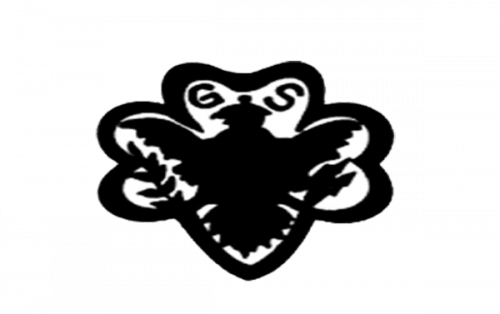
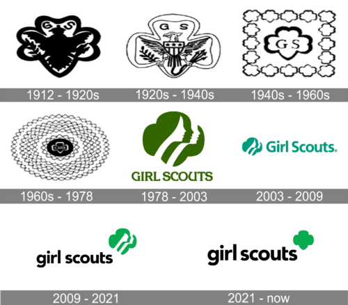
At the beginning of the twentieth century, the Girl Scout logo looked very traditional and resembled the monarchal symbols or emblems on the historical family crests. It was a bird enclosed into a frame resembling a shamrock, with two branches at the bottom and “GS” letters above its head.
1920’s – 1940’s
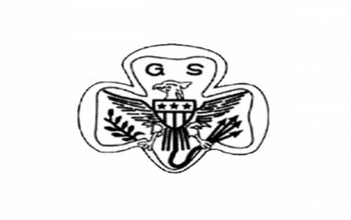
In the 1920s the badge was refined and all the thick bold lines turned into thin and clear ones. The color palette remained black and white, though the mood of the badge has completely changed — it became sophisticated and naive, even though now on the bird’s chest there was a triangular crest with stripes and stars, just like on the national flag of America.
1940’s – 1960’s
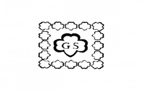
In the 1940s the bird was removed from the badge, and the shamrock-like contour remained the main element of the Girl Scout visual identity. It was depicted in bold lines, inside a square, formed by the same shape elements, but in smaller size and thinner lines. In the center of the main shamrock, there was a bold “GS” monogram in a handwritten serif typeface.
1960’s – 1978
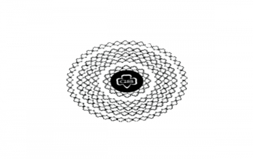
The shamrock with the monogram turned white and got placed on a solid black horizontally stretched oval, which was surrounded by several light circles formed by lots of thin contoured shamrocks. The logo was very interesting but too complicated and not easy to use.
1978 – 2003

A completely new concept was introduced in 1978. This is when the iconic silhouette badge first saw the light. The green and white emblem in the same shamrock shape had three woman profiles on it — white, green, and white. Under the graphical emblem, the “Girl Scouts” wordmark in the uppercase of an elegant serif font was written in the same shade of green.
2003 – 2009

The emblem got smaller and moved to the left from the lettering un 1003. The color palette was switched to a brighter one — with a dark turquoise shade replacing the calm green. As for the inscription, it was also rewritten and now featured a simple bold sans-serif typeface on its narrowed title case letters.
2009 – 2021

In 2010, the OCD Agency made a little change: the emblem remained the same, but the deep green color was replaced with light green.
2021 – Today
The redesign of 2021 has strengthened the look of the Girl Scout badge, using the concept of the previous version, but rewriting the lowercase lettering in a bolder font, and redrawing a green emblem with no white elements on it, so that the triple portrait turned into a solid green crest with four petals. The new badge looks very modern and confident.
Shape
The Girl Scout logo is an image of three diagonally aligned silhouetted female faces.
Font and color
The friendly lowercase Girl Scouts inscription is written in a bold classic sans-serif typeface, which is most likely one of the famous Avenir family fonts — it is whether Avenir Pro 95 Black, Avenir Std 95 Black, or Avenir Arabic Black. It has massive lines and contours, though, due to the use of only the lowercase letters, the inscription does not look heavy or strict.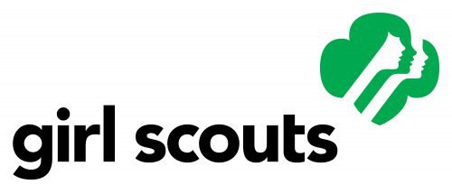
As for the color palette, the emblem in green and white stands for energy and life, it also symbolizes growth and progress, while the black logotype is all about confidence, power, and trustworthiness.


