

The online shop myToys, owned by Europe’s largest mail-order company Otto, has received a new visual identity, aiming to strengthen its position on the market and mark its transition from an online company scheme to a marketplace paradigm.
Selling toys and other children’s goods, the brand was founded in 1999, and the current rebranding is the second facelifting in the company’s history. According to an official press release, the goal of the identity revision was to create a new valuable design that would keep myToys’ essentials. The development process was carried out, considering the results of the surveys among focus groups.
![]()
Explaining its new look, the online brand says that the base idea of its visual identity is joy. And myToys would like to be closer to its customers in the future. “Family life is like a rollercoaster ride — vivid, true, sometimes chaotic and restless and, at the same time, full of joyful moments. And we want these moments to be perceptible in our offerings”, myToys marketing department Ulrich Hauschild said.
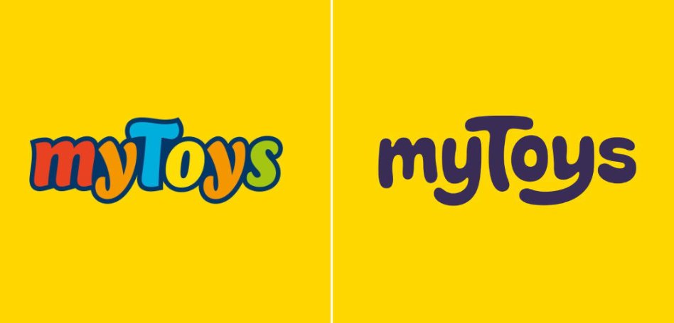
While myToys’ latest rebranding in 2014 resulted in a multicolored logo with an opportunity to be displayed in different color combinations, this time, the company’s logo has got a monochrome design. The new wordmark is executed in a handwritten style, and the letters are separated from each other now. With these changes, yellow stays the main color for the brand to keep it recognizable.
The new branding has already been unfolding for several days as a part of a promotion campaign and can be seen on the company’s website, social media, and the myToys mobile app. The corporate design, involving digital and printed materials, POS, and packaging, was created in cooperation with the design agency Strichpunkt and the audio branding studio We Sound.
Colorful logos are common in the toy/children’s products segment. Jako-o, Vedes, or Toys R Us are good examples of this. Such solutions are thought to reflect the cheerful and carefree world of childhood. It’s quite reasonable as the clichés connected with “childhood” and “playing” do work, and the design ultimately has to correspond with the brand.

It’s not obligatory for the logo to explain the goal of the brand. However, if the identity, including a logo, colors typography, and so on, reflects the brand’s activity, it serves as a guideline and helps make the brand competitive. In the case of myToys, the handwritten wordmark conveys liveliness and jocosity. The fact that the company decided on this kind of typeface, as well as a monochrome design, provides the brand with more elasticity as this “contextualizing” design can be adjusted, depending on the promoted product.


