

Founded in 1901 as the Cleveland Blues, the Cleveland Indians have changed their name and logo amid long-running racism discussions.
![]()
As the franchise announced last Friday, MLB’s team will be renamed to the Cleveland Guardians after the 2021 season has ended. The rebranding has entirely been foreseeable. While the team replaced its primary logo, depicting the comic-style Chief Wahoo, to the big “C” in 2013, it continued using the emblem as one of their alternate insignias. Both the Chief Wahoo emblem and the Indians name have been subjects of criticism from different quarters for many years. In particular, many people from Native American communities consider them racist and offensive.
Back in early 2018, the team’s management said it would definitively stop using the Indian’s head. Now, the new name for the franchise is announced.
According to the franchise, the “Guardians” was one of the most favorable name suggestions from fans. This name has connection with the Hope Memorial Bridge built across the Cuyahoga River in Cleveland. The construction includes so-called Guardians of Traffic, eight statues erected in pairs onto both ends of the bridge.
The Guardians of Traffic with their winged helmets also gave an inspiration for the Guardians’ primary logo featuring a baseball wrapped by two winged “G”’s. With its simple yet strong design, this fastball conveys the spirit of the team, as a Guardians press-release says.

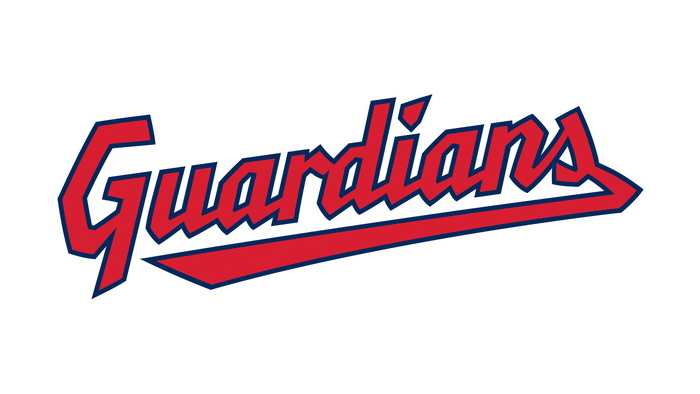
The team’s secondary emblem represents the handwritten wordmark “Guardians” distinguished with cornered letterforms and an underline traced from the final “s”. It will depicted on the home jerseys, while the away uniforms will retain the “Cleveland”. The players’ caps will carry the “C” that was reshaped, receiving a bit curved and cornered lines.


