

![]() Olympics Logo PNG
Olympics Logo PNG
There have been so many Olympics logos so far, and their design has been so diverse that it is hardly possible to find any similarities between them except for the ring symbol.
Meaning and history
![]()
The choice of the symbol and logo of the Olympic Games is always accompanied by heated discussions and criticism in the press and blogs. After all, the symbolism of the Olympics advertises not only the Games but also the countries that are identified with the visual style it exhibits. And the image of a country is different for each of its inhabitants.
The main official symbols of the Olympic Games include the rings, flag, emblem, oath, motto, anthem, and torch with relay, but the main symbol is still the logo consisting of five colorful rings.
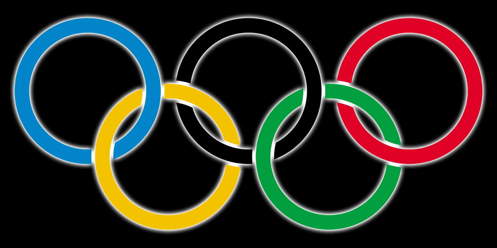
The Olympic symbol represents five intertwined rings. Both its single-color version and a combination of blue, yellow, black, green, and red colors can be used. It was proposed in 1913 by the Frenchman Pierre de Coubertin, who was the initiator of the modern Olympic Games. According to the Olympic Charter, the symbol represents the unity of the five continents (Africa, Europe, South and North America, Asia, Australia, and Oceania) and the meeting of athletes from all over the world during the Games.
Thus, Europe represents the color blue, Africa – black, America – red, Asia – yellow, Australia – green, but since the middle of the twentieth century (to move away from racial discrimination) abandoned such a distribution of colors. In favor of the theory of the unity of all peoples is also the fact that the flag of any state contains at least 1 color from the emblem.
When designing a personal emblem for each Olympic Games, the symbolism of the 5 rings is always used. Due to its versatility, the rings are perfectly combined with other components of the image. National Olympic Committees have their official emblems, but in their image also necessarily present 5 Olympic rings.
1912 – 1986
![]()
The original iconic five rings logo of the Olympic Games was introduced in 1912 and featured thick lines of the five colored elements. The badge looked solid and bright, yet in comparison to the current logo, it was a bit heavier and darker.
1986 – 2010
![]()
The redesign of 1986 refined the contours of the rings and added some thin white lines to the place of their intertwining. The colors were also refined and made more delightful. This logo definitely looked more professional and stylish than the original version.
2010 – Today
![]()
After the redesign of 2010, the five rings on the Olympic Games logo became thinner and smaller. At the same time, the colorful rings got their outlines removed, and now the locations of their intertwining look more harmonized and smooth. This is the most laconic emblem of all, and it looks super calm yet strong.
The 2020 Symbol Olympics

For the Olympic Games Tokyo, held in 2020, the bright rings became part of the “2020” number, keeping the style of the logo, established in 2010. While the first “2” was colored blue, and the second one — black, the zeroes were drawn in yellow and green, with the last one depicted by a solid red roundel, reminding of the national flag of Japan.
The 2024 Olympics in Paris
![]()
For the 2024 Olympic Games, taking place in Paris, the five elegant rings in different colors got placed under a sleek yet light and fresh emblem — a white stylized frame on a golden roundel. The main thing here is the golden lip contour placed at the bottom of the flame, making it look like the famous Disney character Ursula, from the Mermaid story.
The rings emblem Olympics
The history of the Olympic rings dates back to 1912. The author of the design is Baron Pierre de Coubertin, one of the founders of the current version of the Olympic Games. There were five rings altogether, each representing one continent. The color scheme of the rings included the colors of each country taking part in the Olympics back then. Today, the International Olympic Committee claims that this emblem emphasizes that every country is welcome to join.
Font
![]()
The current version of the Olympics logo utilizes a simple serif typeface, all the letters are capitals.
Color
![]()
The palette includes red, yellow, black, grey, blue, green, and white for the background.


