

![]() Toys R Us Logo PNG
Toys R Us Logo PNG
Toys “R” Us is known for its colorful and playful logotype, which perfectly fits the toy industry and appeals to kids.
Meaning and history
![]()
Toys R Us is a globally famous toy retailer, which history dates back to the 1940s. Charles Lazarus, the founder of the company, chose one of the most promising and prospective areas for his business, andin 1948 he opened Children’s Supermart, a children’s furniture store in Washington. Those were the years of the Baby Boom in the United States, so the demand for baby products was really great.
Pretty soon after the opening of the Supermart, Charles was faced with the need to expand the store’s range. At the request of his customers, he first included toys, and then bicycles, and books.
The name Toys R Us emerged almost ten years later.Charles Lazarus was able to add a twist to the rather ordinary name in the form of the mirrored letter “R”. In the middle of the 1950s, the store’s symbol and mascot, the cute giraffe, appeared. In those years he was called Dr. G. Raffe. In the 1960s, along with the renaming of the store, the giraffe changed his name and became Geoffrey. As the store grew, the Geoffrey family also grew, becoming one of the most popular toys. And the giraffe itself entered the top 25 mascots of all time in 2010.
In 1966 Toys “R” Us was bought by Interstate Department Stores, which also owned many other stores for children, such as White Front, Topps, and Children’s Bargain Town USA.In 2005, the stores were purchased by three firms Capital Partners LLC, Kohlberg Kravis Roberts (KKR), and Vomado Realty Trust.
What is Toys R Us?
Toys R Us is one of the world’s largest toy retailers. The company, headquartered in Wayne, New Jersey, was founded in 1948. Today it has more than 800 Toys “R” Us and Babies “R” Us stores in the United States, and more than 700 international stores in 35 countries. Toys R Us employs over 100 thousand people across the globe.
1948 – 1957
![]()
The Toys R Us logo was created in 1948 when the store was called “Children’s Supermart”. It was a simple yet bright banner in white with bold arched lettering in the red set above the blue promotional text-line, where there were sales and deal announced.
1957 – 1967
![]()
The redesign of 1957 introduced the logo where the “Toys R Us” line first appeared. It was a cool and friendly monochrome badge with the “Children’s Supermart” nameplate on top, and a funny giraffe image on the left. The animal was wearing a Sabra hat and saying “Toys R Us”.
1967 – 1969
![]() In 1967, the brand was officially renamed “Toys “R” Us” and adopted a logo with letters of different colors. The old Toys R Us logo looked pretty similar to the current one, though there were several notable differences.
In 1967, the brand was officially renamed “Toys “R” Us” and adopted a logo with letters of different colors. The old Toys R Us logo looked pretty similar to the current one, though there were several notable differences.
1969 – 1972
![]()
In 1969, the design was slightly updated. While the overall style remained the same, there was some playing around with the color and shape of the glyphs.
1972 – 1976
![]() The following modification (1972) resulted in smoother glyphs. Now, they looked rather like a single whole than several letters put together. However, it still had a distinctive feature separating it from the later versions – an exclamation mark.
The following modification (1972) resulted in smoother glyphs. Now, they looked rather like a single whole than several letters put together. However, it still had a distinctive feature separating it from the later versions – an exclamation mark.
1976 – 1980
![]() In 1976, the exclamation mark was removed.
In 1976, the exclamation mark was removed.
1980 – 1985
![]() The palette grew brighter and more playful in 1980. Some of the colors became more vivid, and there were also new ones added.
The palette grew brighter and more playful in 1980. Some of the colors became more vivid, and there were also new ones added.
1985 – 1998
![]() As a result of the 1985 update, the colors were modified once again. The green grew slightly darker, while all the letters, except the “T” and “S,” changed their colors (remaining within the existing palette, though). Several outlets went on using this version until 2018.
As a result of the 1985 update, the colors were modified once again. The green grew slightly darker, while all the letters, except the “T” and “S,” changed their colors (remaining within the existing palette, though). Several outlets went on using this version until 2018.
1998 – 2007
![]() In 1998, the reversed “R” was placed inside a blue star. This approach made it more visible and added playfulness to the logo. This logo was also used at several locations until 2018.
In 1998, the reversed “R” was placed inside a blue star. This approach made it more visible and added playfulness to the logo. This logo was also used at several locations until 2018.
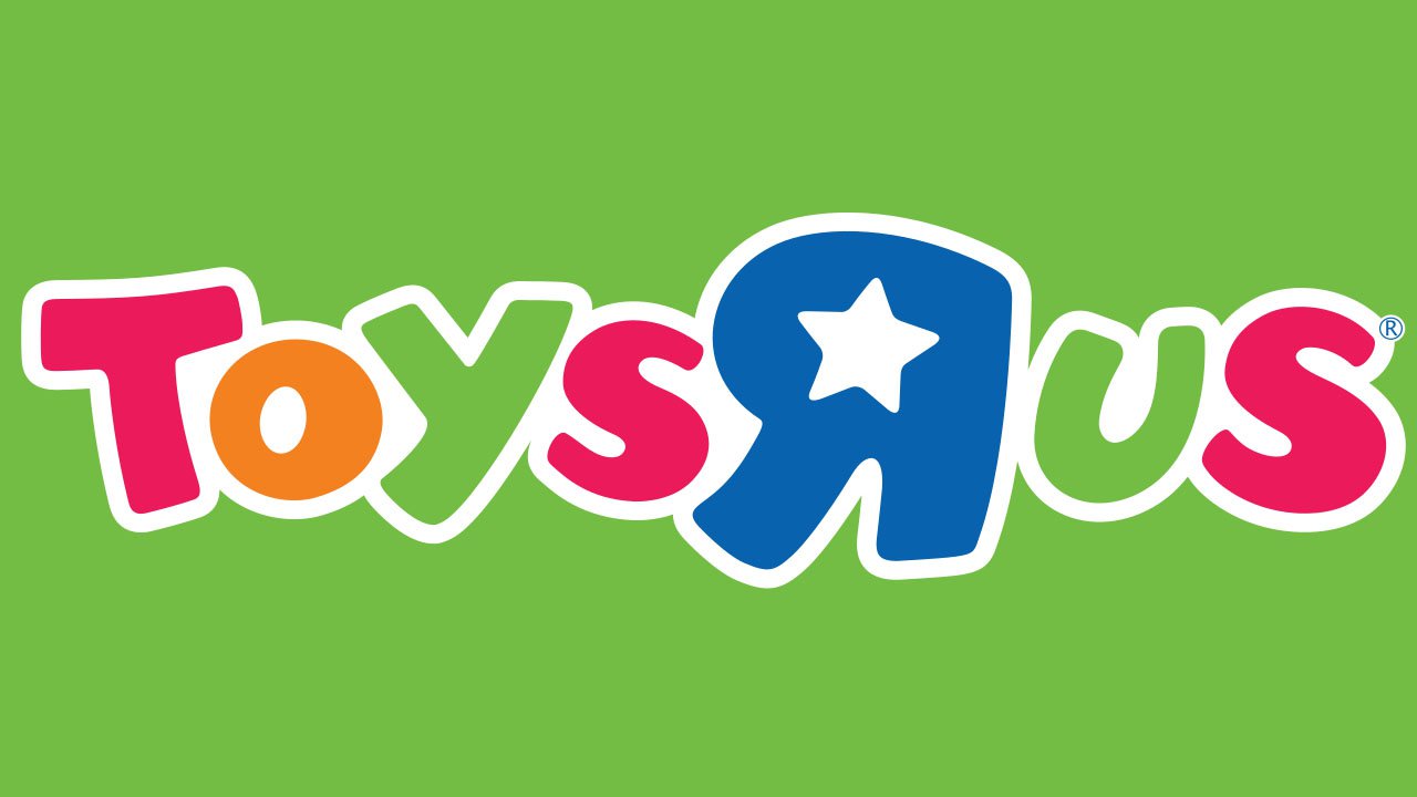
2007 – Today
![]()
The 2007 emblem had both the shapes and colors modified. If you compare it side by side with the previous logo, you’ll notice almost all the letters have slightly altered their shape and size. This is especially noticeable in the case of the “R.” As for the star, it was still present on the logo, although it grew smaller and was now placed inside the reversed “R.”
Colors
The color scheme looks vivid and features a visual “rhythm.”
Font
The bold playful lettering from the primary logo of Toys R Us retailer is set in a heavy custom sans-serif typeface with smooth contours of massive capitals. The closest fonts to the one, used in this insignia, are, probably, Bouncy Black, Top Banana, or Beachday Regular, but with some significant modifications of the letters’ shapes. The inscription looks very welcoming and cool and evokes a sense of stability and trustworthiness.


