

Last week, the Mexican Football Federation (Federación Mexicana de Fútbol Asociación) presented its new logo at a special event at the Estadio Atzteca in Mexico City. The emblem came as a result of a strategic development plan the organization has been implementing over the last years.
The association said the logo was created in collaboration with Adidas that is a long-time partner of the FMF. Before the federation’s new symbol was presented to the public, tests and surveys were conducted among football fans.
![]()
Founded in 1922, the FMF changed its logo several times throughout its history. The latest revision was in 2011 when the emblem’s basic structure, which is composed of an eagle, ball, and the Mayan calendar, was only slightly changed. The recent redesign is the most dramatic change over the past 40 years. All the elements of the design were considerably reworked. The eagle, Mexico’s national symbol, got bigger, being placed in the center of the logo. The Aztec sun stone is symbolically drawn with the green and red serrated lines now, instead of the almost detailed depiction of the calendar previously.
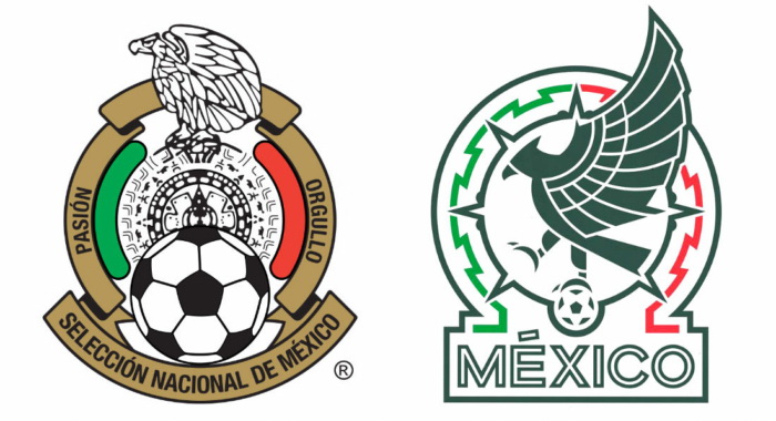
The new iteration features only three colors – dark green, light green, and red. The wordmark “MEXICO”, which is framed, along with FMF’s symbols, with a bold line, was inspired by the emblem of the 1968 Olympics which was held in Mexico.
According to the association, the logo with its elements expresses the Mexican national identity and symbolizes the country’s culture and nature, while paying deep tribute to its history.


