The national brand launched by the Australian government in July 2020 met so harsh criticism when presented that the National Brand Advisory Council decided to create a different Australia logo. The result of the revamping has recently been unveiled to the public.

While the National Brand of Australia has been in existence for almost four years, it is managed by the Advisory Council established by the government. According to an official statement, the goal of the National Brand is to develop a stronger and more unified visual identity that could improve the country’s image and global competitiveness. The first attempt to implement such a brand failed, opposed by the Australian public. As critics said, many people saw in the logo a resemblance to coronavirus as the emblem featured a round flower of wattle, a vegetable symbol of Australia. As a result, the branding process was halted.
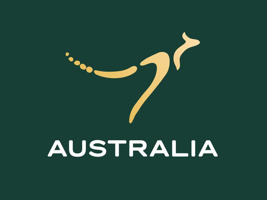
Moving on, the Advisory Council engaged two partners – Houston Group and design and strategy studio Balarinji. For the new logo, the wattle was eventually replaced with a kangaroo as Australia’s heraldic animal. According to a press release, the emblem’s design was inspired by Dreamtime and related old stories. The depiction of the kangaroo built-in into the cultural richness of the country is an infallible part of Australian symbolism.

The color palette including dark green and gold is still the base asset of the National Brand. On the other hand, the trademark and wordmark were entirely reworked. The kangaroo was chosen as a central feature as it is used by numerous Australian companies, brands and governmental institutions.
The new National Brand kangaroo is made up of three boomerangs and several dots at the end of the tail. The kangaroo’s jumping posture, as the official statement says, conveys the dynamism, vital strength and power of Australia.

Although the wattle concept was rejected, the new design concept based on aboriginal art is using a dot design. Instead of the wattle, the graphics show off a ring drawn with dots. Additional design elements, that will be used depending on the context, symbolize a river, a path as well as the country and the people who live in it.
As it was planned two years ago, the AU Sans typeface will be a distinct feature of the National Brand’s visual profile. The Economy and Trade Ministry of Australia has already adopted AU Sans as a corporate font.


