

Founded in 1999, Nutiva is a food brand that pioneered the technology for producing organic plant-based foods, including baking oils, nut spreads and butters, and nutrition categories. Advocating healthy natural foods, the company, headquartered in Richmond, California, supports organic farming communities, regenerative agriculture, and programs for stopping global warming. To articulate the “green” agenda more clearly, Nutiva has rolled out a new visual identity forged by the New York-based design studio Sterling Brands.
![]()
For Nutiva’s new look, the studio took inspiration from the colors of nature and the energy of the sun. Prevailed by green and blue shades, the brand’s logo represents a kind of a halo whose design symbolizes the nourishing components which are being used in the Nutriva products. While showcasing the combination of fresh and airy colors and forms, it elevates the brand, expressing its aspiration “to build a better and more delicious future”.
While Nutiva’s previous emblem represented just a wordmark, with interestingly designed letterforms, though, the green-blue-yellow mixture, telling of the freshness of nature, is really something new, certainly demanding more attention with its watercolor design. In addition, the reworked wordmark, placed in the center, is another element that is worth mentioning as it demonstrates a distinct design solution with classic-like letterforms as well as the curious “ti” ligature.
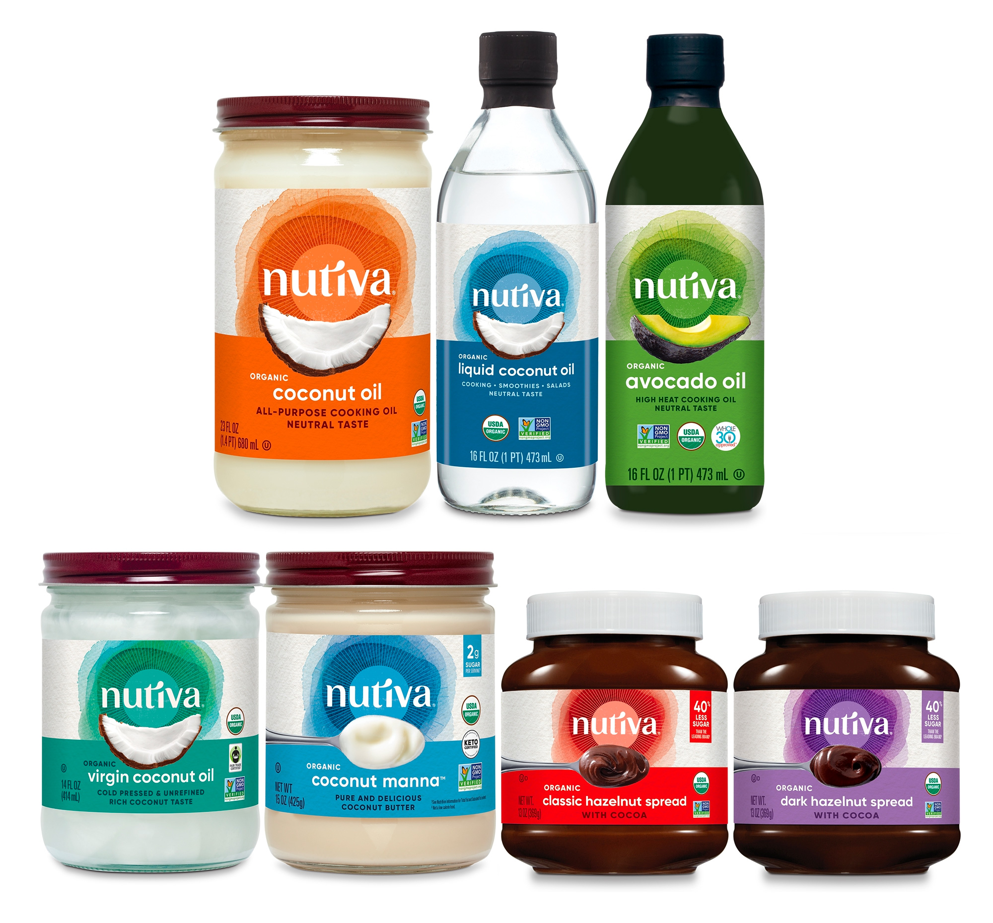
This logo will definitely look nice on the packaging, especially alongside product information. Although multicolored logos combined with generic typefaces are uncommon today, a balanced design like this one can really work, creating a family of food products and highlighting customers’ beloved delicacies.


