

Getting ready to relocate to the Intuit Dome in Inglewood, California for the upcoming season, the Los Angeles Clippers are embarking on a new chapter in their history. Concurrently, the NBA franchise has unveiled an updated visual identity.
![]()
Previously considered outsiders in the National Basketball Association, the Clippers struggled to secure playoff berths until a significant shift occurred in 2014. This transformation transpired when the team was purchased for $2 billion by former Microsoft CEO Steve Ballmer. Subsequently, the Clippers have emerged as formidable contenders in the Western Conference, earning spots in the NBA championship series.
The refreshed Clippers’ identity is designed to honor the team’s heritage. According to Gillian Zucker, President of LA Clippers Business Operations, the management actively listened to various perspectives and enlisted specialists to craft a “timeless design” fusing elements from the Clippers’ past and future. The new emblem is intended to encapsulate “our roots and commitments,” added Zucker.

The rebranding initiative was a collaborative effort involving the club’s design team, the Brooklyn-based agency Doubleday & Cartwright, and designer Matthew Wolff, renowned for his expertise in sports design. Additional support came from the NBA and sportswear giant Nike.
The latest time when the franchise changed its brand design was in 2015. Nine years later, the Clippers logo is revamped again, along with the other visual assets of the brand.
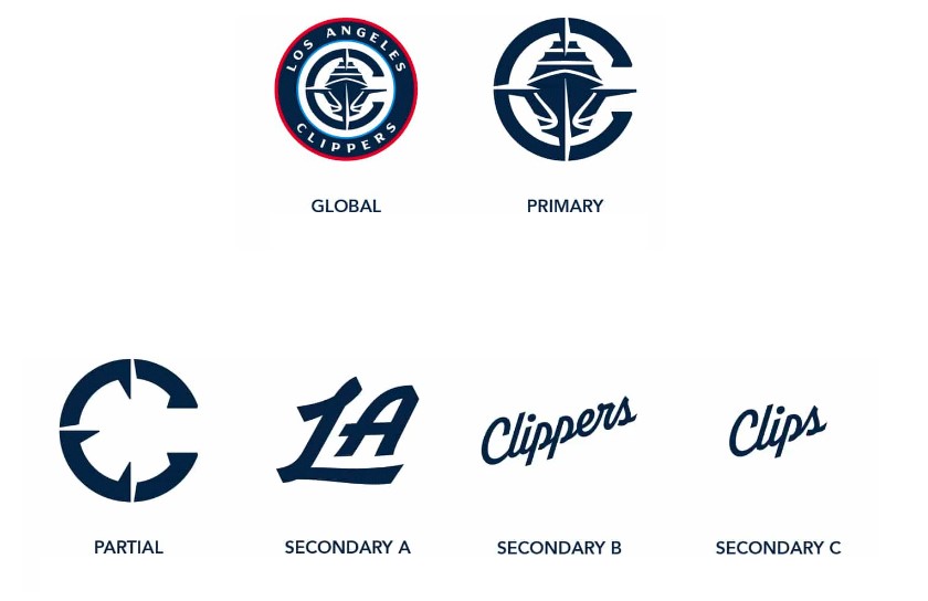
As a reminiscence of the 1979 logo, the new emblem highlights the name “Clippers” and its nautical heritage. While the previous design represented a circle, referring to the basketball and the central circle in the court, with cornered letters “C”, “L”, and “A”, the new roundel features a big “C” with an outline of an oncoming ship. Interesting and symbolic elements here are also points of a compass on the “C”, a basketball pattern on the ship’s hull as well as thin light blue and red rims. The full name “Los Angeles Clippers” in white is placed into the wider dark blue rim.
The name “Clippers” is, in fact, connected with San Diego, a city where the franchise was located in 1979-1984. In the 19th century, this coastal city was known for a large number of sailing vessels, called “clippers”, associated with high speed and maneuverability.
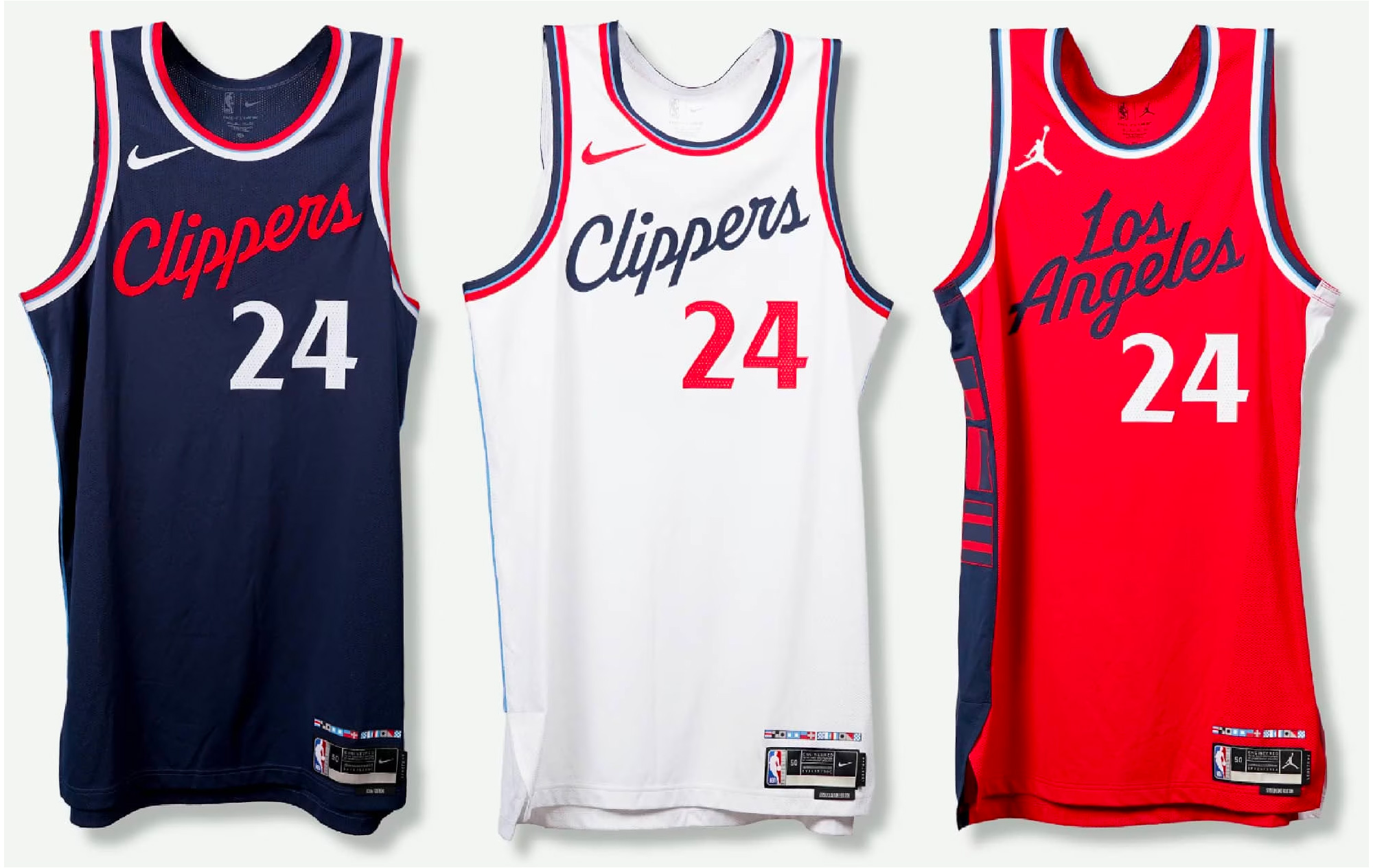
The updated color palette comprises three primary shades: Clippers Navy Blue (darker), Clippers Pacific Blue (lighter), and Clippers Red. These colors will be used for graphic elements, merchandise, and the team’s uniforms. In this regard, Clippers’ new red jerseys are a comeback of the uniform Clippers used twenty years ago.
In addition to the logo, the LA Clippers wordmark and supplementary design items have been modified for use as secondary emblems. These components incorporate distinct symbols derived from the primary logo, alternative letterings, and additional club insignias. While the new design has already been implemented on the Clippers’ page on nba.com, fans can anticipate seeing the team debut their fresh look in the 2024/2025 season.


