

Founded in 1881, Iittala is a Finnish design brand, owned by Fiskars Group, that is known for its premium glassware and cookware products. The company acquired its unique style in the early 1930s when it started producing pieces, like the glasses designed by Aino Aalto or the Savoy Vase created by Alvar Aalto, that would become the classics of Scandinavian design. Even today, their distinctive wavy forms are reproduced in plates, trays, cutting boards, and other objects of application design. To pay homage to its rich history and traditions of glassblowing, the brand has updated its visual identity, which has received new color accents.
![]()
Also celebrating joining the UNESCO Intangible Cultural Heritage List in December 2023, the Iittala brand is entering a new era with a fresh and confident identity, as the company’s creative director, Janni Vepsäläinen, says. As part of the rebranding project carried out by Iittala’s in-house design team and Aleksi Tammi from 066.studio, the brand’s new logo, which represents an all-caps wordmark, takes inspiration from one of the early Iittala signatures, referring to the company’s great expertise in glass making.
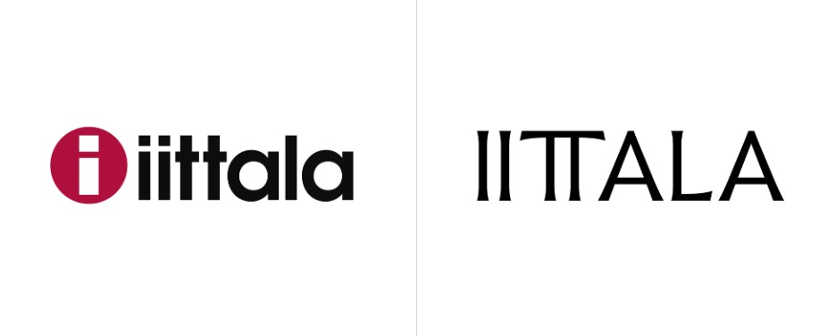
Iittala’s previous emblem, introduced in 2001, featured a red circle with an “i” inside that stood not only for the brand’s name but also symbolized a glass-blowing tube with glass mass on the top. The general design of this icon was originally developed by graphic designer Timo Sarpaneva in 1956. It’s noteworthy that the “i-sign” became iconic among connoisseurs of Scandinavian design while being a kind of seal of quality on all the Iittala products.
But new times require new signs. So, instead of lowercase lettering, “Ittala” is now executed in an all-caps typeface. The logo looks stronger through the bold strokes of the letters that, while widening a bit at the ends, remind us of serifs. While a similar design was used in the 1890s, the new iteration is distinguished by a “TT” ligature that aesthetically echoes, of course, the initial “II” and adds much stylishness and expressiveness.
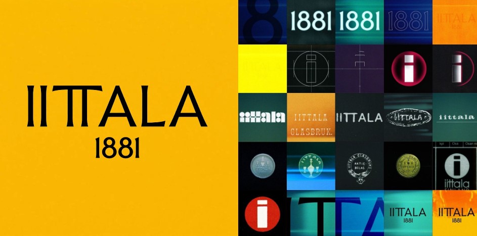
Abandoning the old aesthetics, the brand also dropped red as its main color, switching to Glowing Yellow. According to Vepsäläinen, this hue symbolizes the color of melted glass when it goes out of the blower. It may also mean joy, energy, and creativity. “What other color can be more suitable for such an energetic brand like Iittala?” she adds.
Typography-wise, the visual identity is supplemented with a custom typeface based on the logo’s letterforms. While looking quite elegant, the glyphs remind of old inscriptions, thus conveying history and heritage.

The presented set of branded elements reveals that Iittala aspires to be not just a houseware brand but a real fashion house. Regardless of how it felt in the past, the brand still realizes it has to move on to be relevant to the new generation of consumers.


